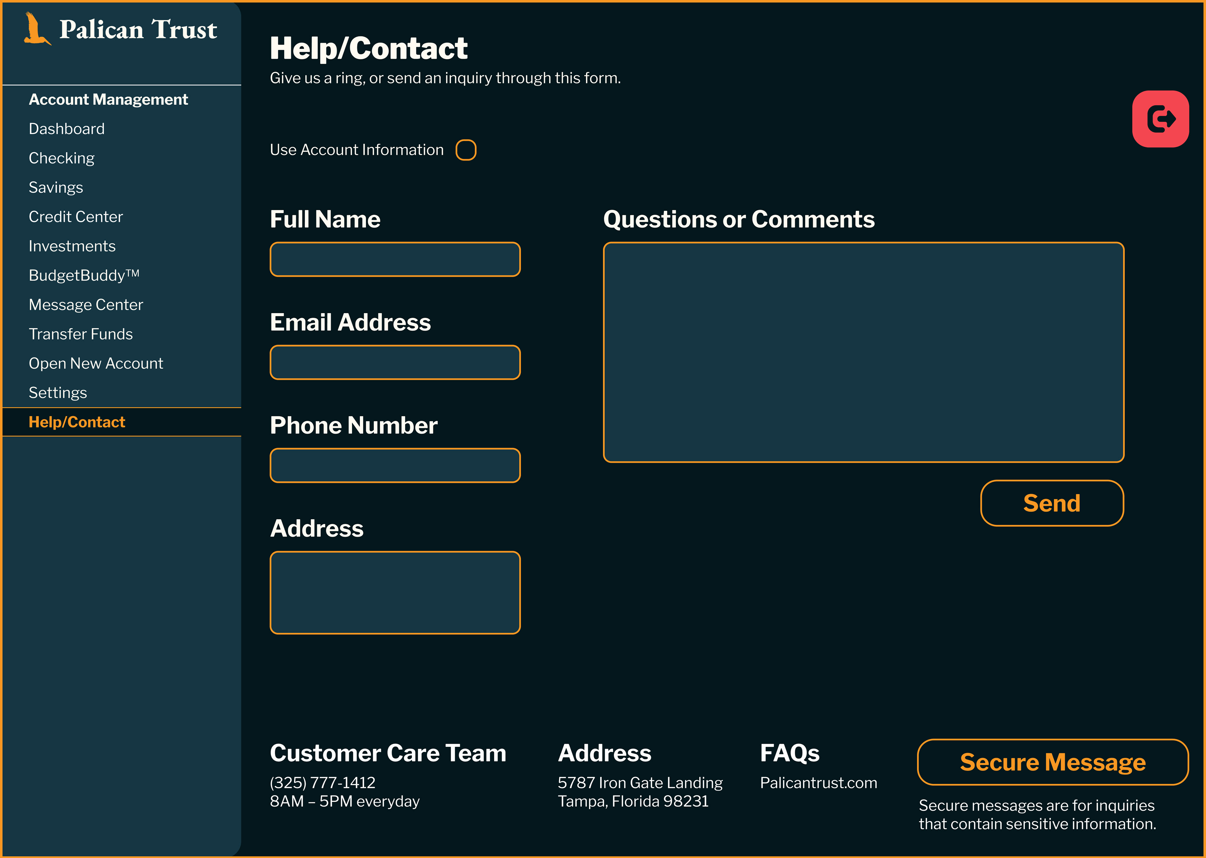
All Screens
aSasas
The Brief
Design and prototype a website for a fictitious bank. Utilize basic design principles to create a modern and unique web based design and user interface. Create custom graphics, navigation, buttons and icons.
Based off of an image by Richard Sagredo on Unsplash

Main Dashboard
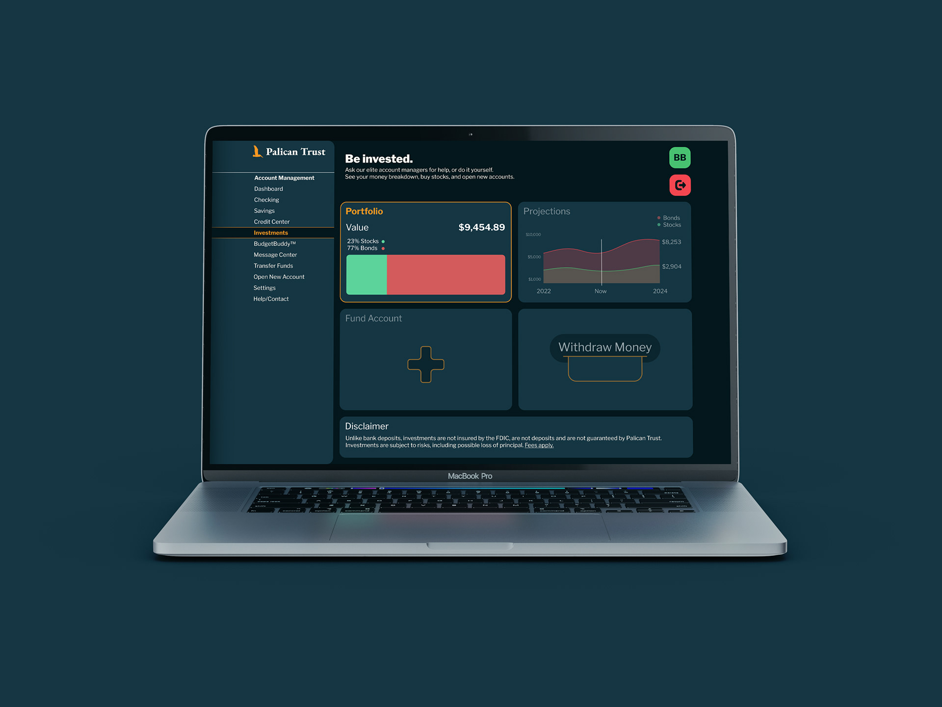
Investment Portfolio
Sketches and exploration for my logo design.
Competitive Research
Big Bank Style
Many massive banks have websites that pair stiff typefaces with carefully curated stock imagery to create a fully forgetful landing page. Their logos are minimalist, and they all have the same colors. Each of these websites is designed to steer widely of any risks, and focus on functionality.

US Bank

HSBC
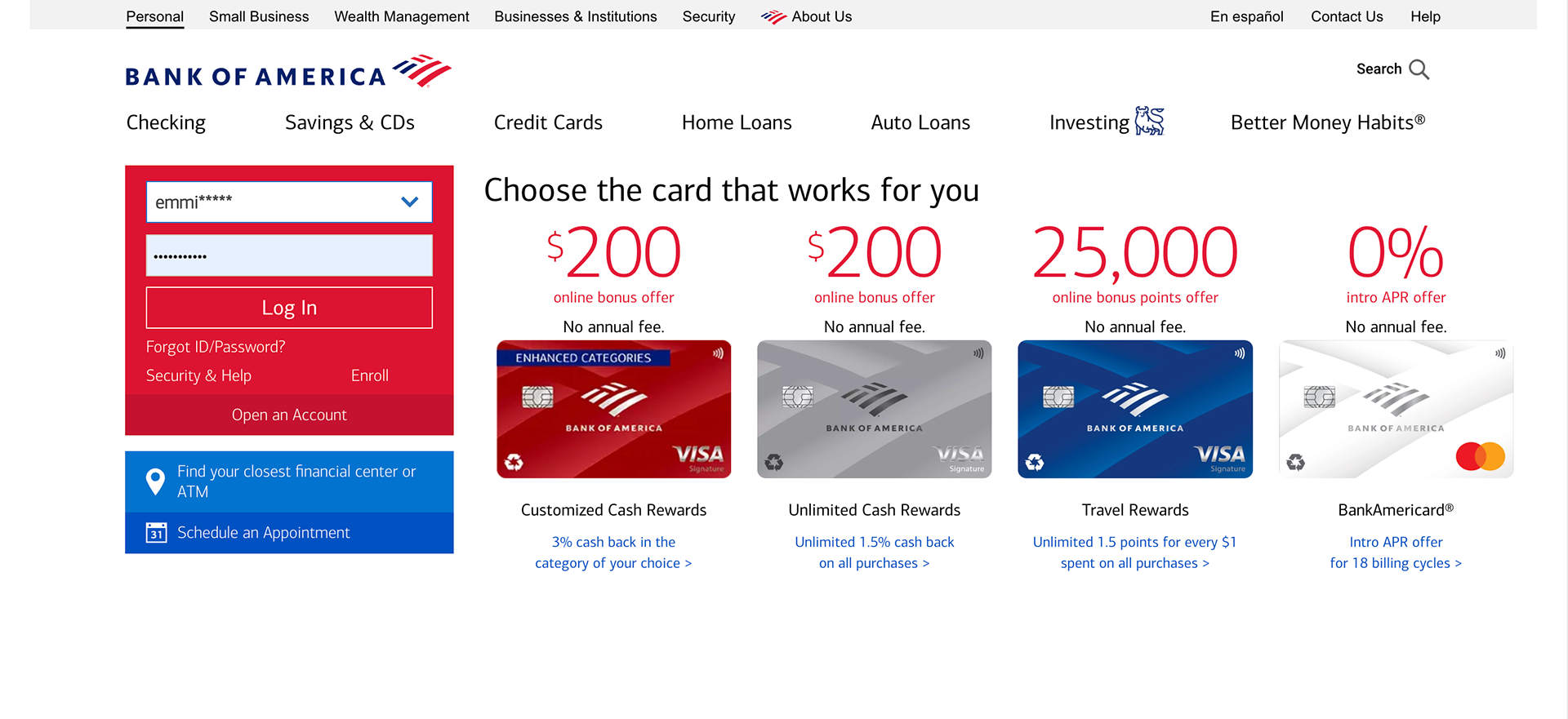
Bank of America
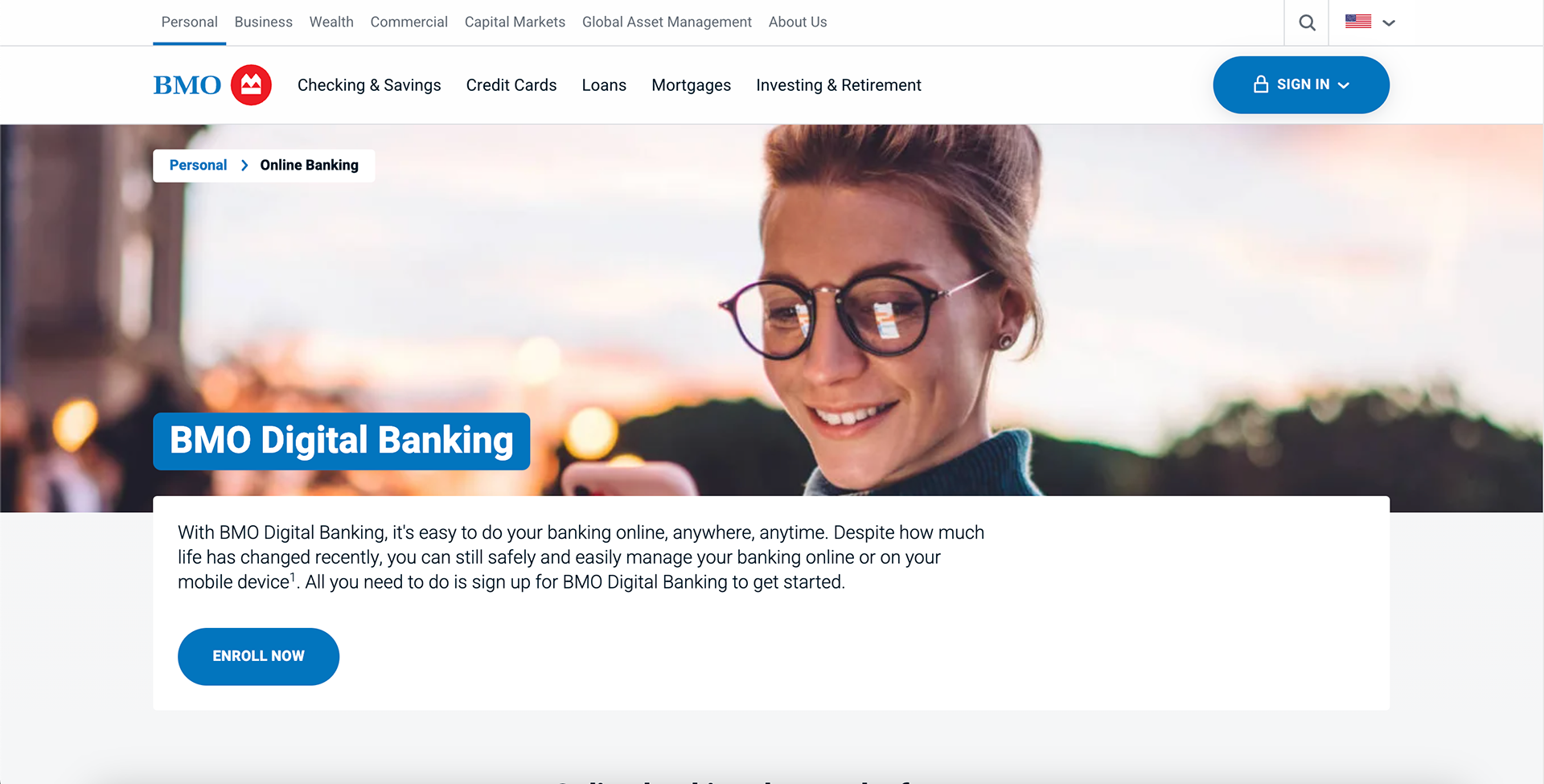
BMO
State Bank Style
Regional U.S. banks adopt a more interesting approach. With text floating over an original photo, and more varied typefaces, logos, and colors, these websites feel well-suited to the expectations of a smaller populace.
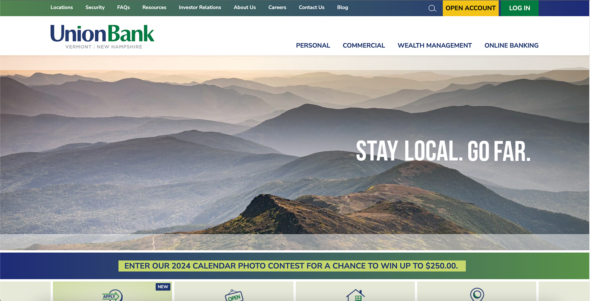
UnionBank (Vermont & New Hampshire)

Bank of Idaho
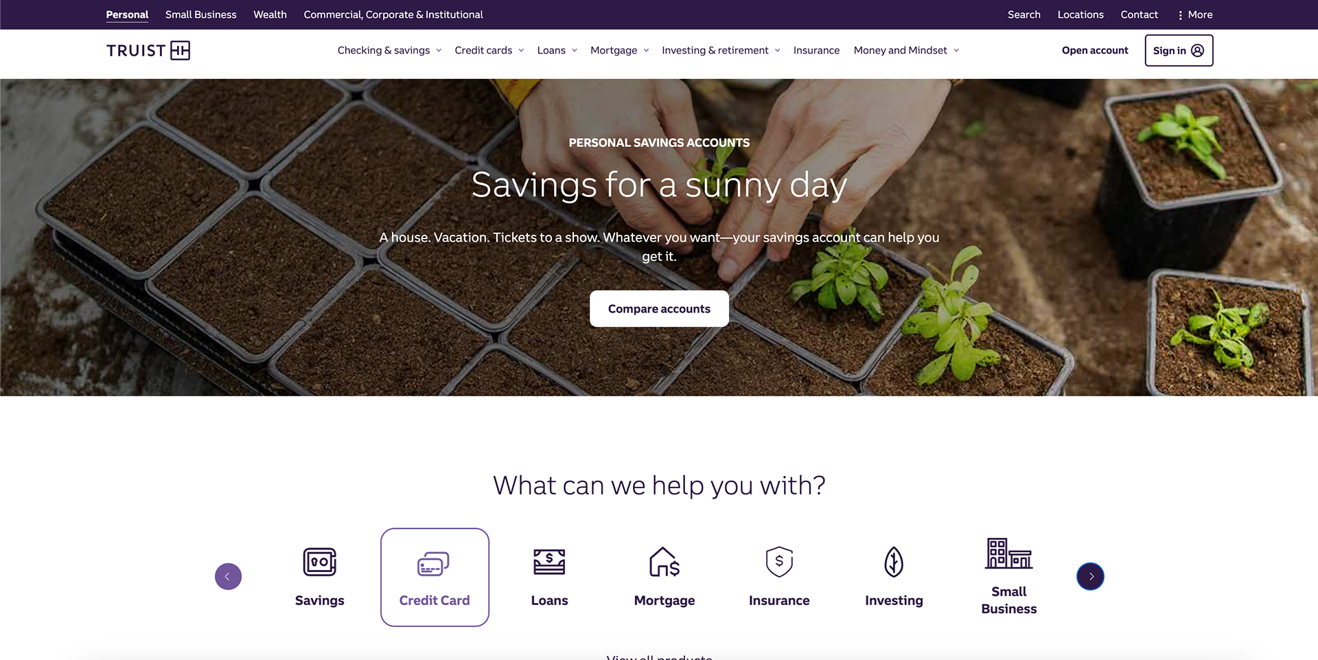
Truist Bank (Eastern Seaboard)
Crypto Bank/Behance Style
These trendy websites make use of nifty gradients, 3D models, and rounded corners to proclaim themselves as the next big thing. You'll find many Laurenz Brunner-esque fonts similar to Akkurat and Circular.
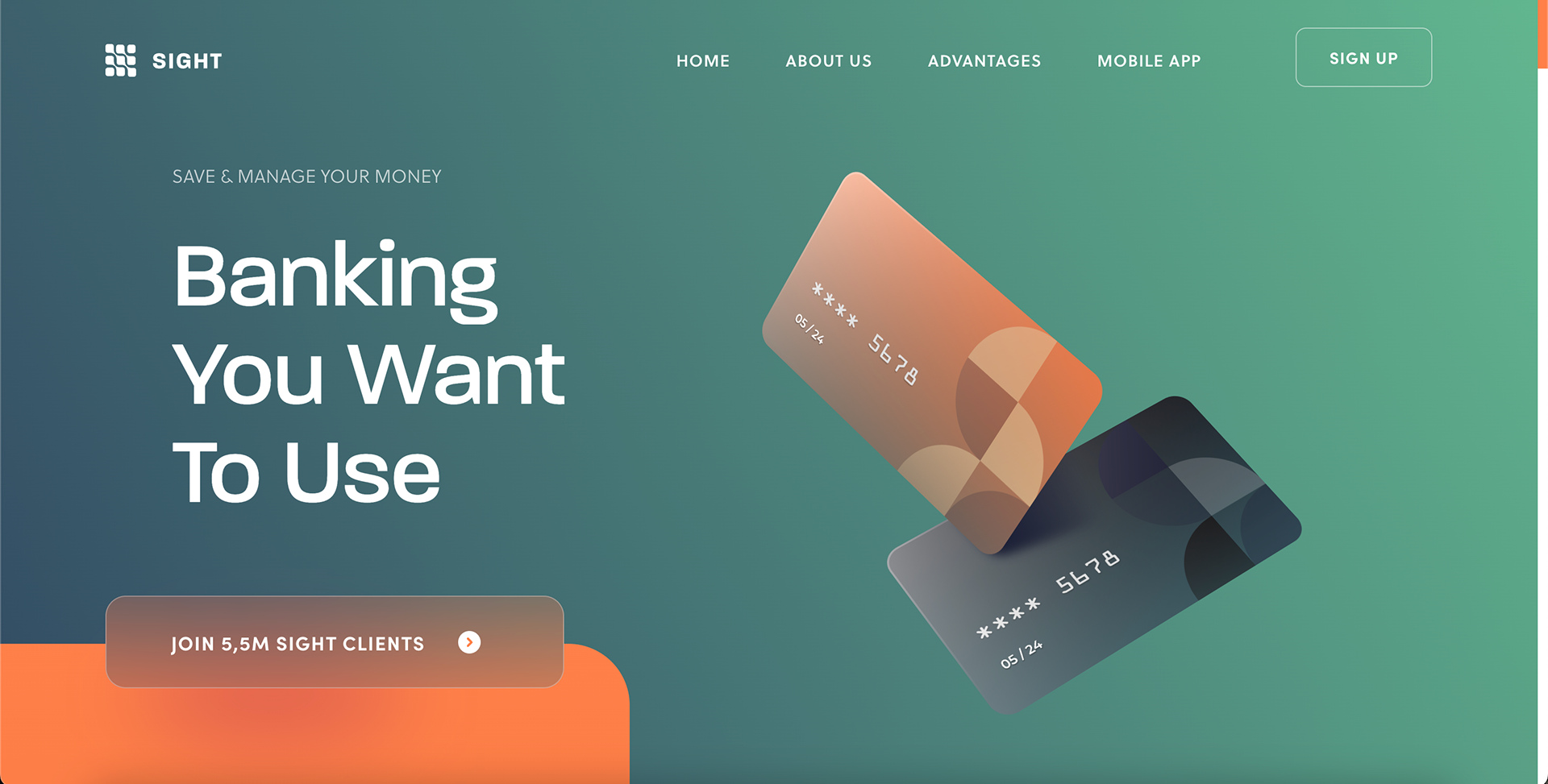
Sight Banking
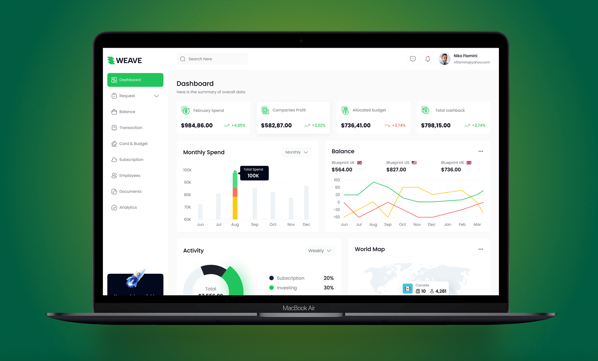
Concept Design by Abu Musa on Behance
Colors
The warm, aquatic blue represents stability. The golden, yolky yellow represents wealth. Together, they’re a picture of a warm beach sunset with a cold drink in hand.
Type
Libre Franklin, redesigned for web readability by Pablo Impallari, perfectly suits the professional and approachable nature of Palican Trust.
For the logotype, I used EB Garamond ExtraBold for its simple, elegant trustworthiness that is naturally expected of a bank.
Web Accessibility
Palican Trust colors tested against the Web Content Accessibility Guidelines (WCAG).
Sitemap
adasasdasd

Landing Page
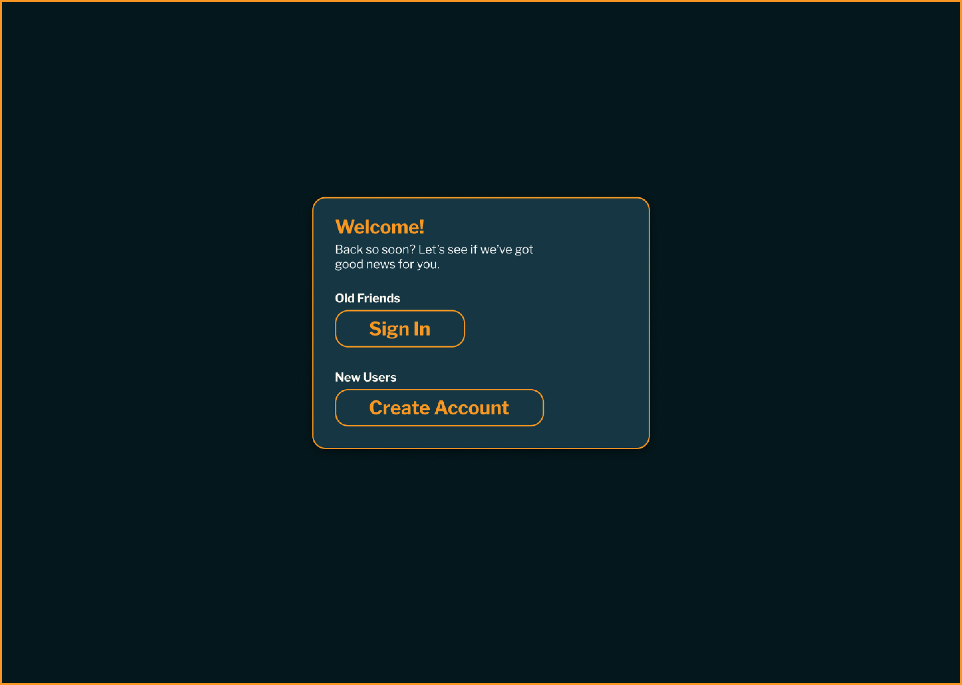
Welcome Popup
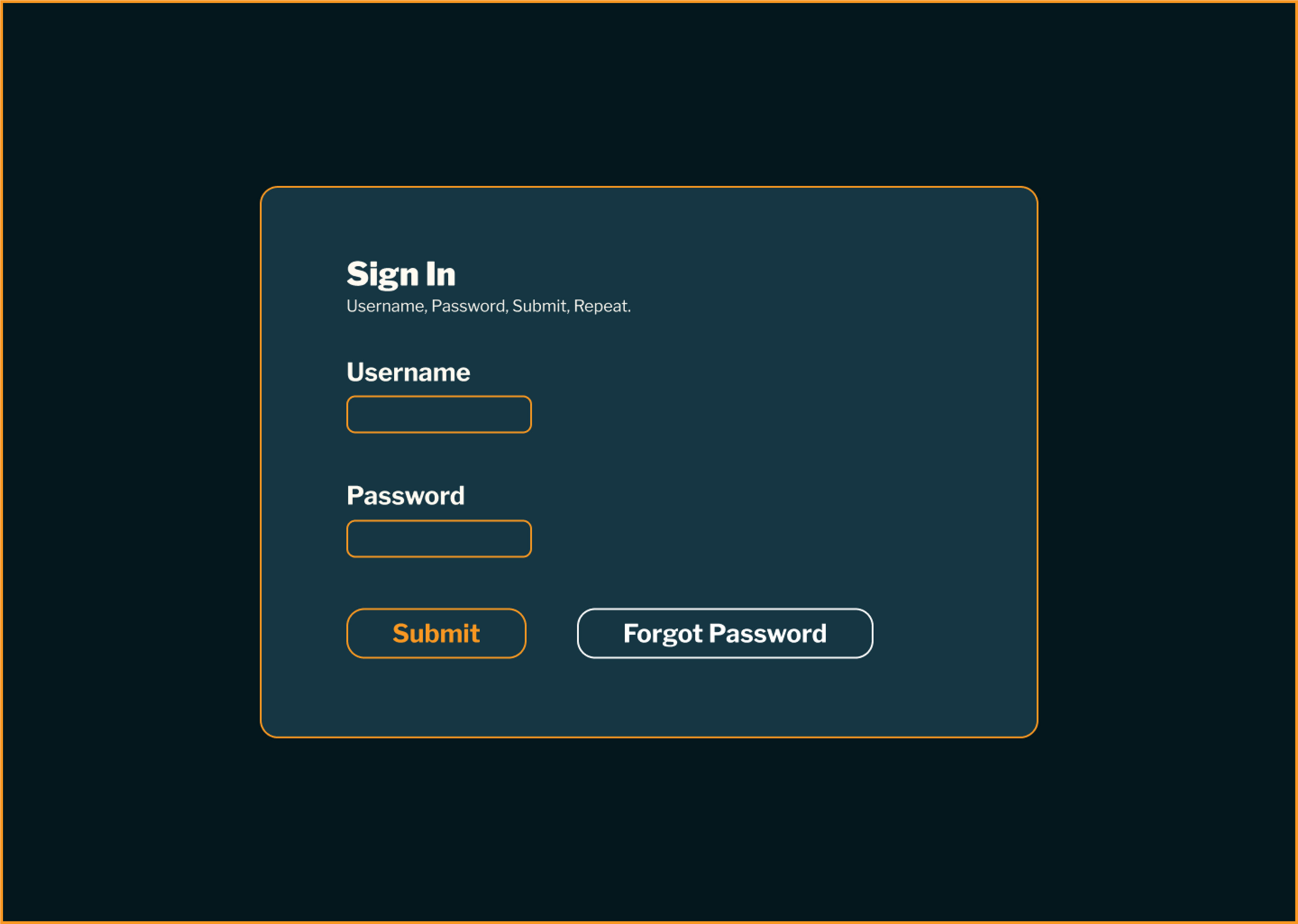
Sign In
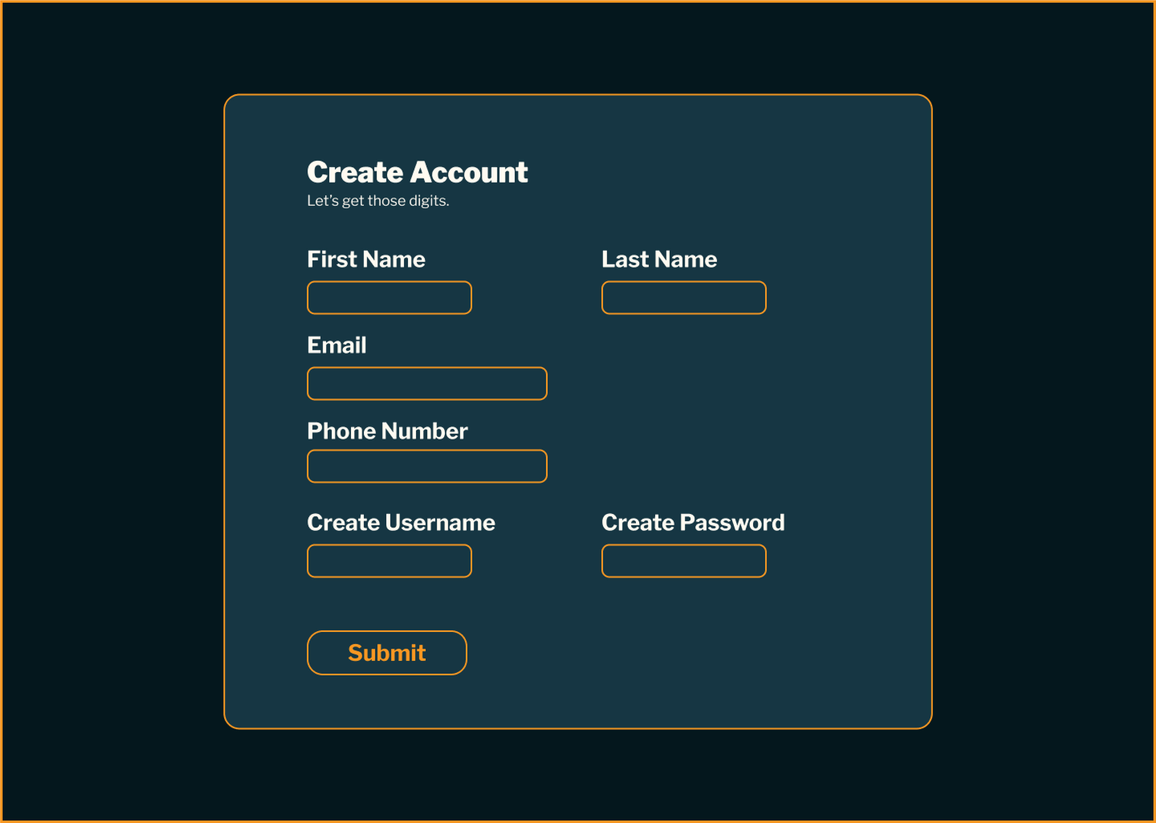
Create Account
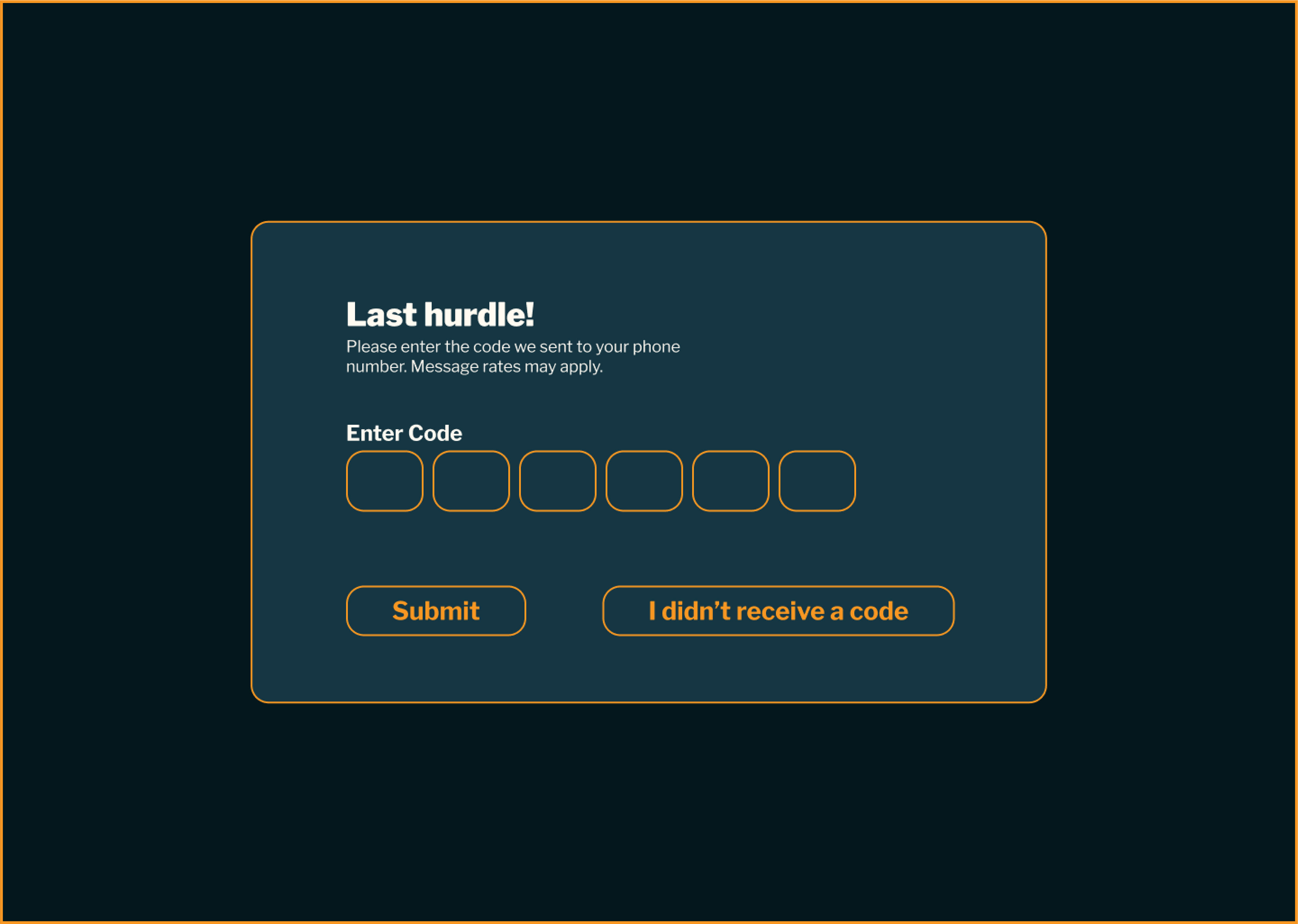
Two Factor Authentification
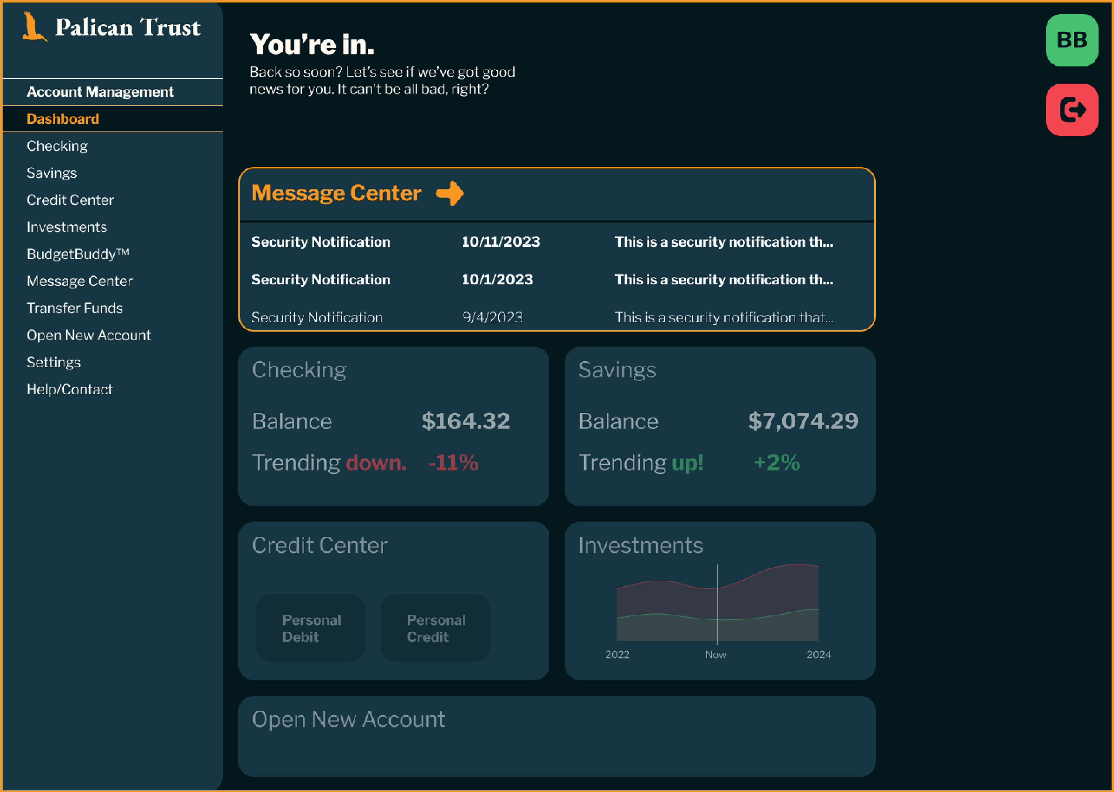
Main Dashboard

Checking Account

Savings Account

Credit Center Account View
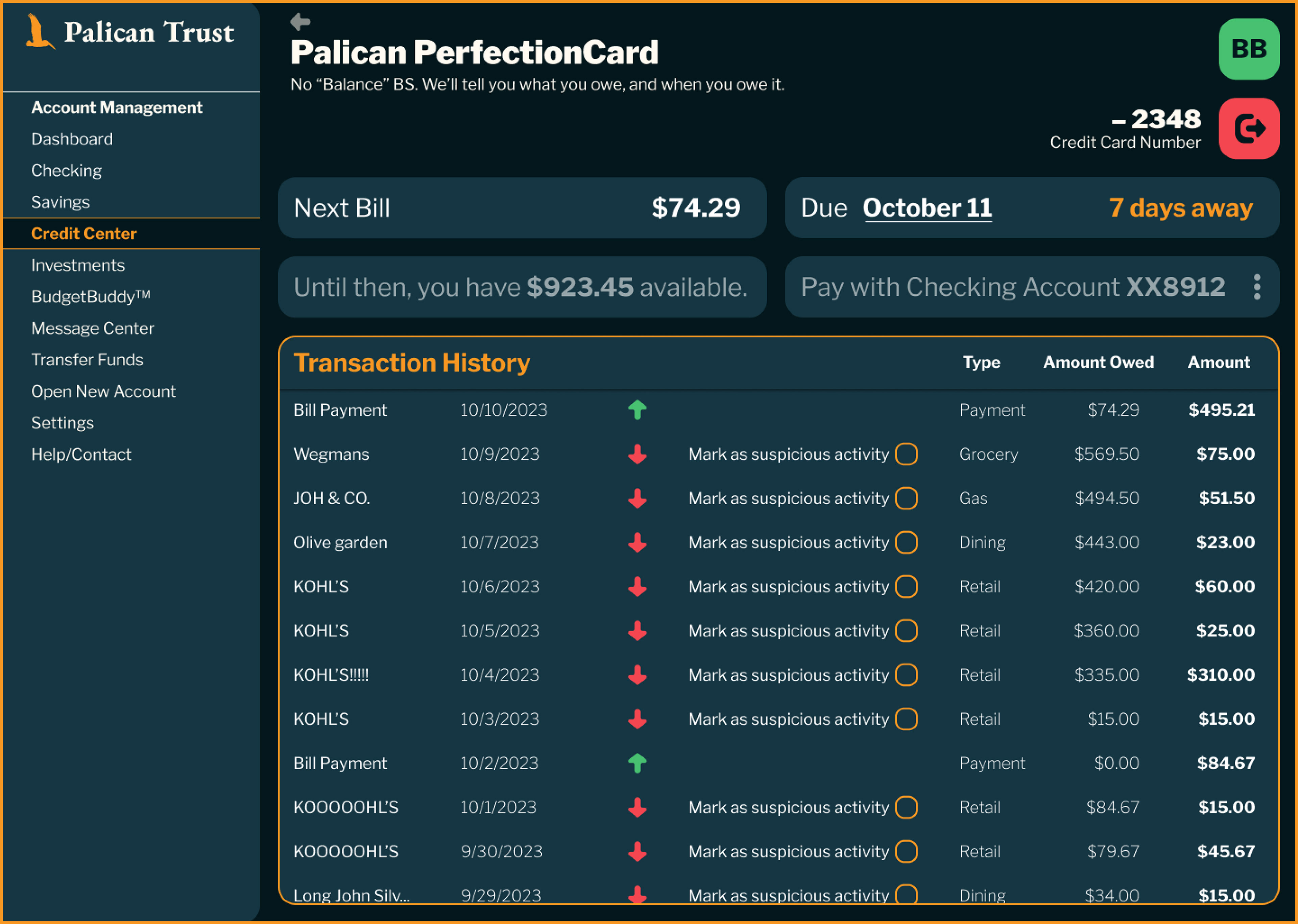
Credit Center Transactions View

Investment Portfolio
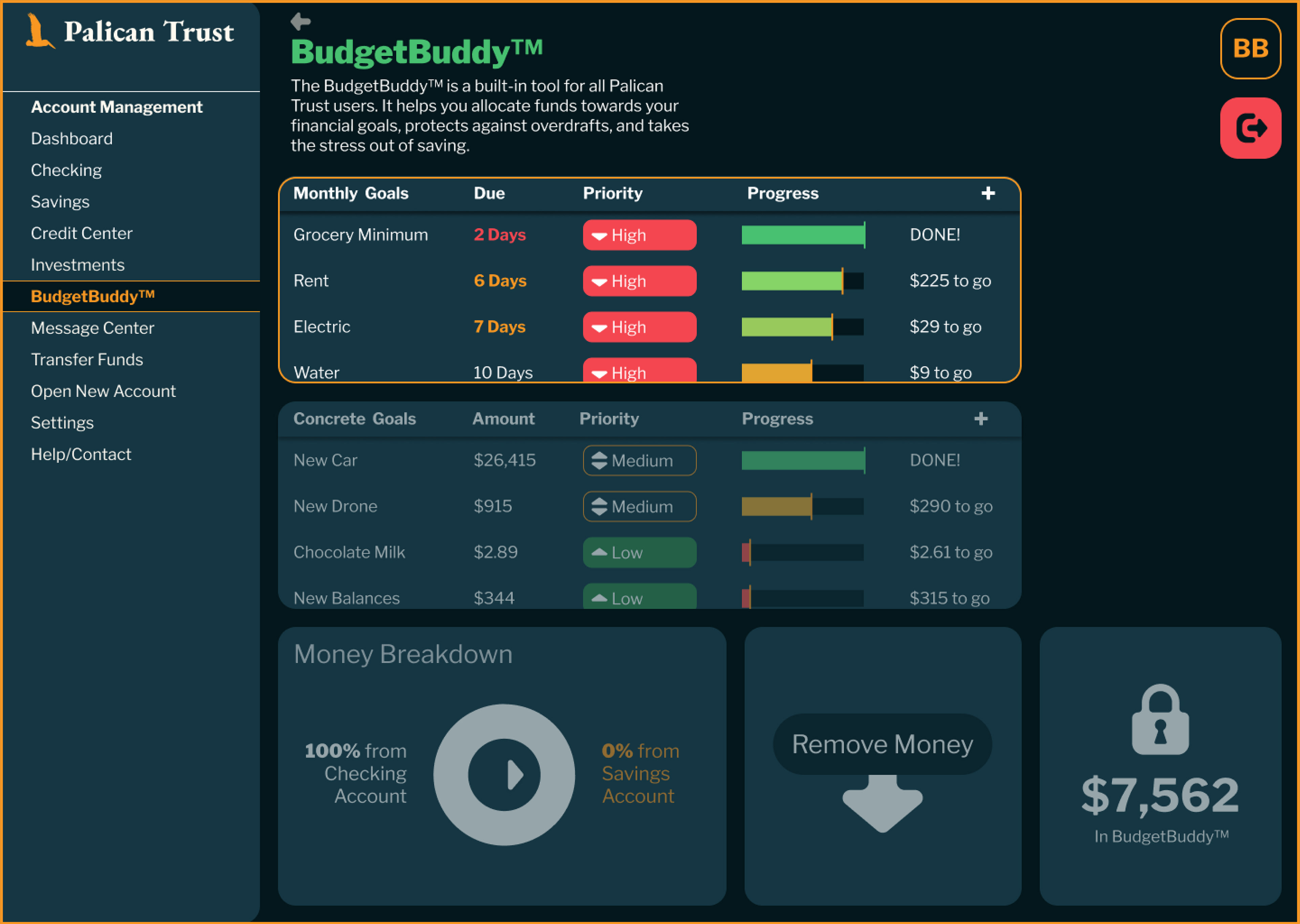
BudgetBuddy™
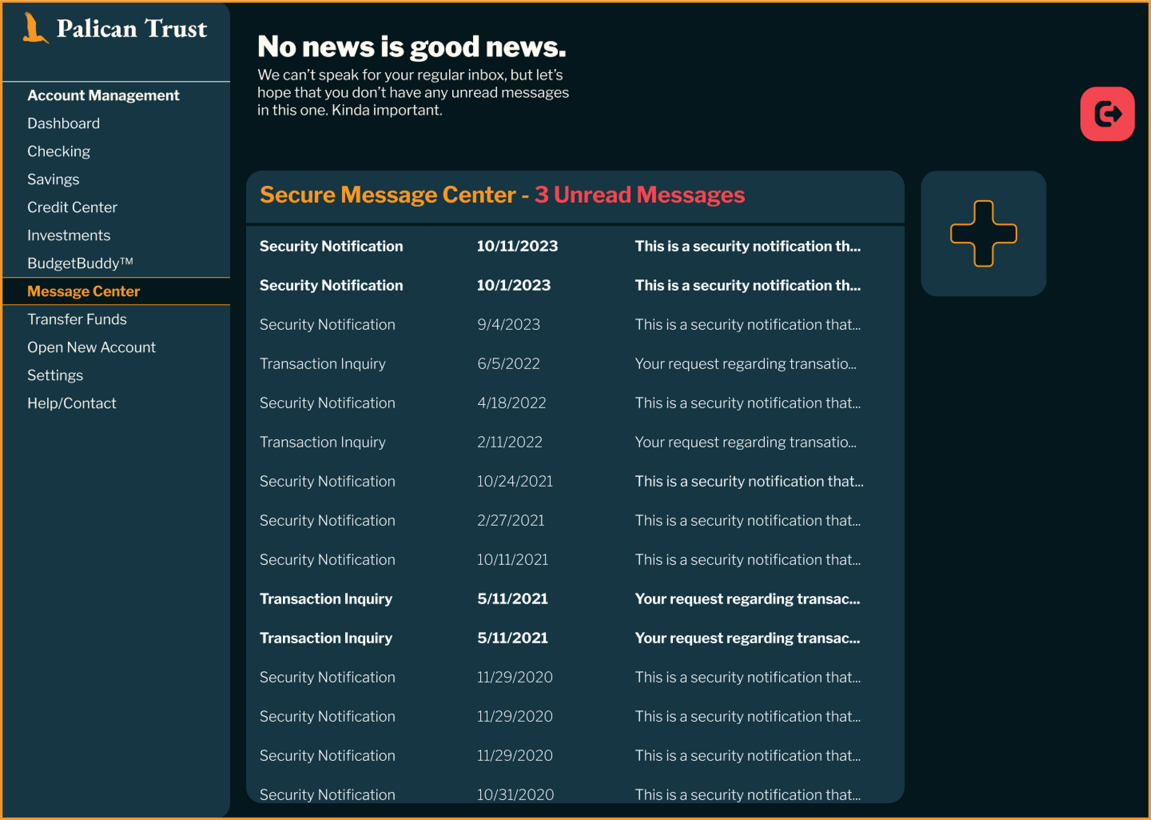
Message Center Inbox

Message Center Compose
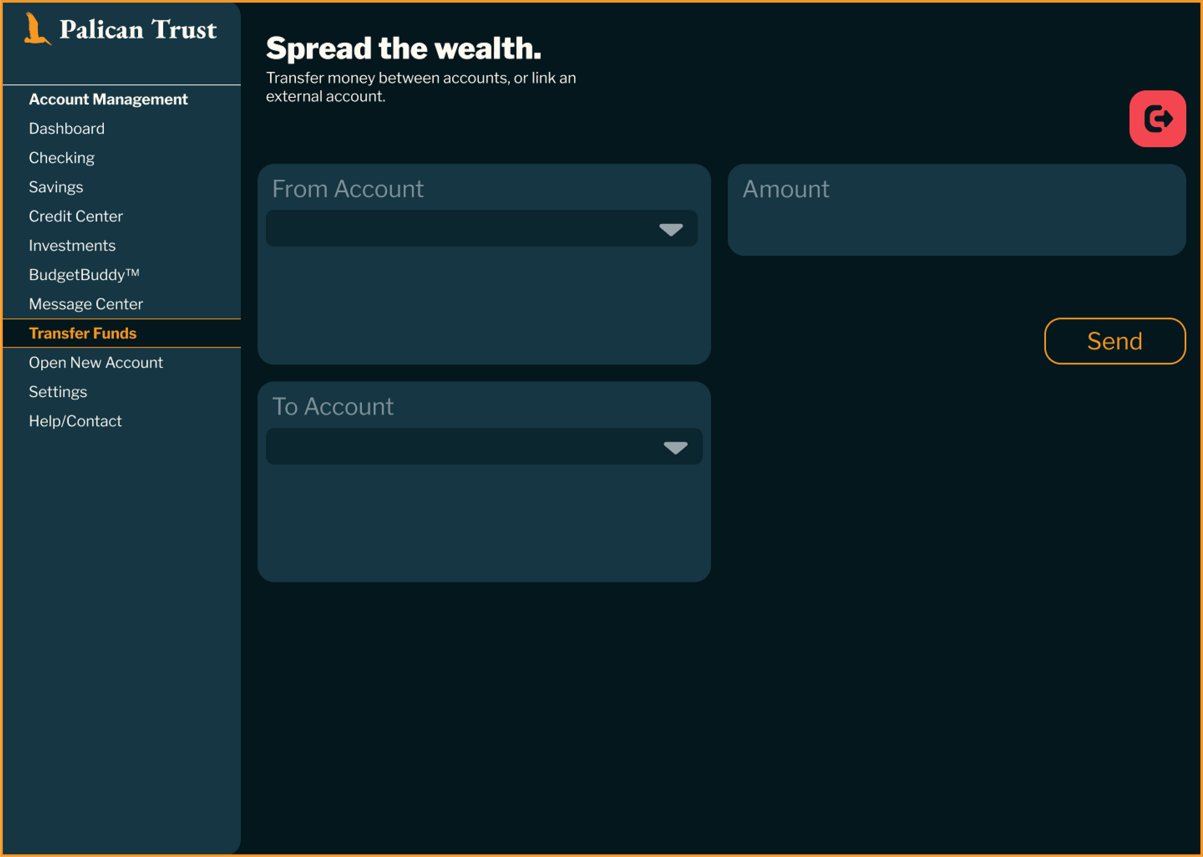
Transfer Funds

Loading Screen

Open New Account
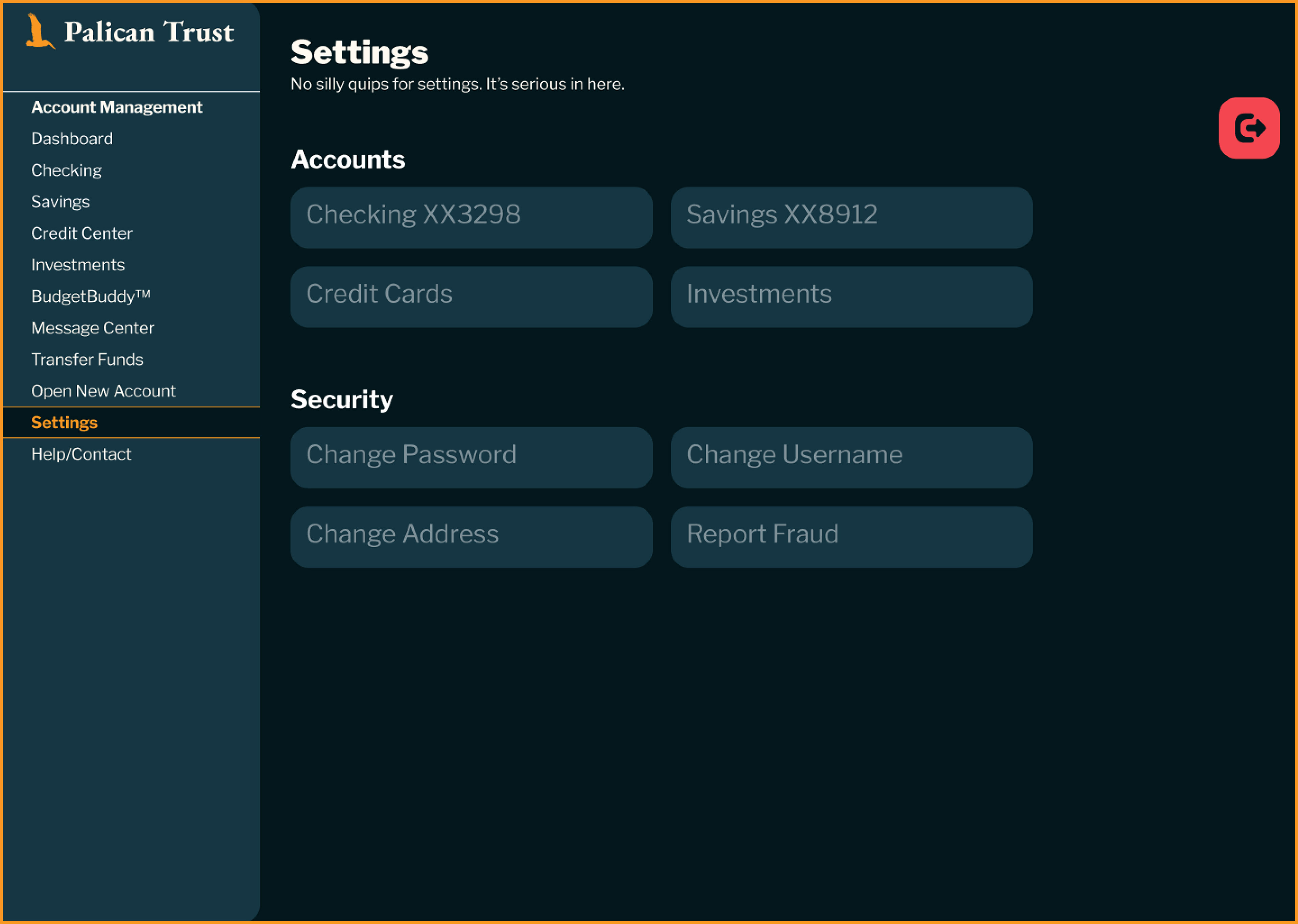
Settings
