

BACKGROUND
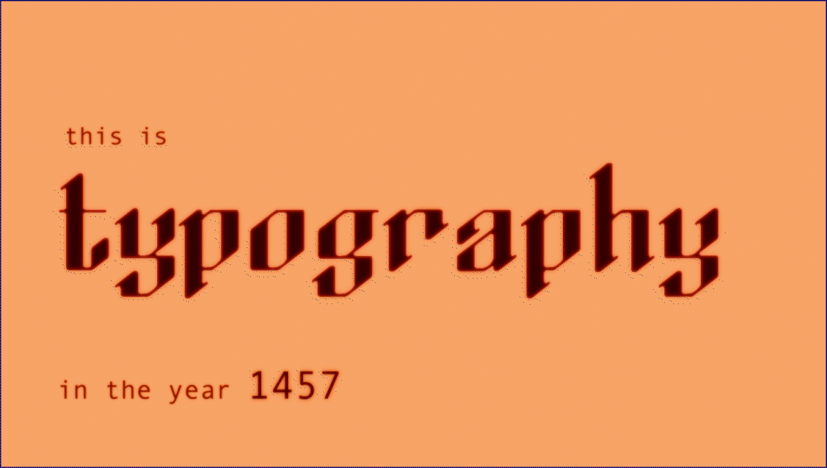
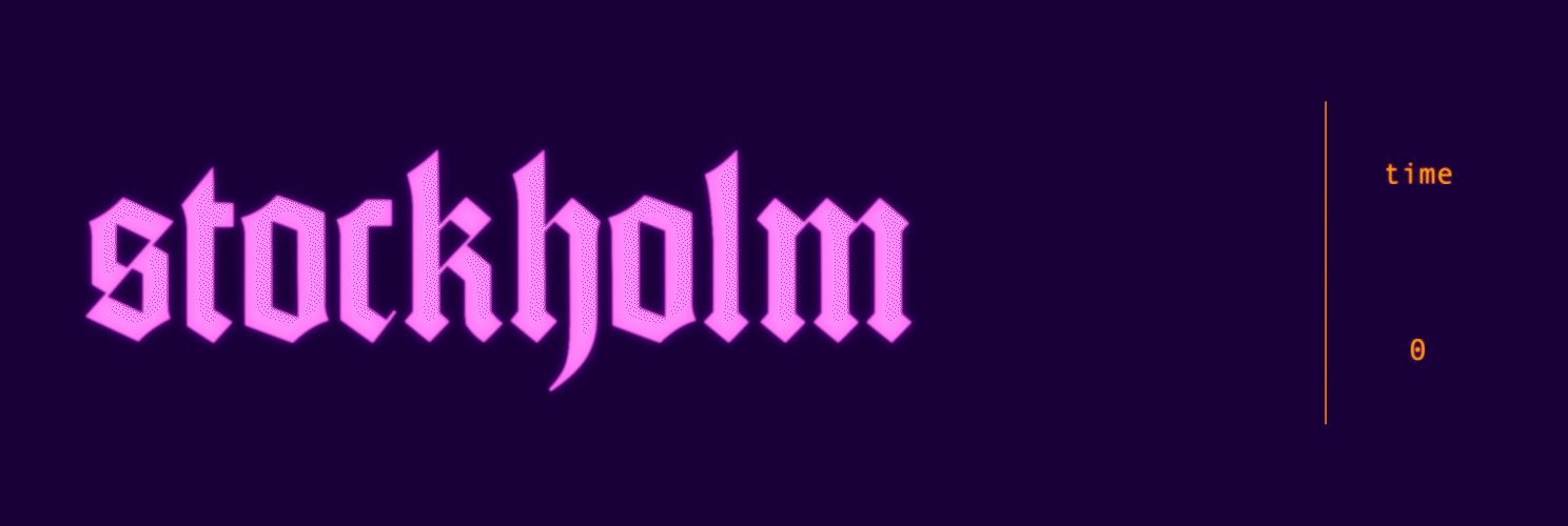
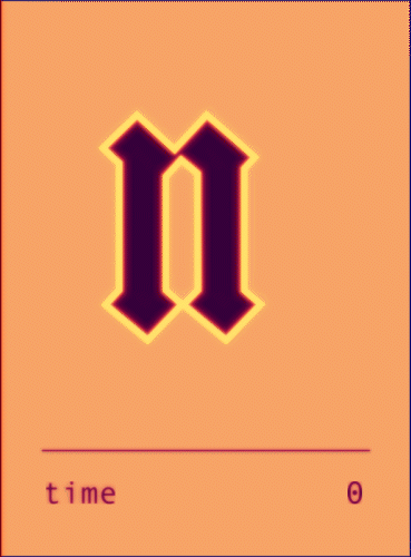
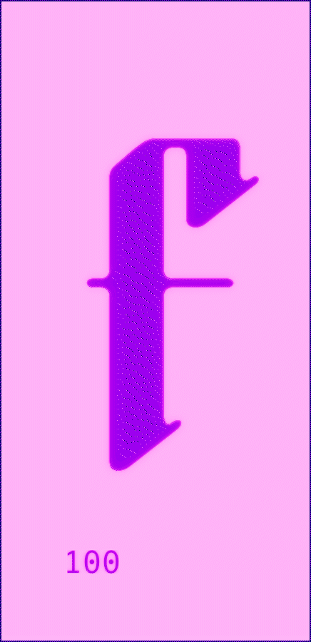
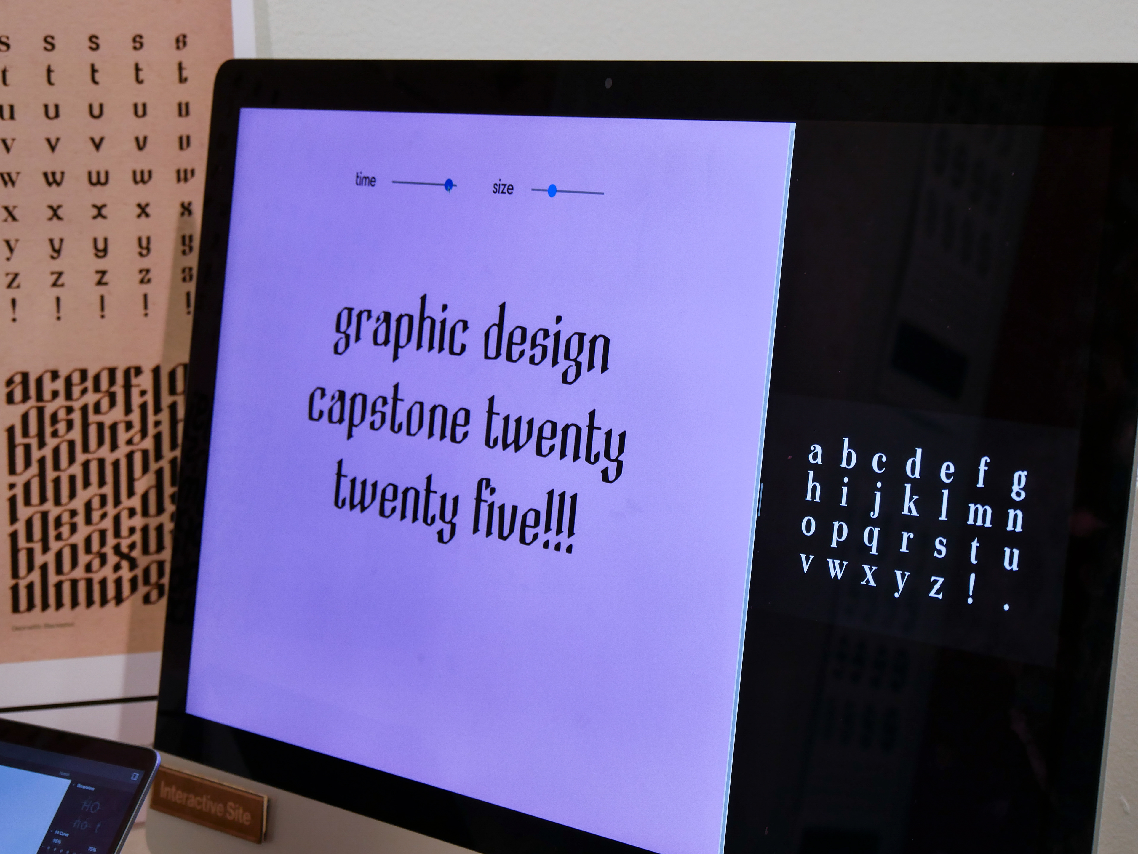
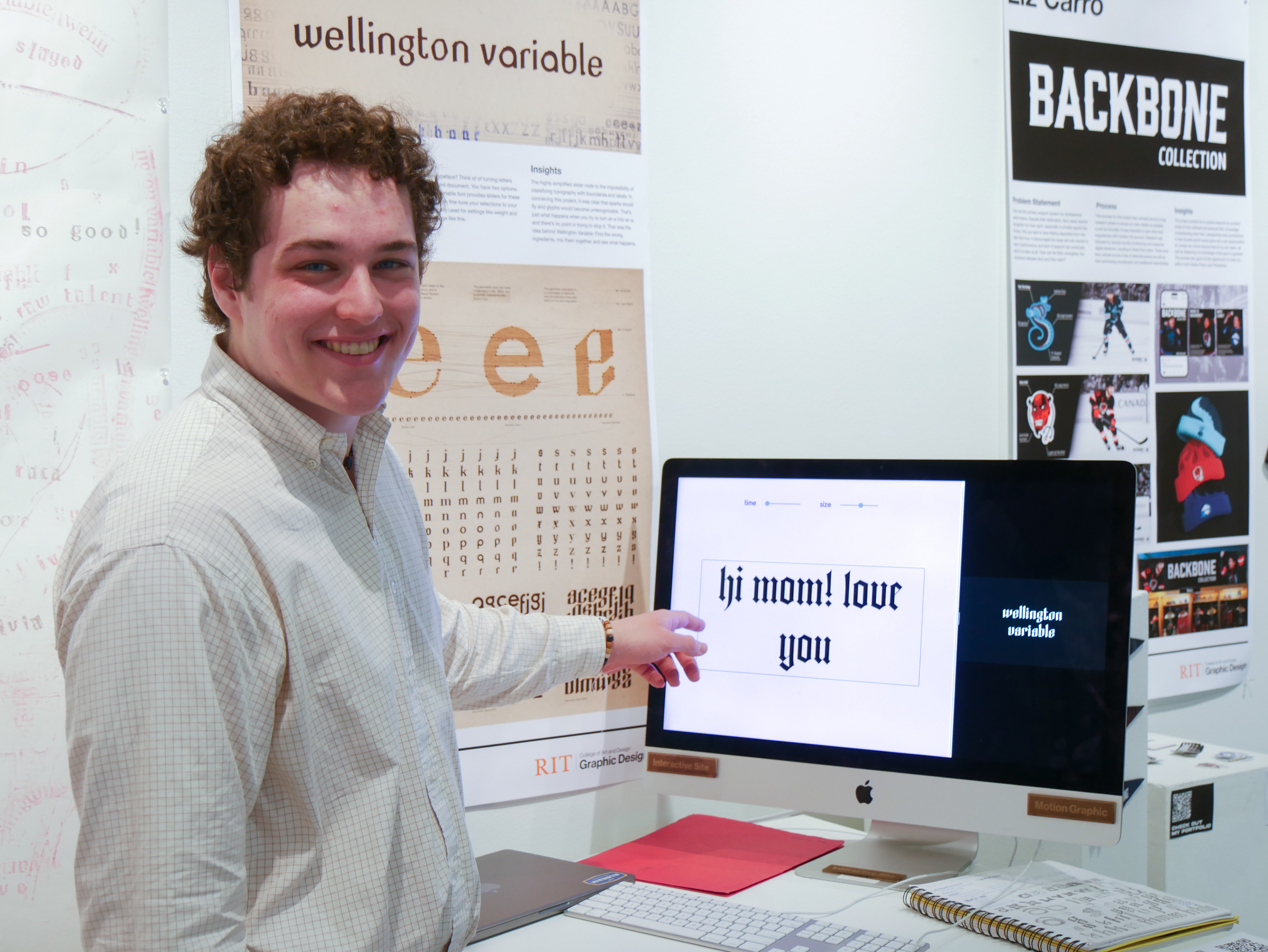
Wellington Variable consists of 26 lowercase characters in 4 extremely different styles on the variable axis of time. Chosen to represent landmark moments in typographic history, each style corresponds to a certain year or time period. As you move the slider, the typeface vaguely approximates a linear timeline of typographic history.
The typeface was drawn over a period of 14 weeks in preparation for the RIT Graphic Design Capstone Showcase and refined in the months afterward.
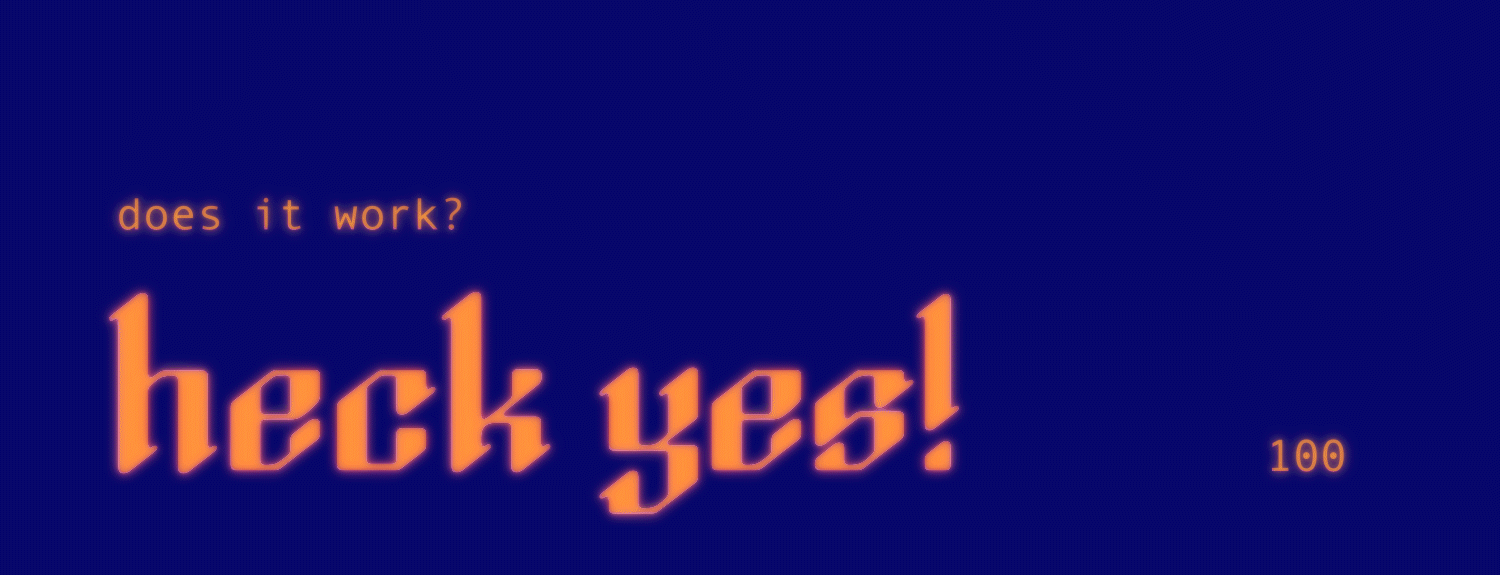
Head to the bottom of this page to download Wellington Variable and try for yourself!
Type Design and many other design disciplines.
Glyphs 3, Adobe Illustrator, After Effects, HTML, CSS, JS
PROCESS
This project began out of two small inklings that eventually merged into one big inky blob. The first, a desire to create a typeface, had been simmering on the back burner for years. The second was a cheeky vision of a linear typographic history that "sets the record straight" on the dominant styles of a time period. No such thing exists, and for good reason. It's not possible to distill the work of thousands of people over hundreds of years into a single set of Bezier points—but why not give it a shot?
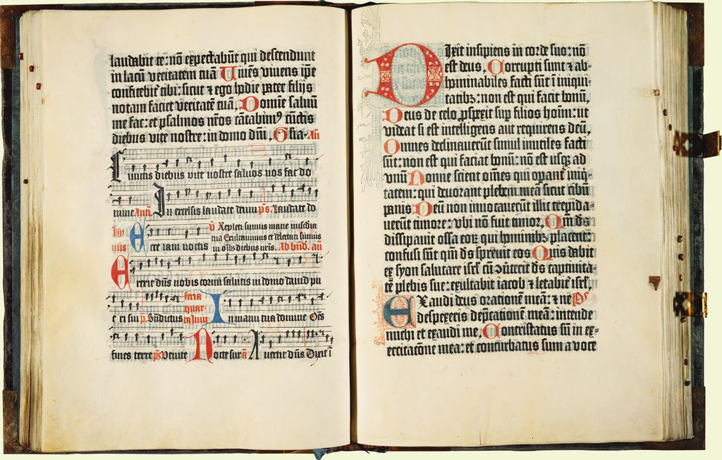
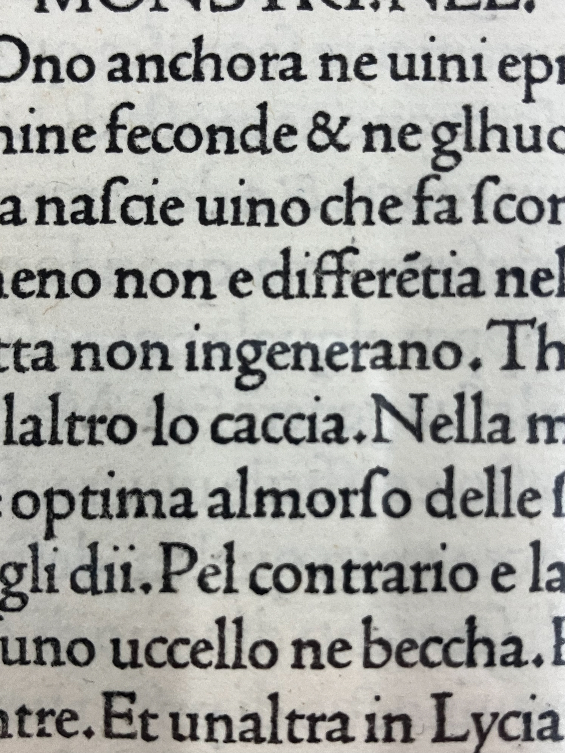
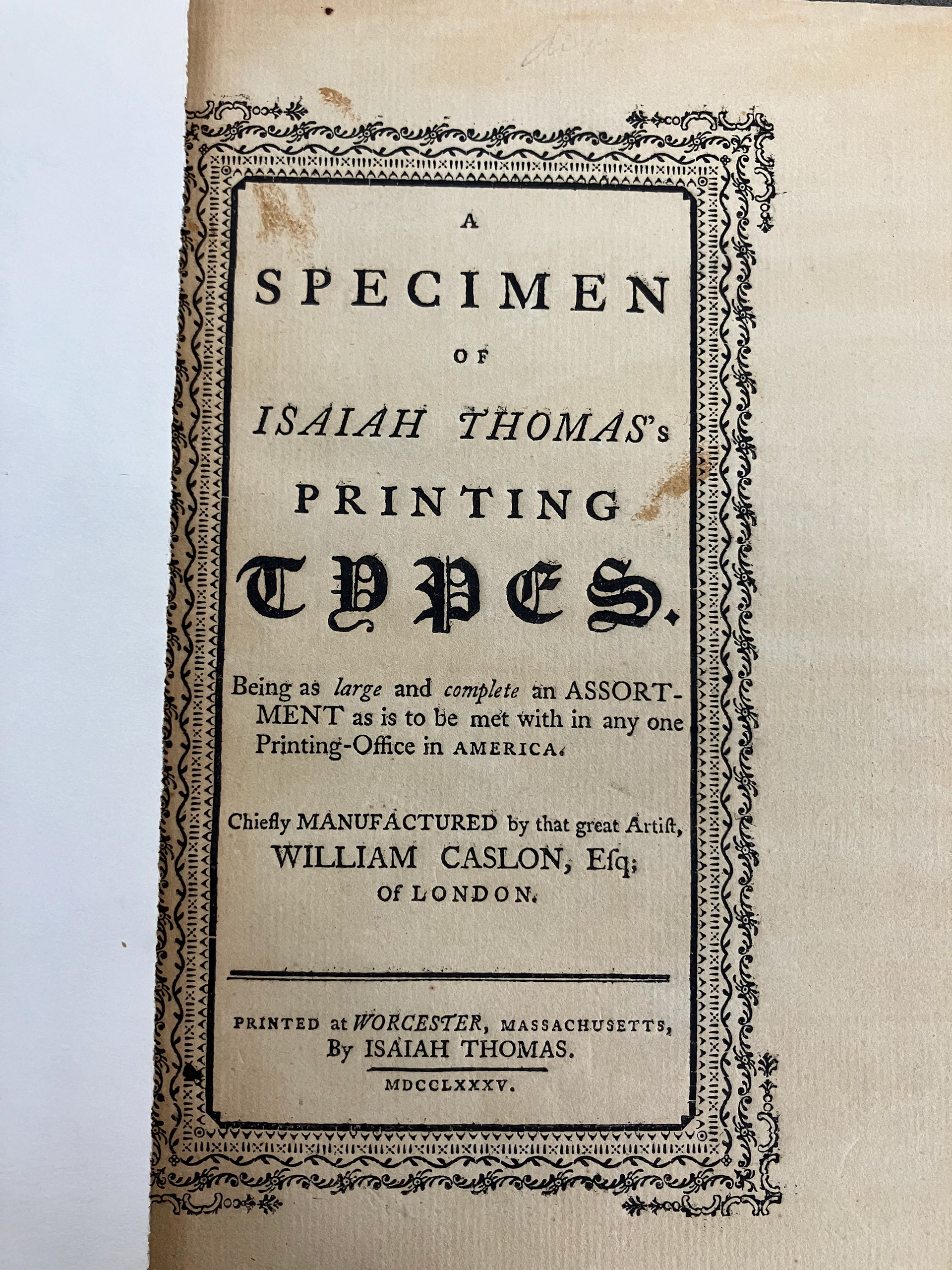
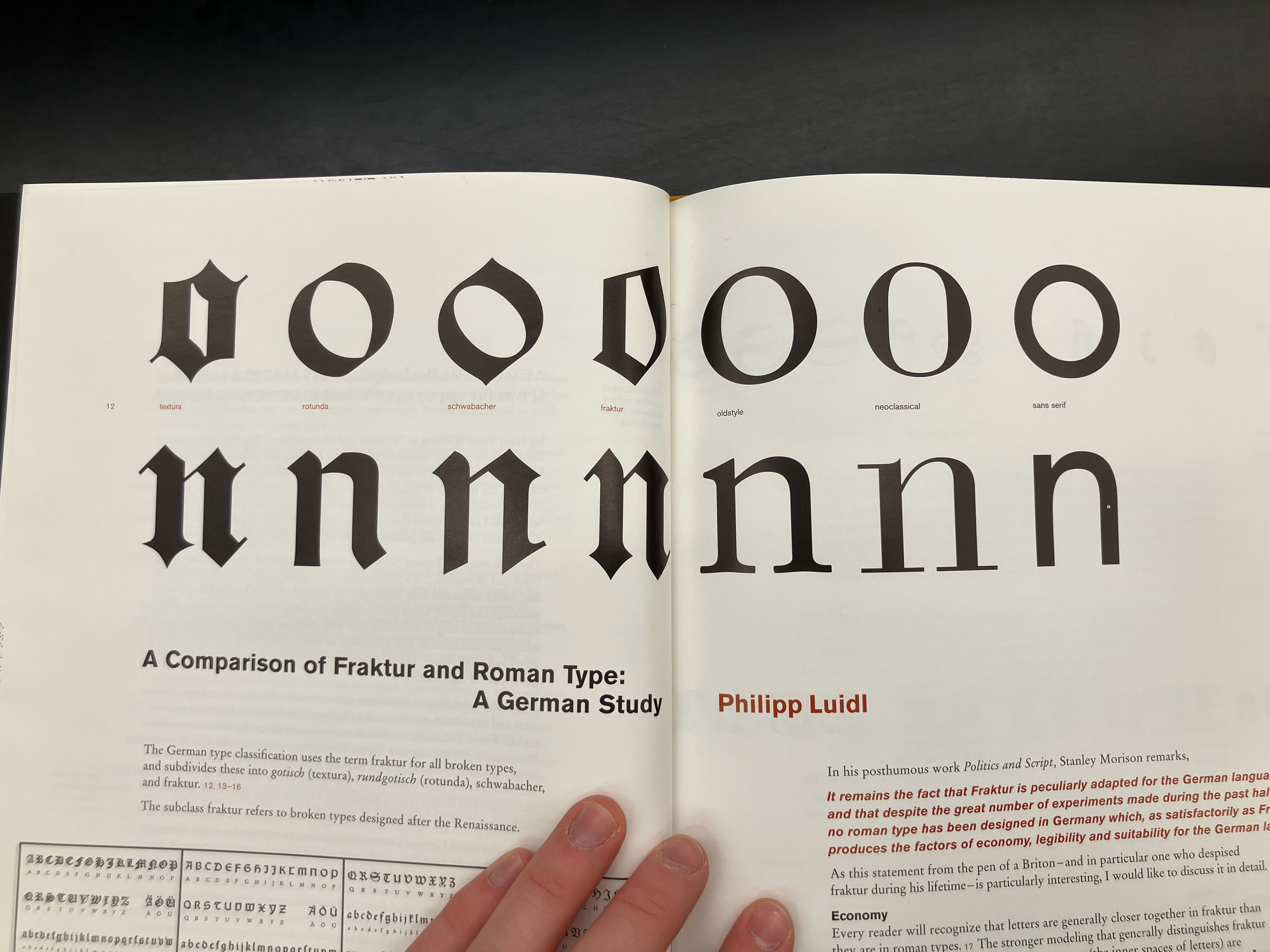
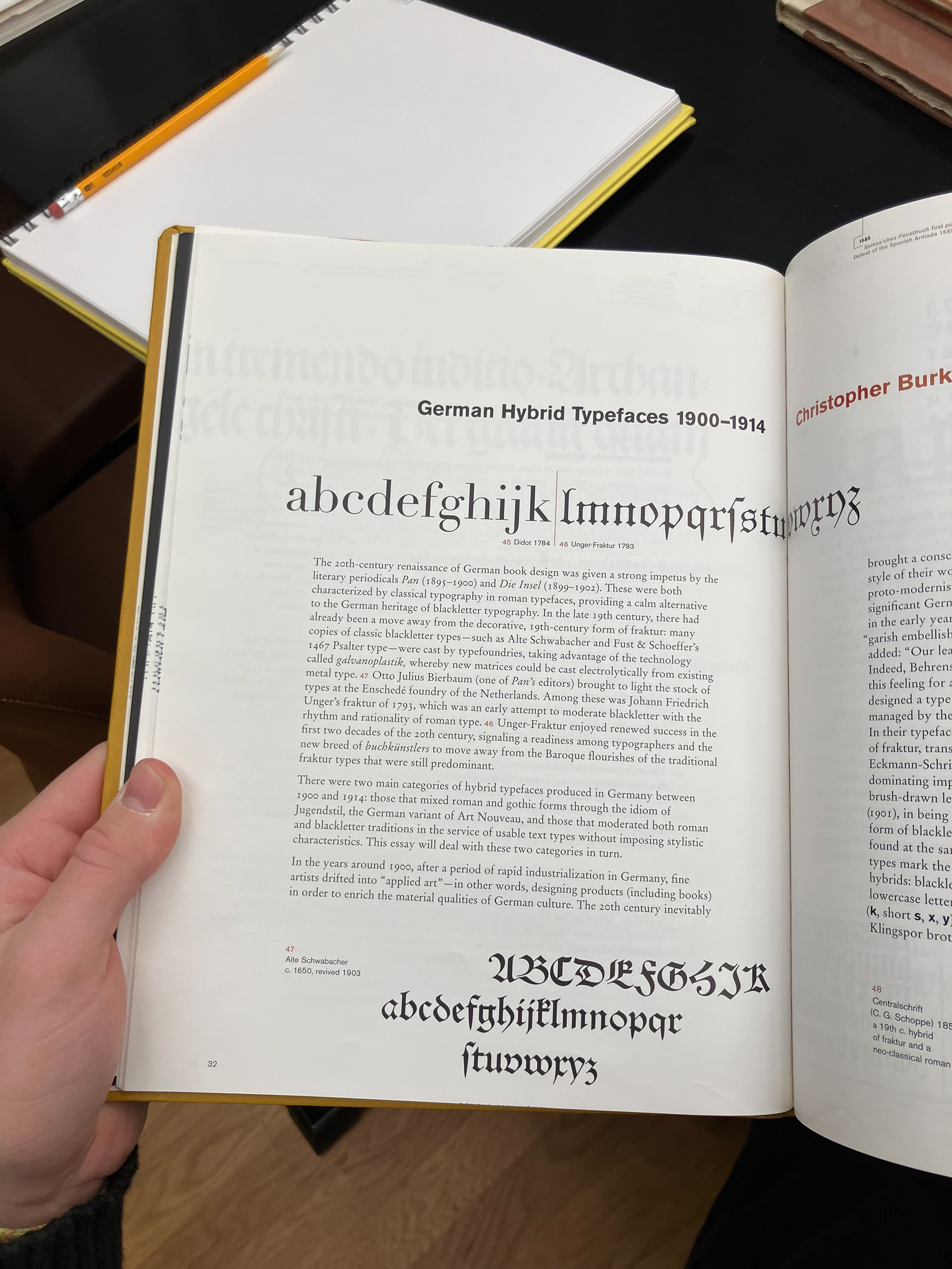
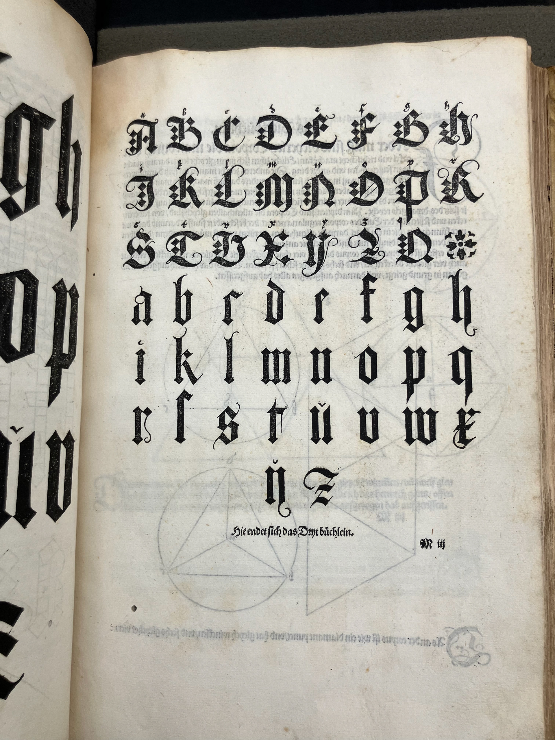
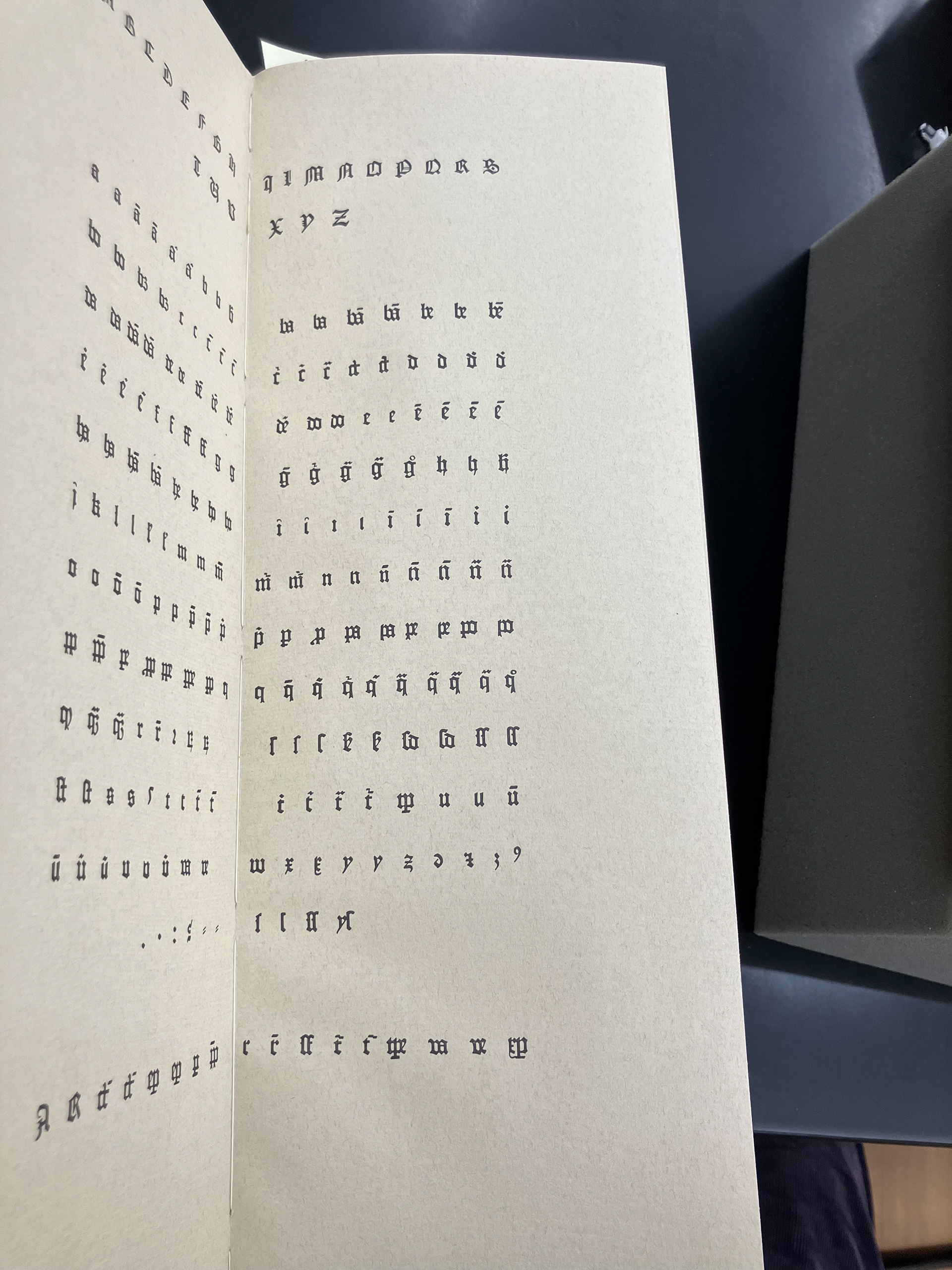
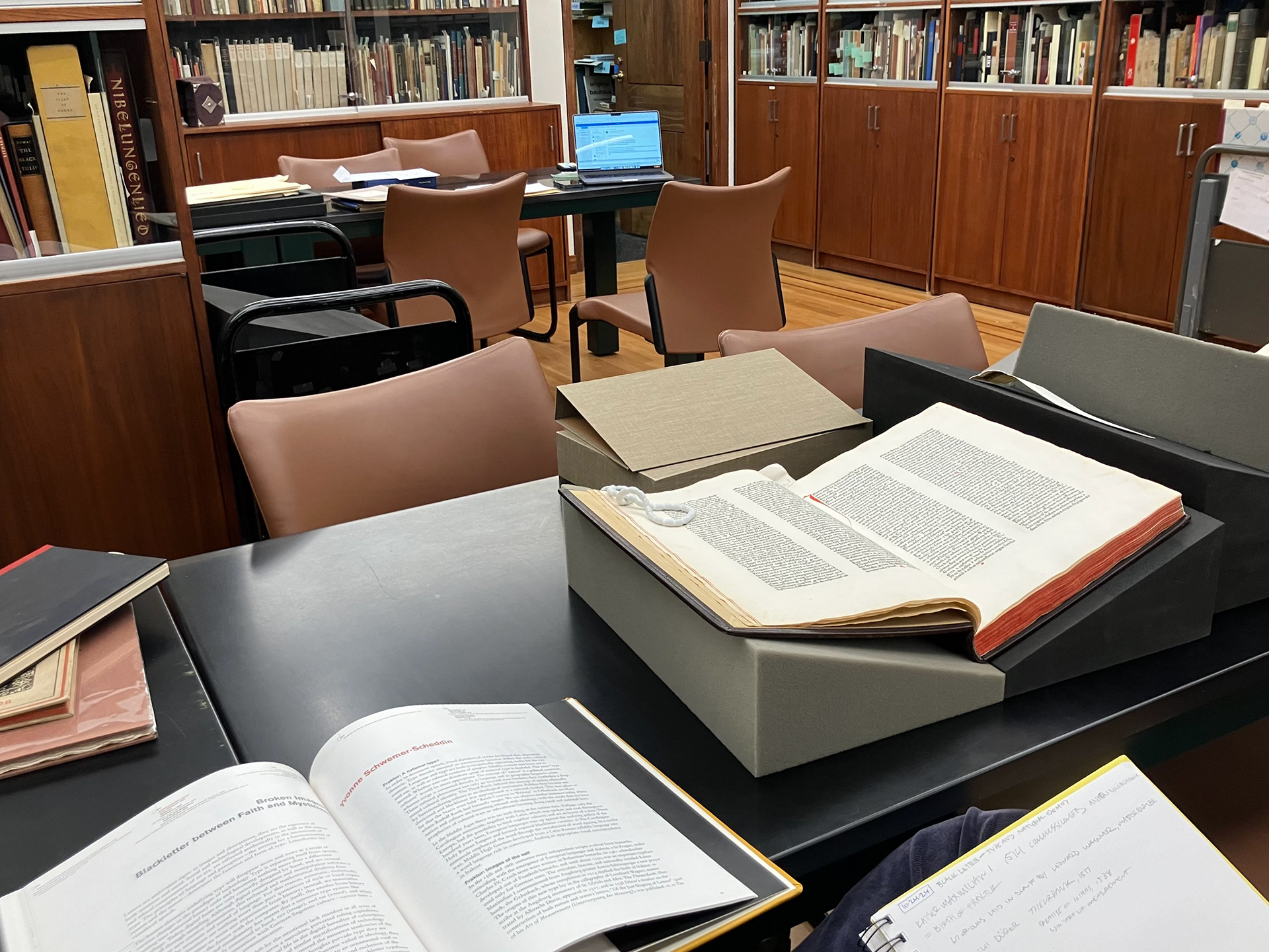
Below are my first pieces of research as the picture of this project came into focus. I was looking for inspiration on which styles to interpolate and found excellent examples in RIT's Cary Graphic Arts Collection & Archives.
DRAWING REAL LETTERS
A variable typeface was the perfect medium to explore these goals, and the only snag was that I had never made one before. Below are my sketches as I felt out what these letterforms would look like.

Figuring out that I Should Not draw in pen
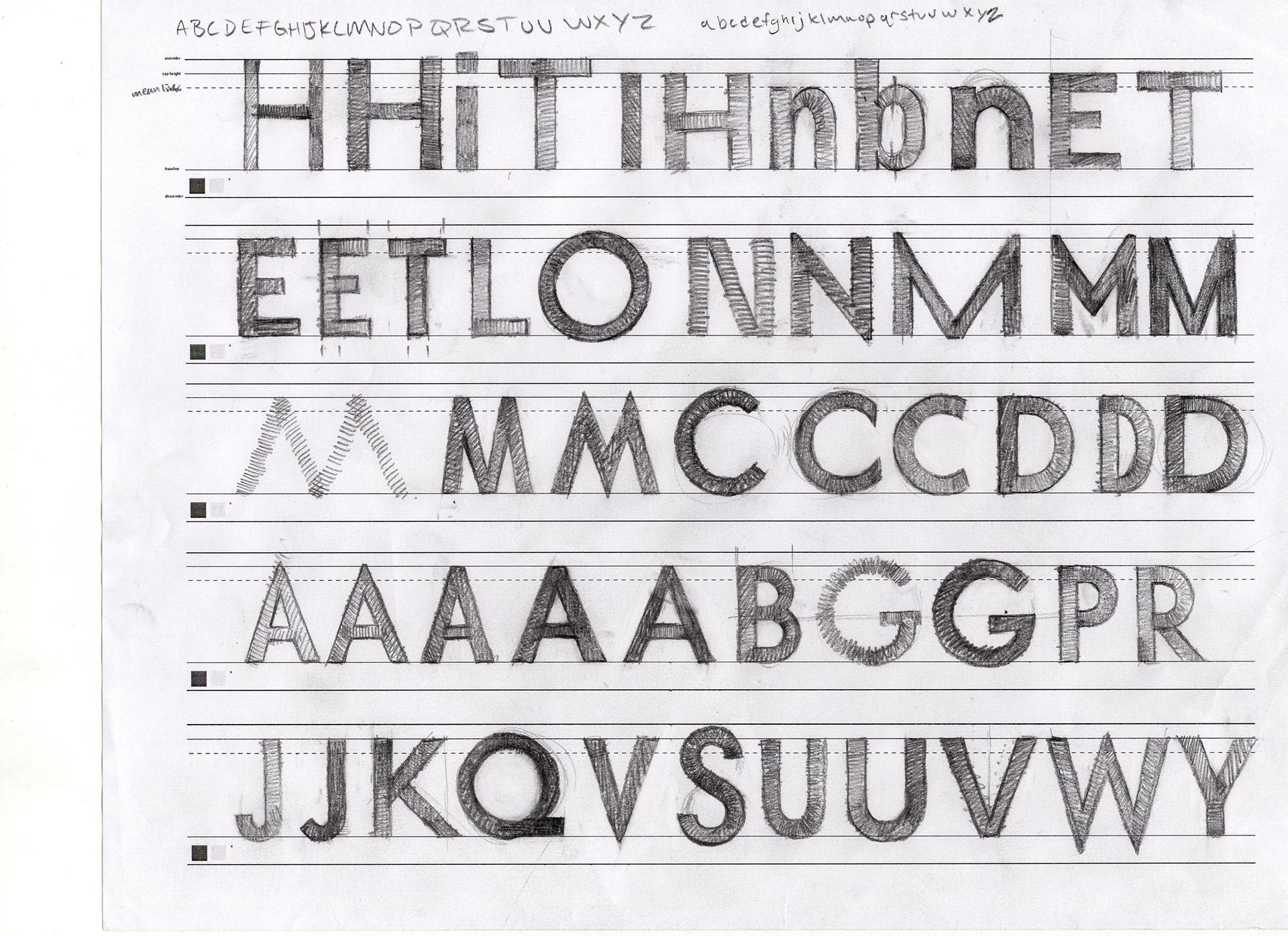
Geometric letter experimentation
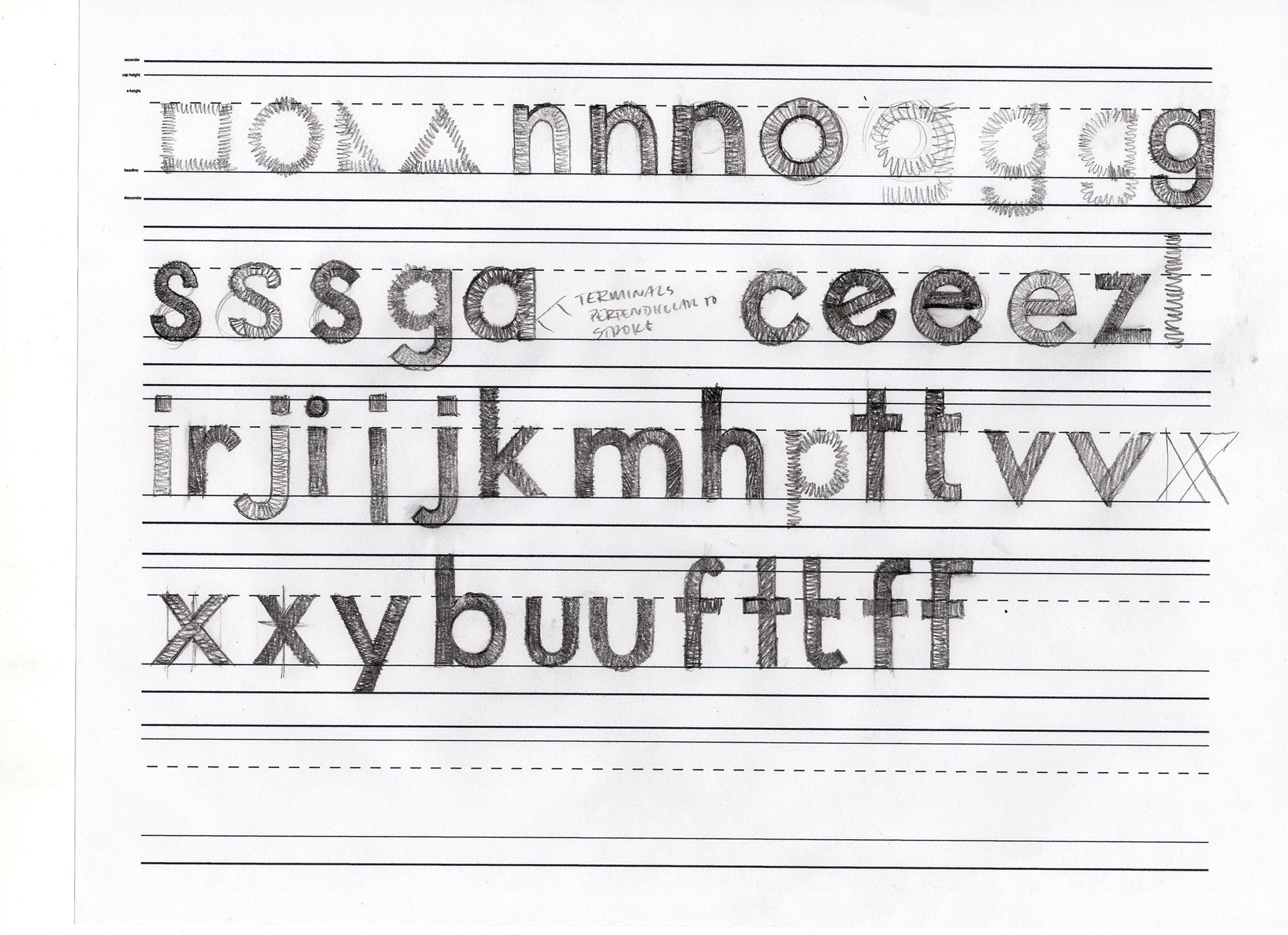
More geometric experimentation
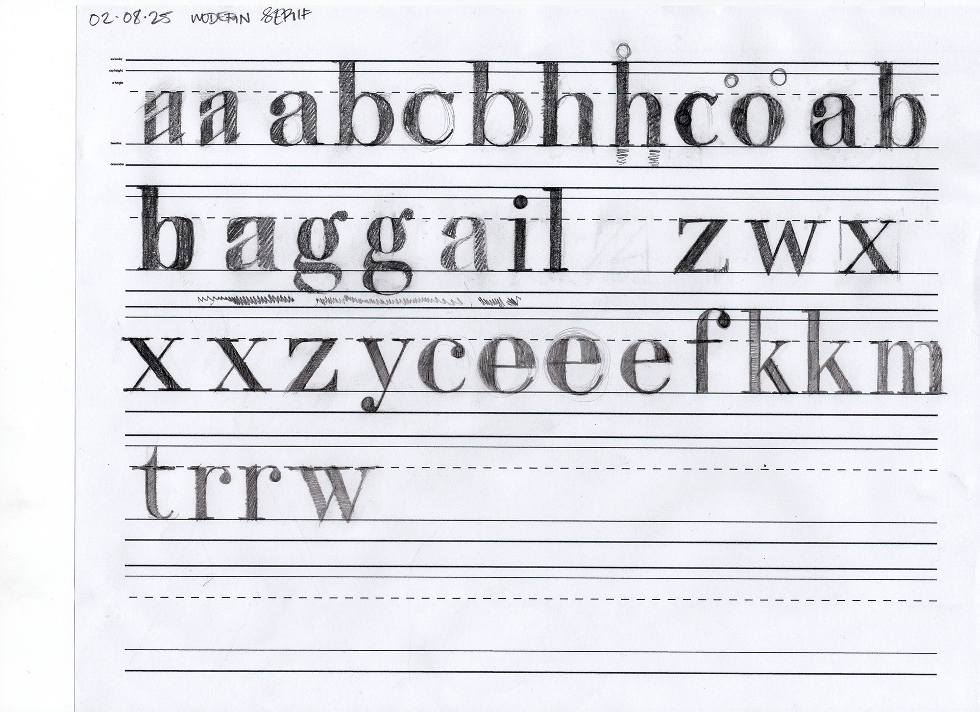
Modern serif sketches
Geometric serif, v.2
Geometric blackletter
Textura blackletter test
Last squibs of creativity
1.
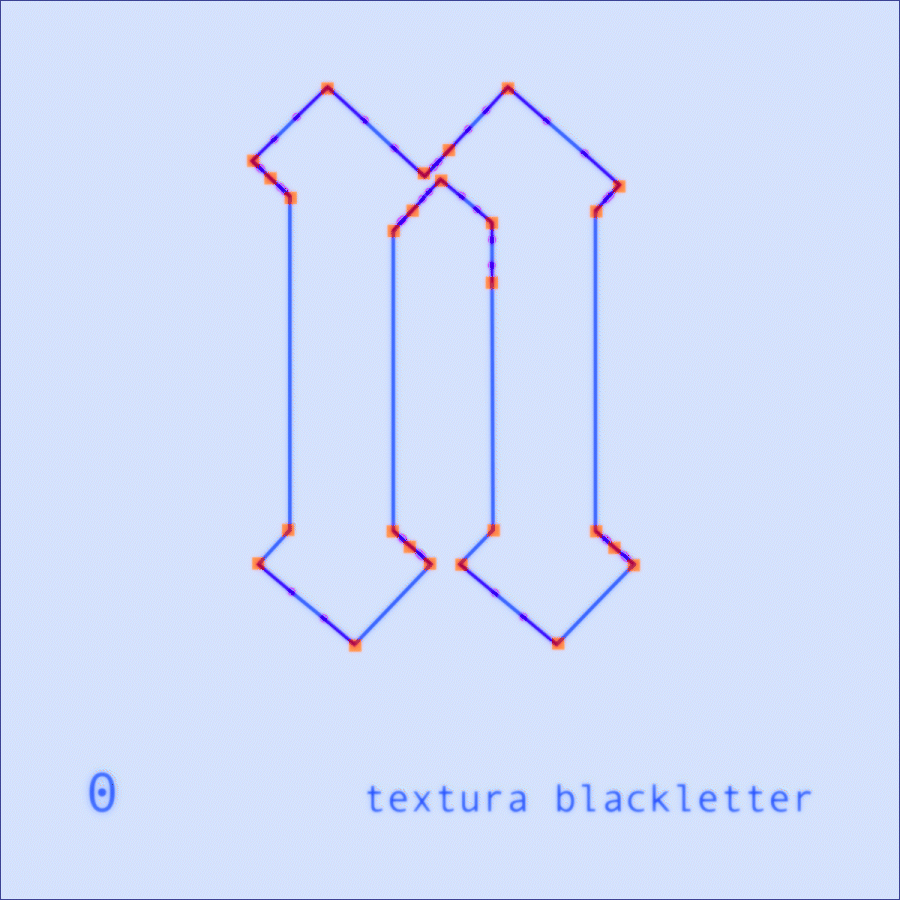
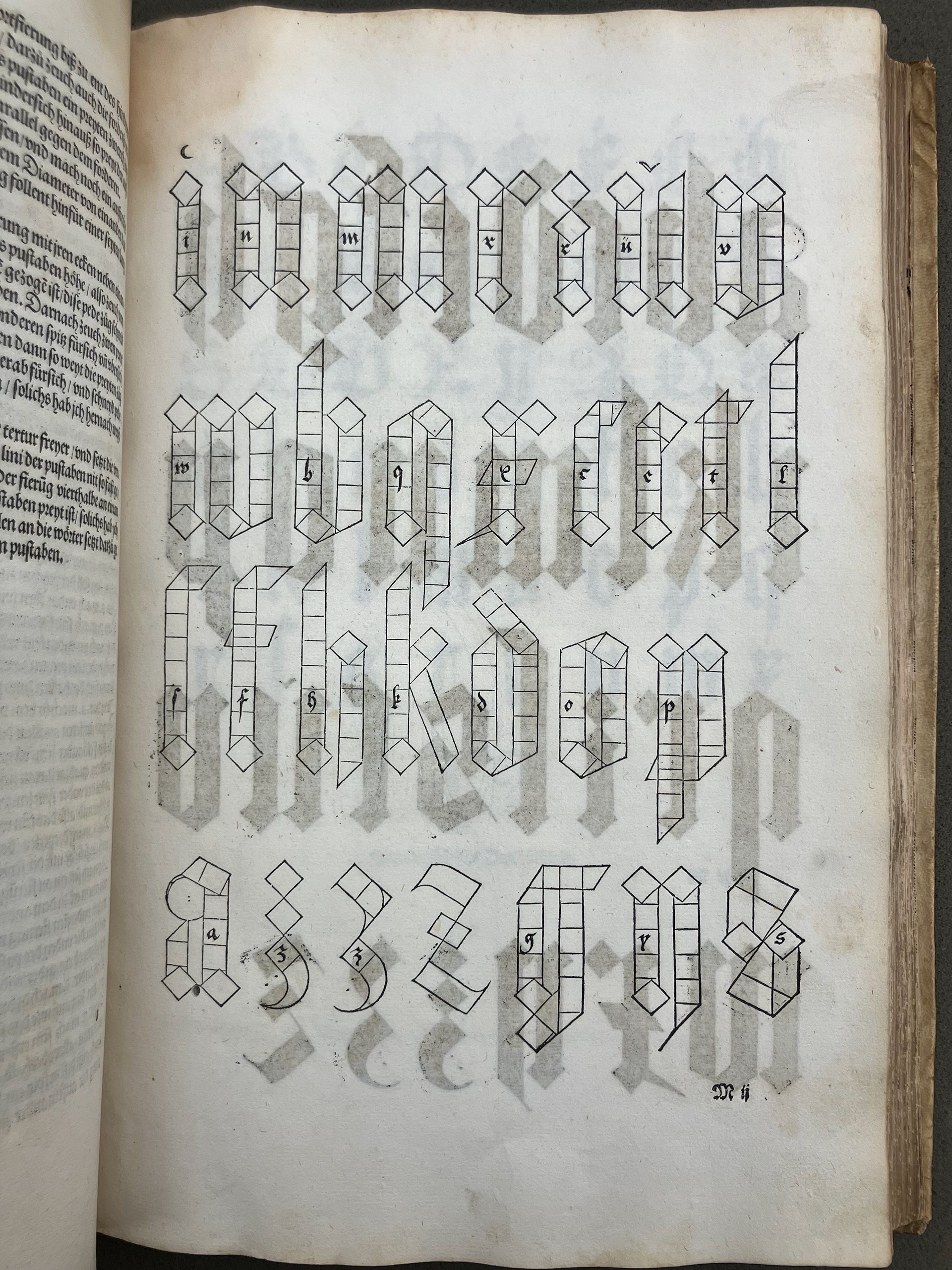
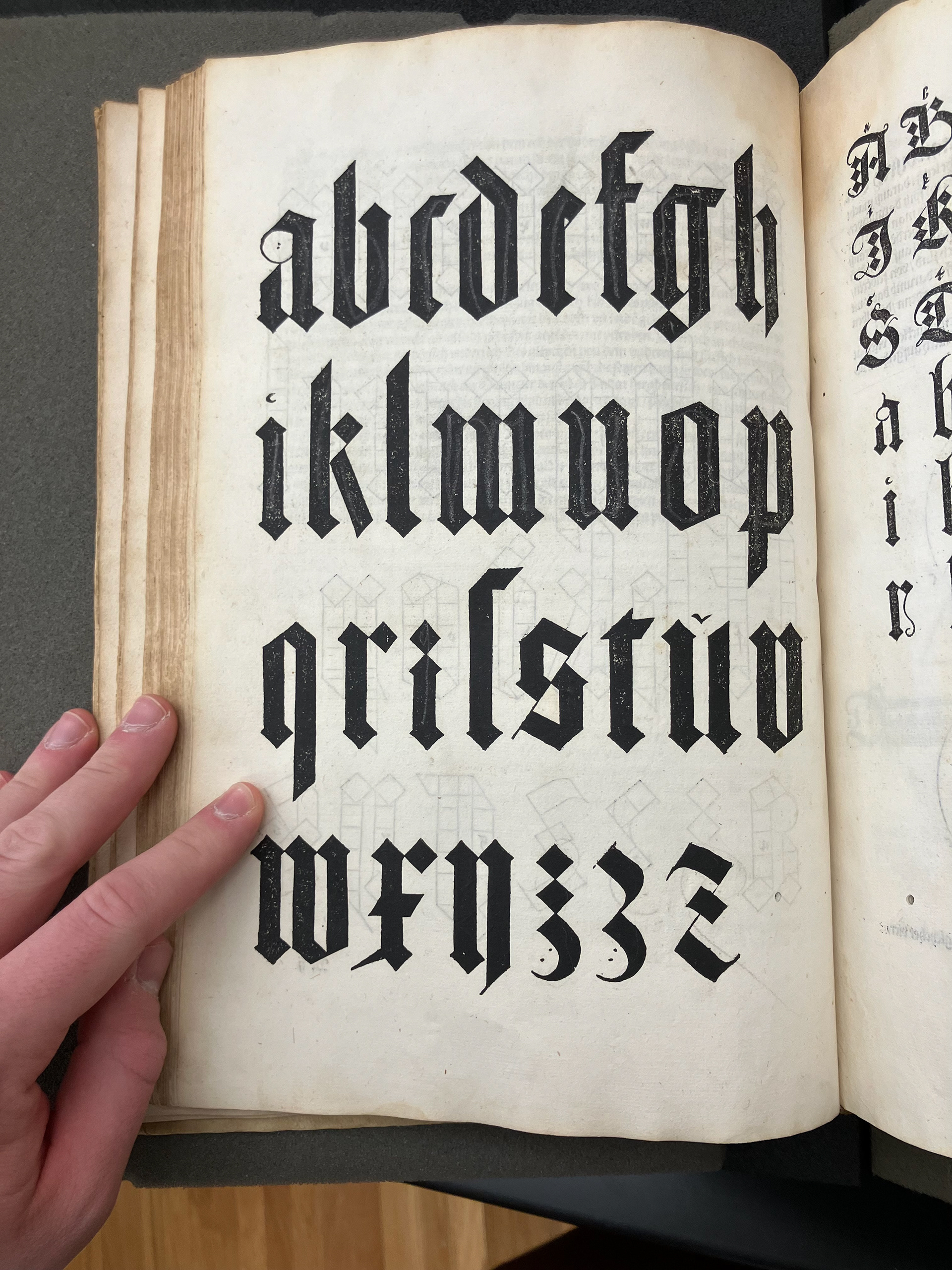
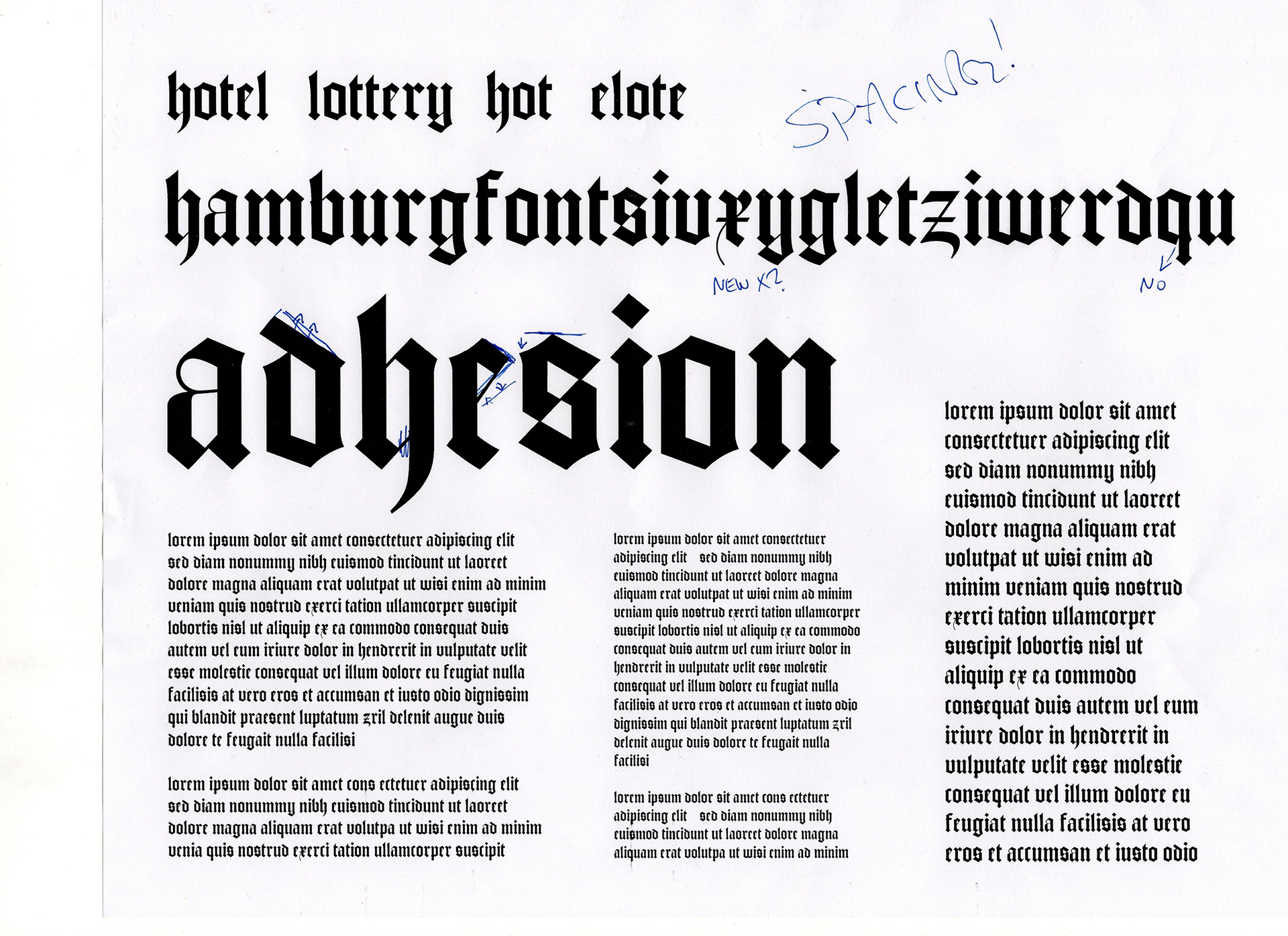
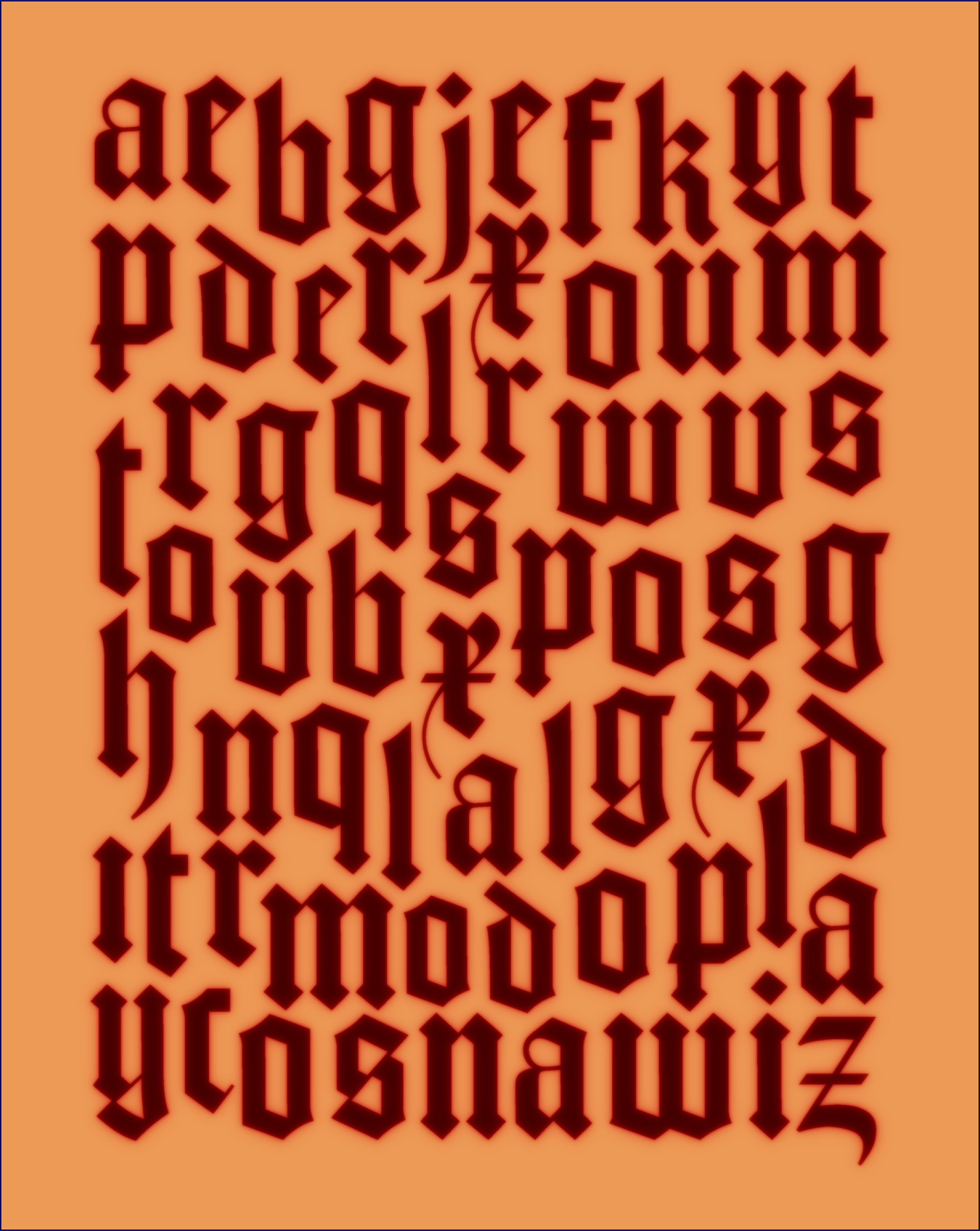
TEXTURA BLACKLETTER
This textura blackletter is inspired by Peter Schöffer and Johann Fust’s Mainz Psalter, printed in 1457. Using that text as a primary inspiration led to a precise, strong set of characters.
For a true revival, check out the amazing Psalterium by José Alberto Mauricio.
2.
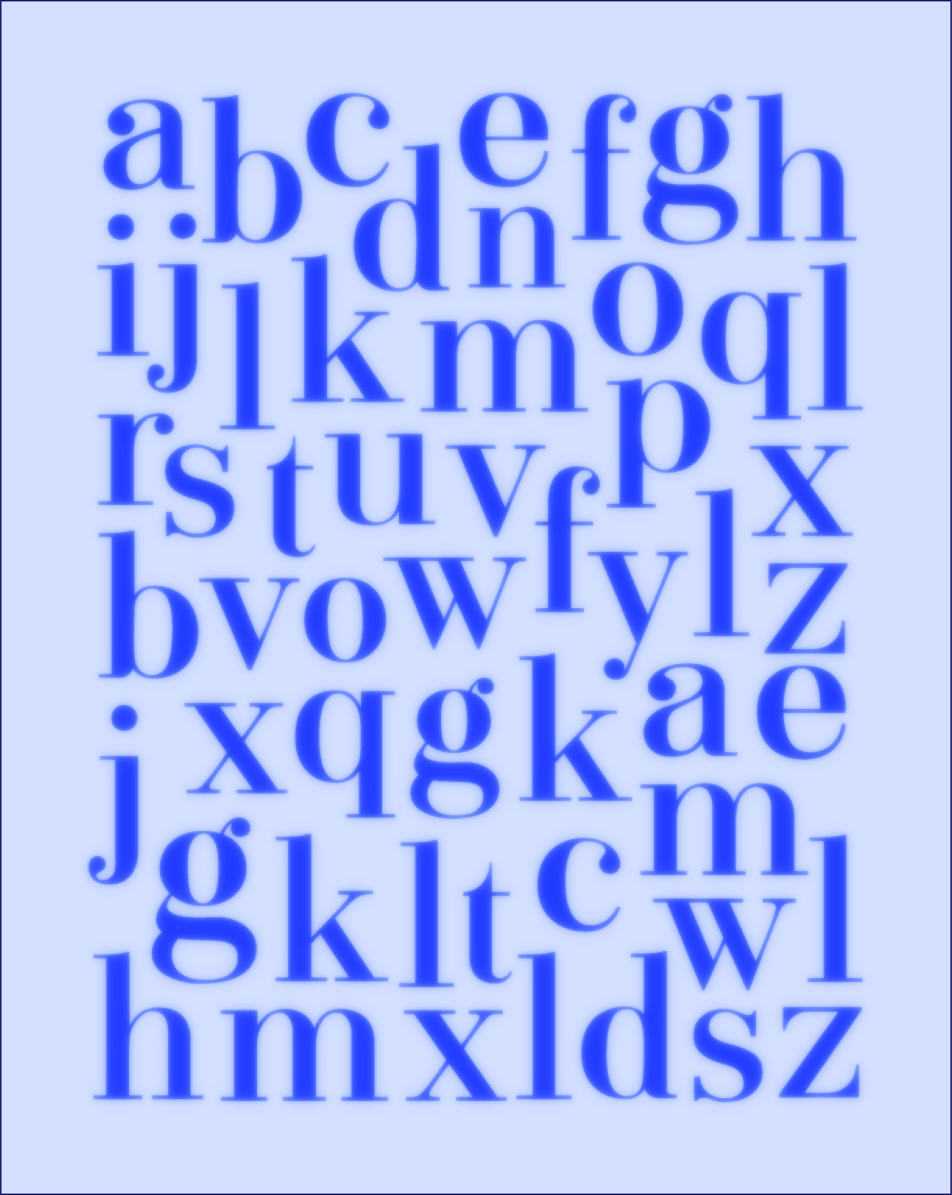
MODERN SERIF
The modern serif dates to the late 18th century, and is inspired by Bauer Bodoni among many others. The focal point of this character set is the 'a' glyph, offering a loopy ball terminal.
The mixture of elegance and precision necessary in this style was an exciting challenge to tangle with and surmount.
3.
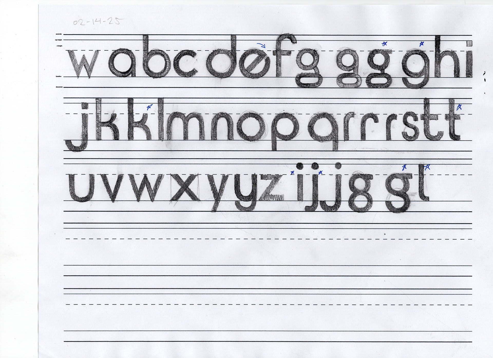
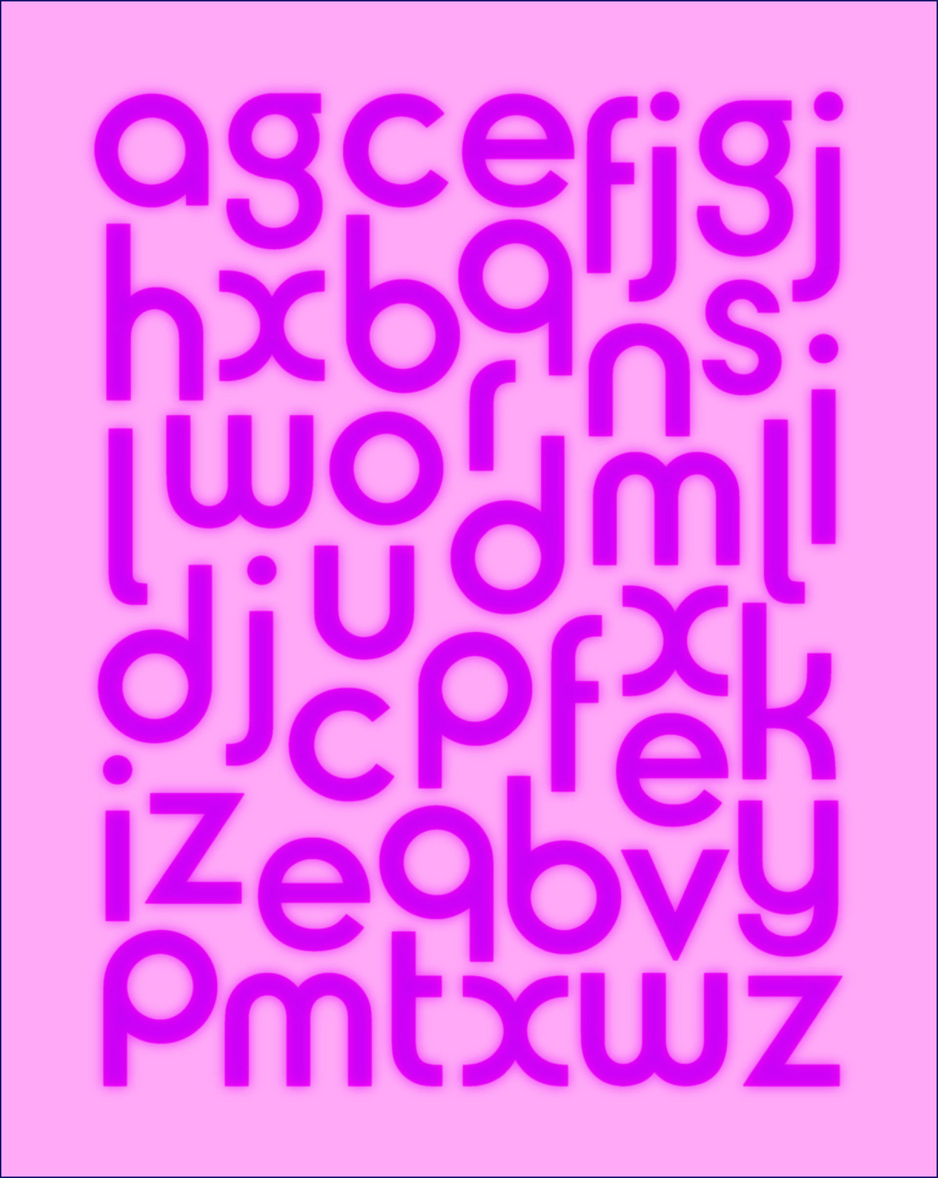
GEOMETRIC SANS
This style is inspired by numerous classic geometric sans serifs such as Futura and Kabel, but departs into softer and rounder territory. Similar to the Dyson wordmark, it favors circular shapes over triangles and rectangles wherever possible.
This style went through the most meandering journey out of all the character sets, leaning this way and that until being clamped down and decided on. The 'g' was the focal point that I built around.
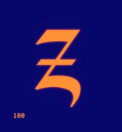
4.
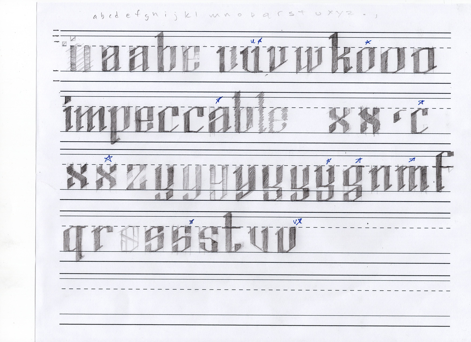
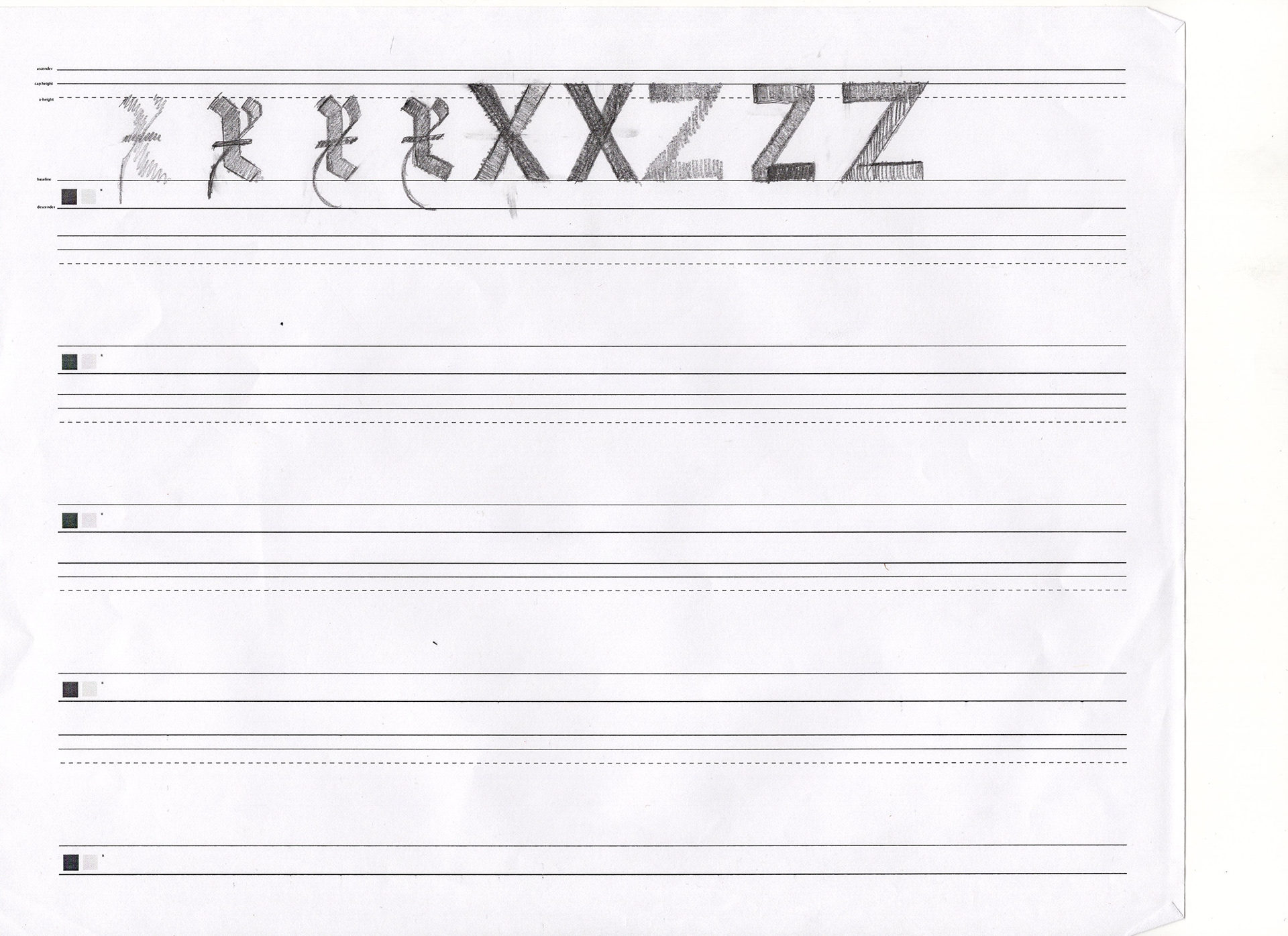
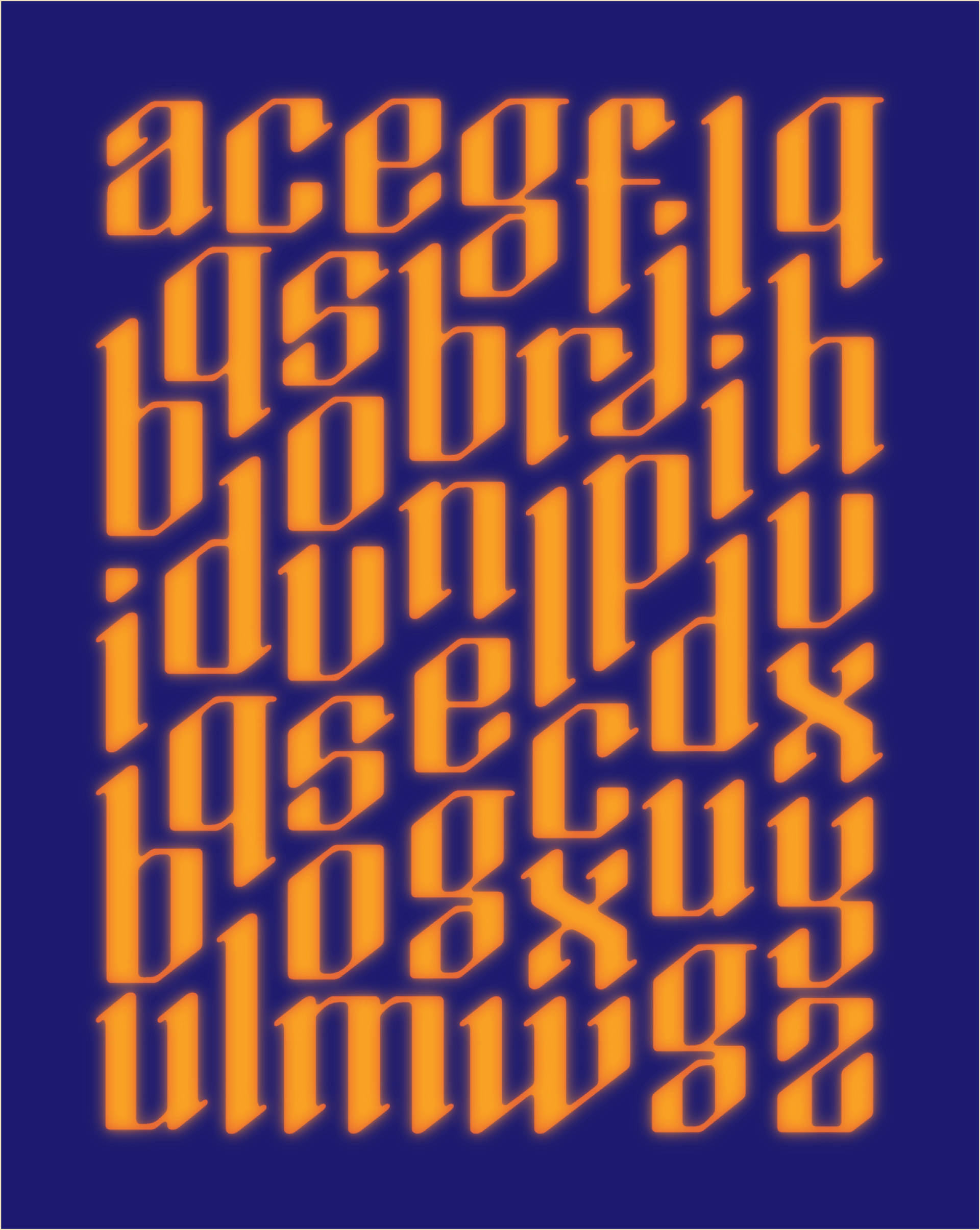
GEOMETRIC BLACKLETTER
This geometric blackletter is a combination of elements from the previous three eras, and is of my own inspiration. It caps off the timeline by representing the present.
It borrows strong and repetitive verticals from the textura, high contrast from the modern serif, and a geometric construction from the geometric sans.
PUTTING IT ALL TOGETHER

THE SHOWCASE
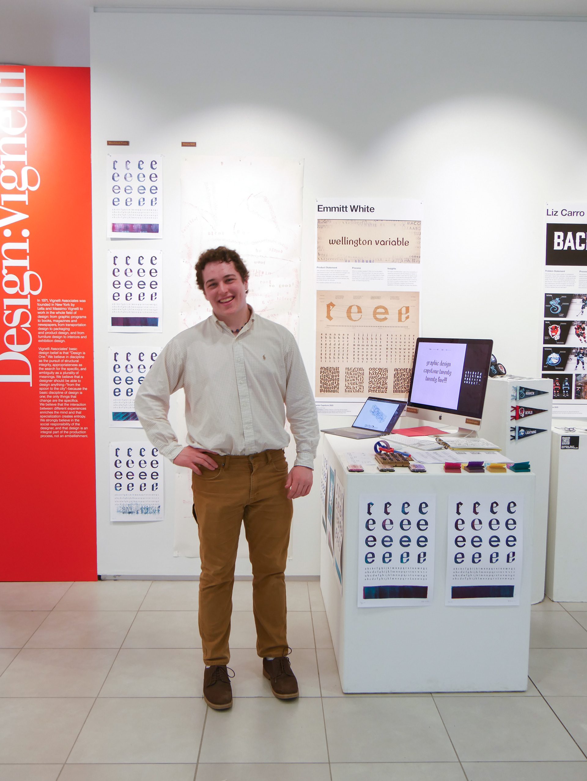
Physical manifestations of type make me happy. For the Capstone Showcase I put together a host of multimedia interactions with the type so that visitors could explore the forms in novel and engaging ways.
I coded an interactive type tool that let visitors type whatever they wanted and play with the sliders to their hearts' content.
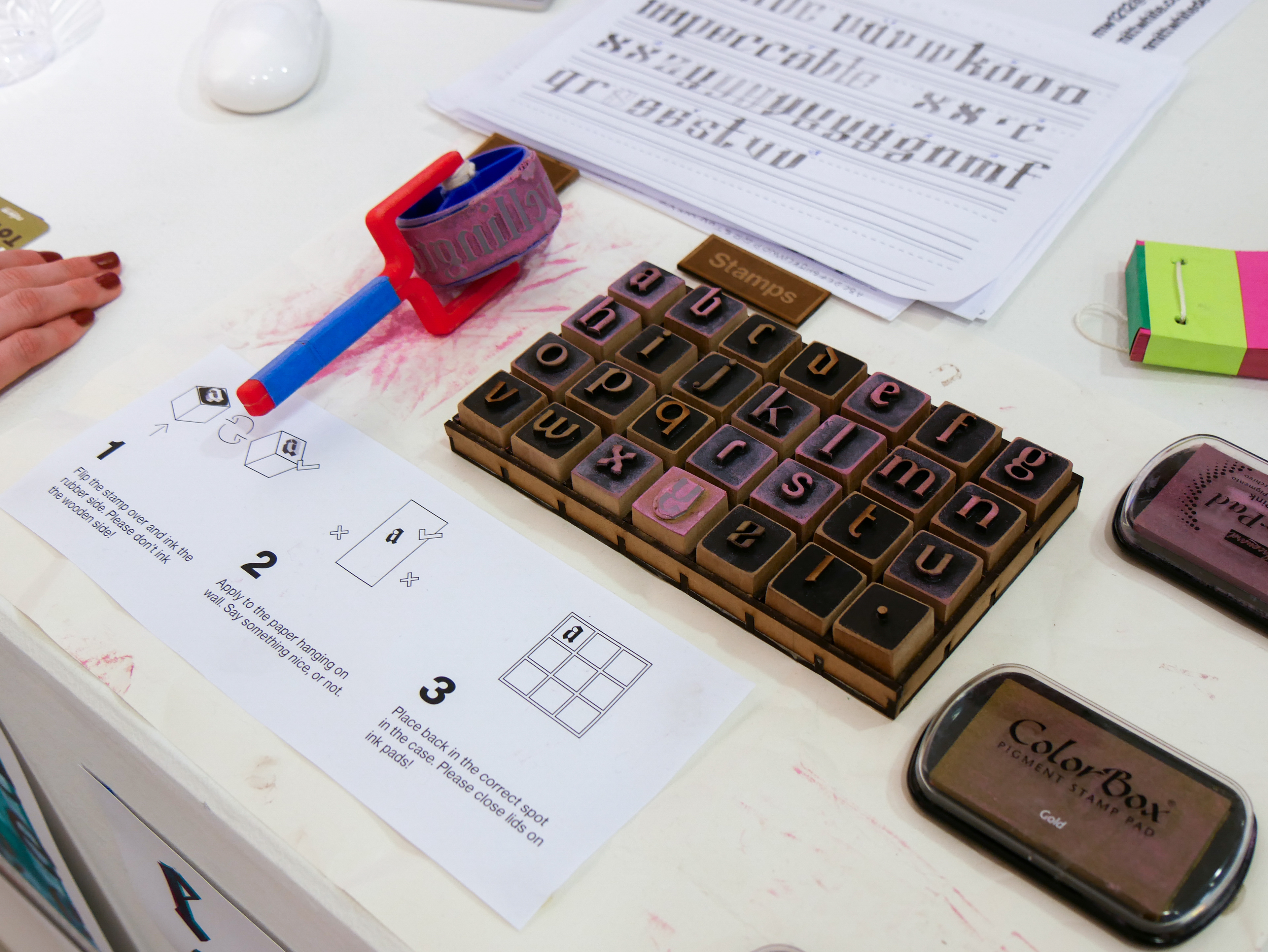
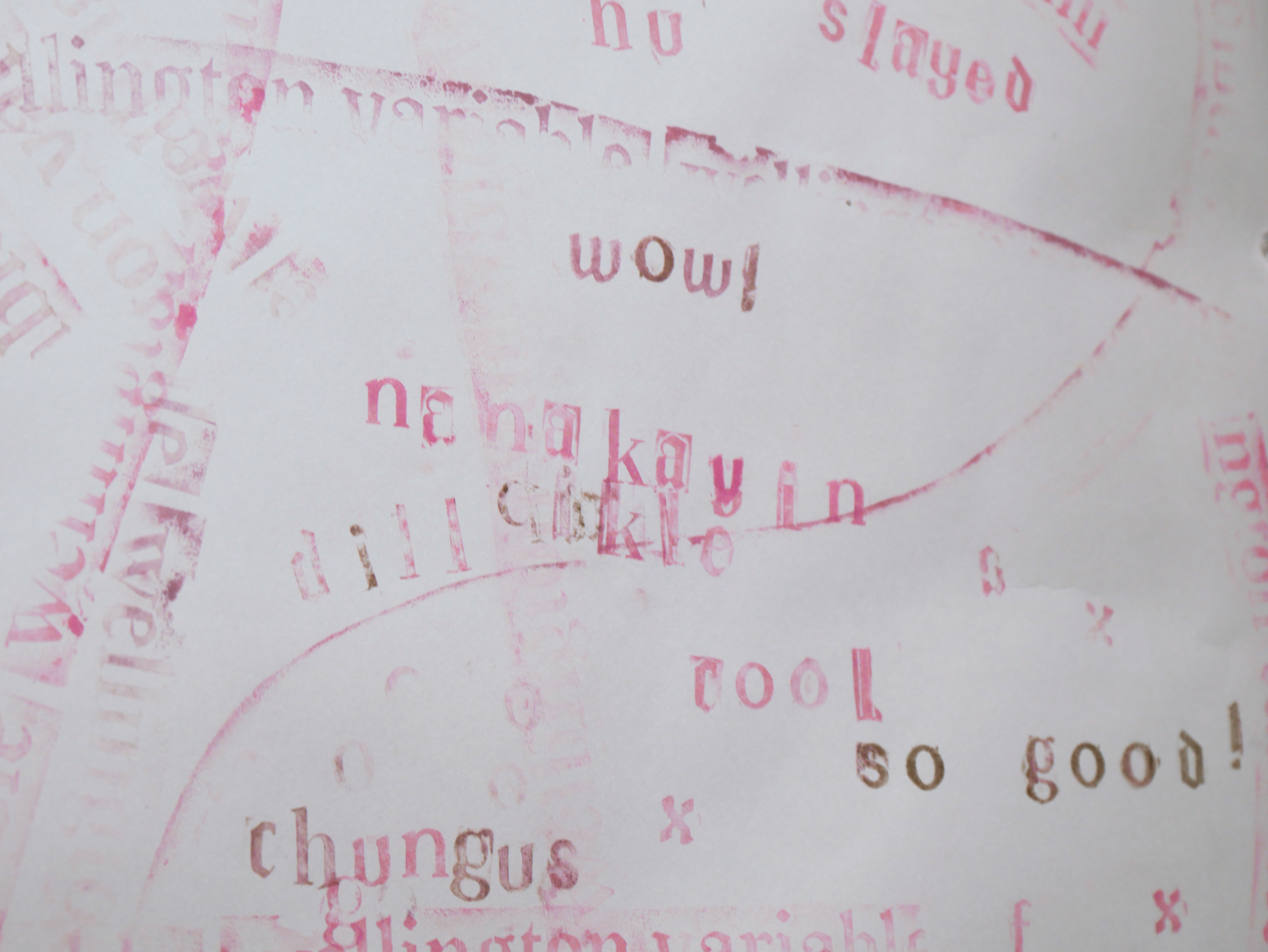

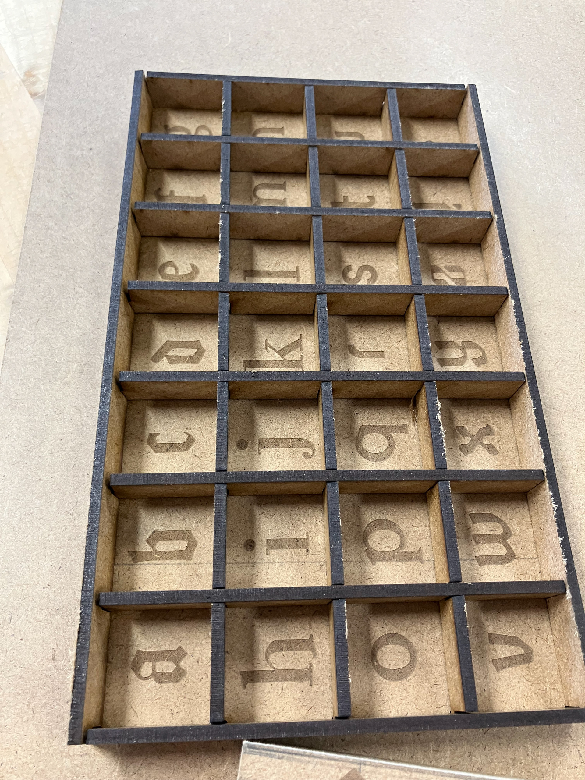
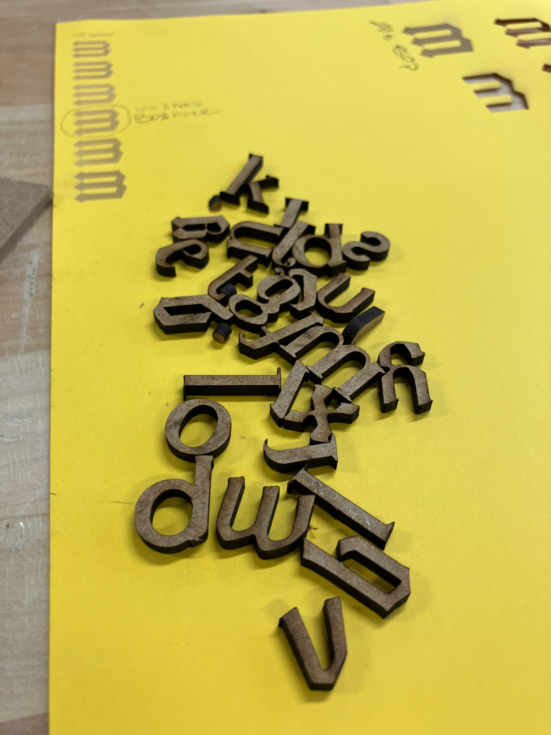
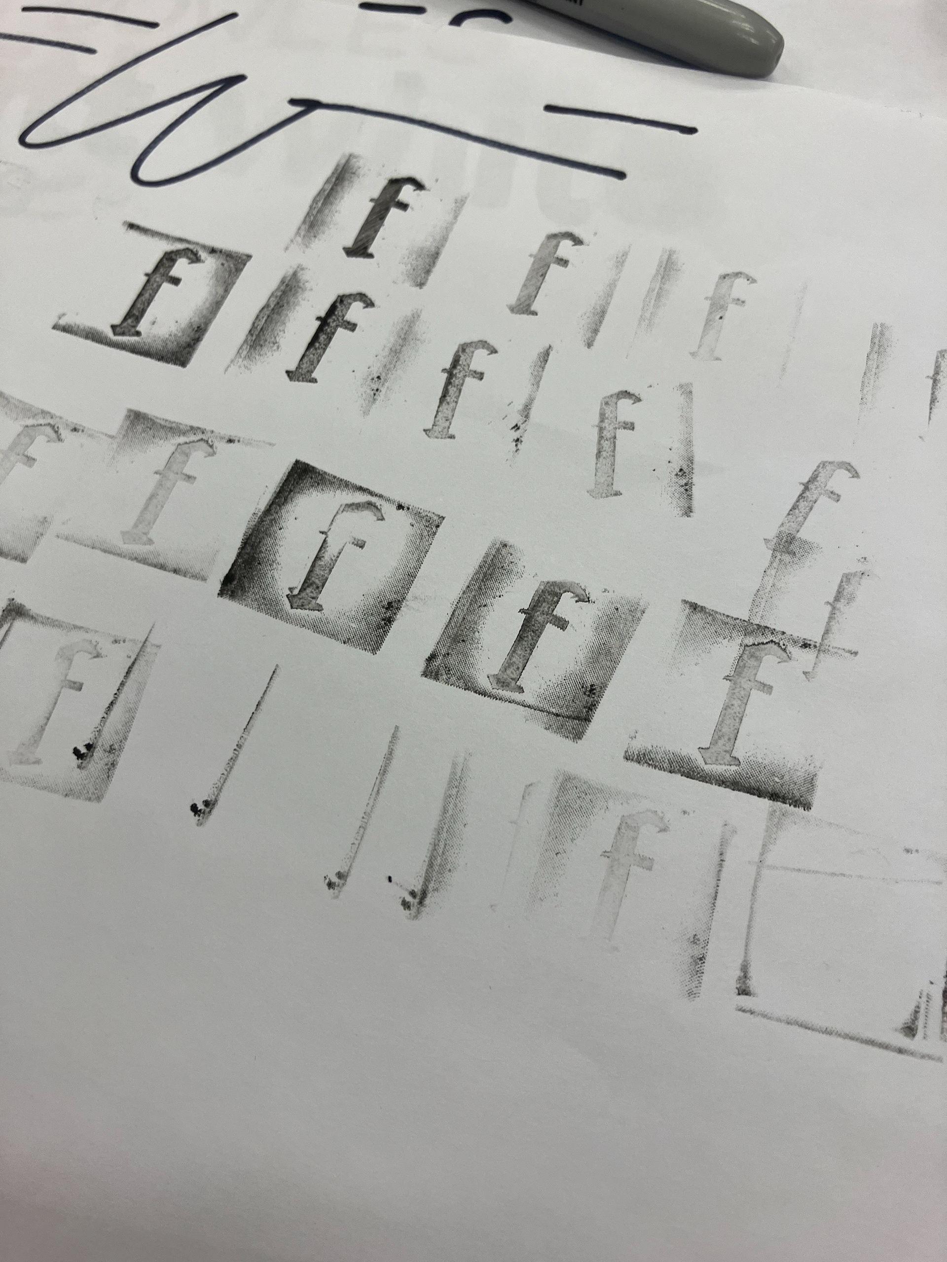
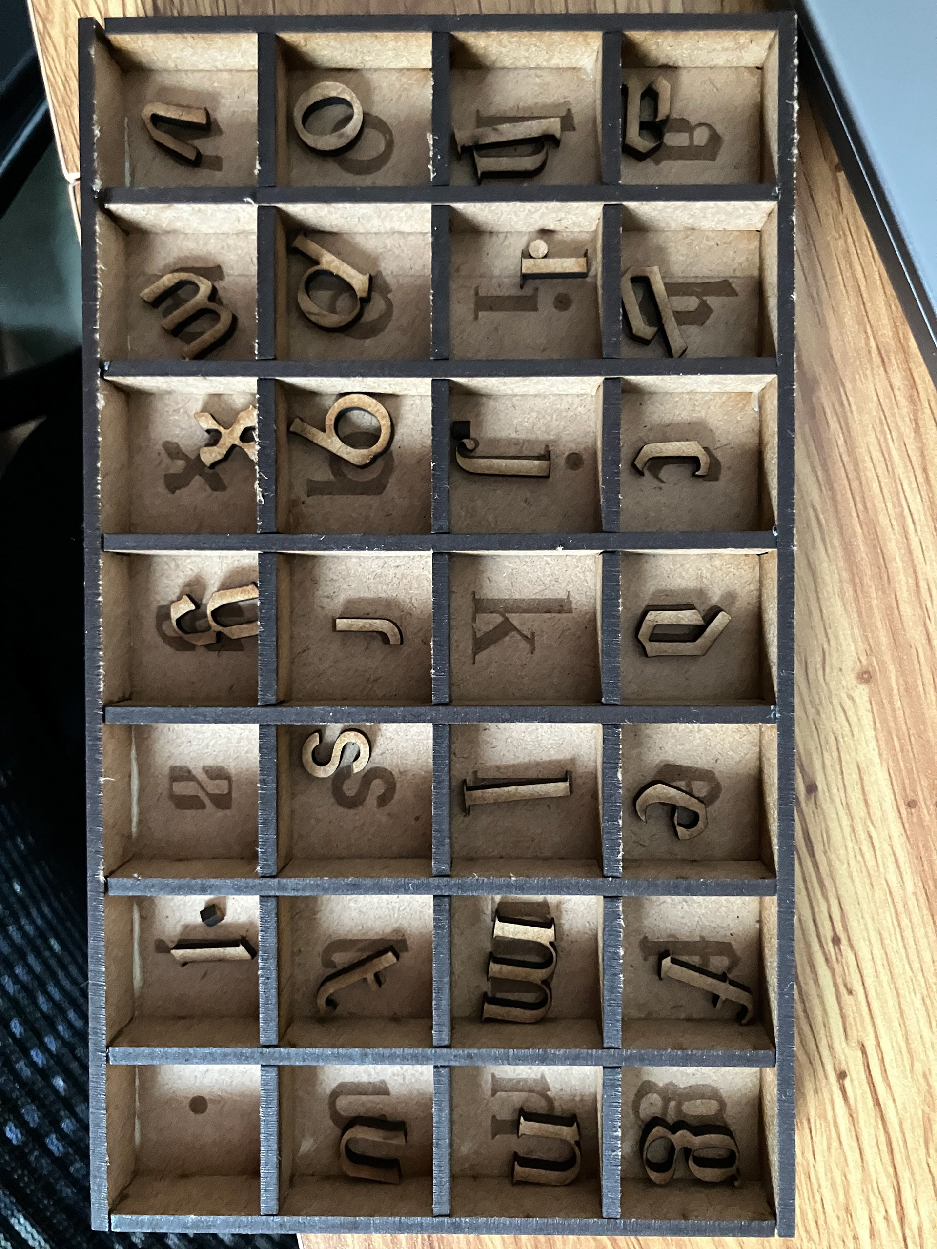
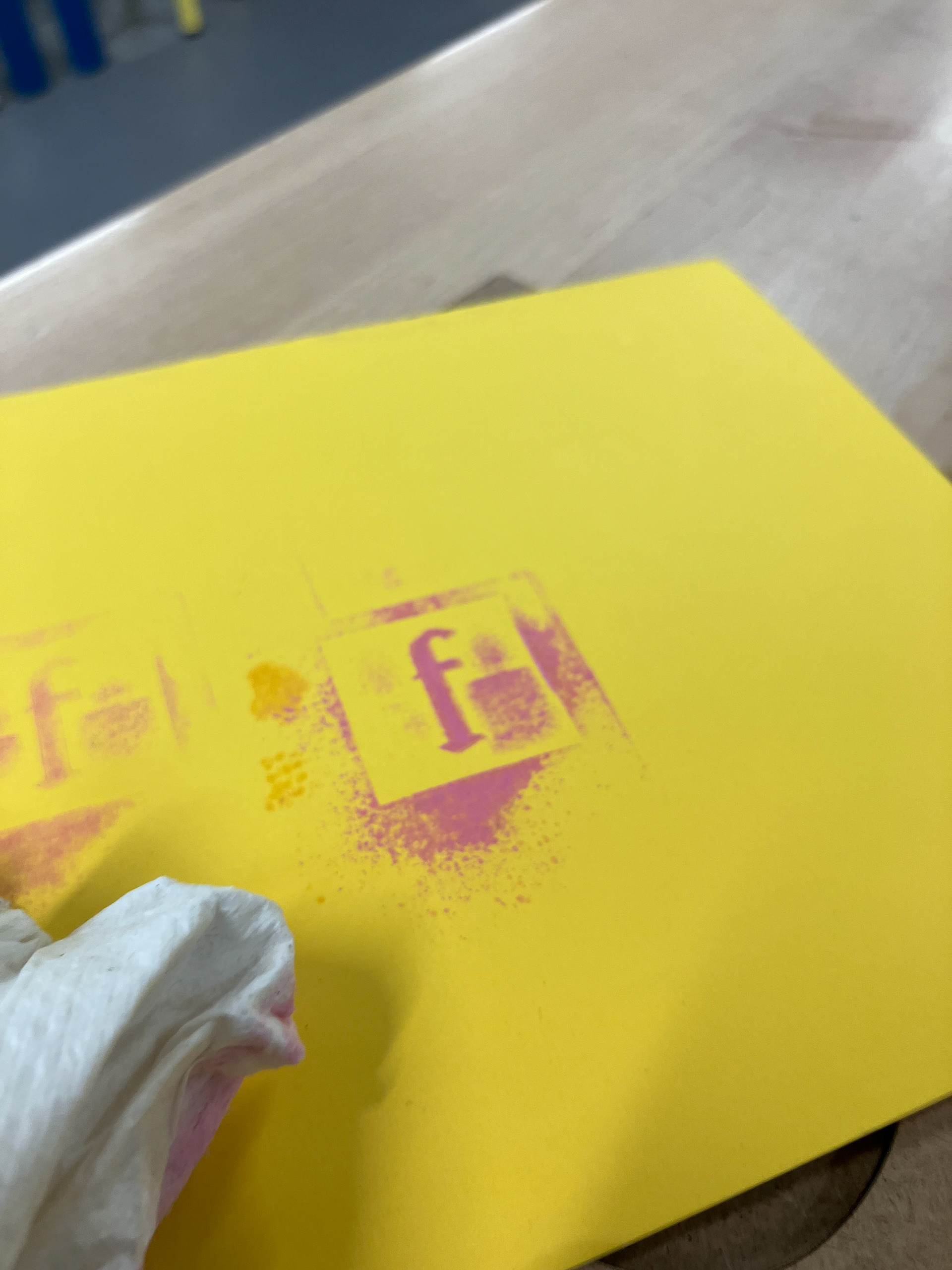
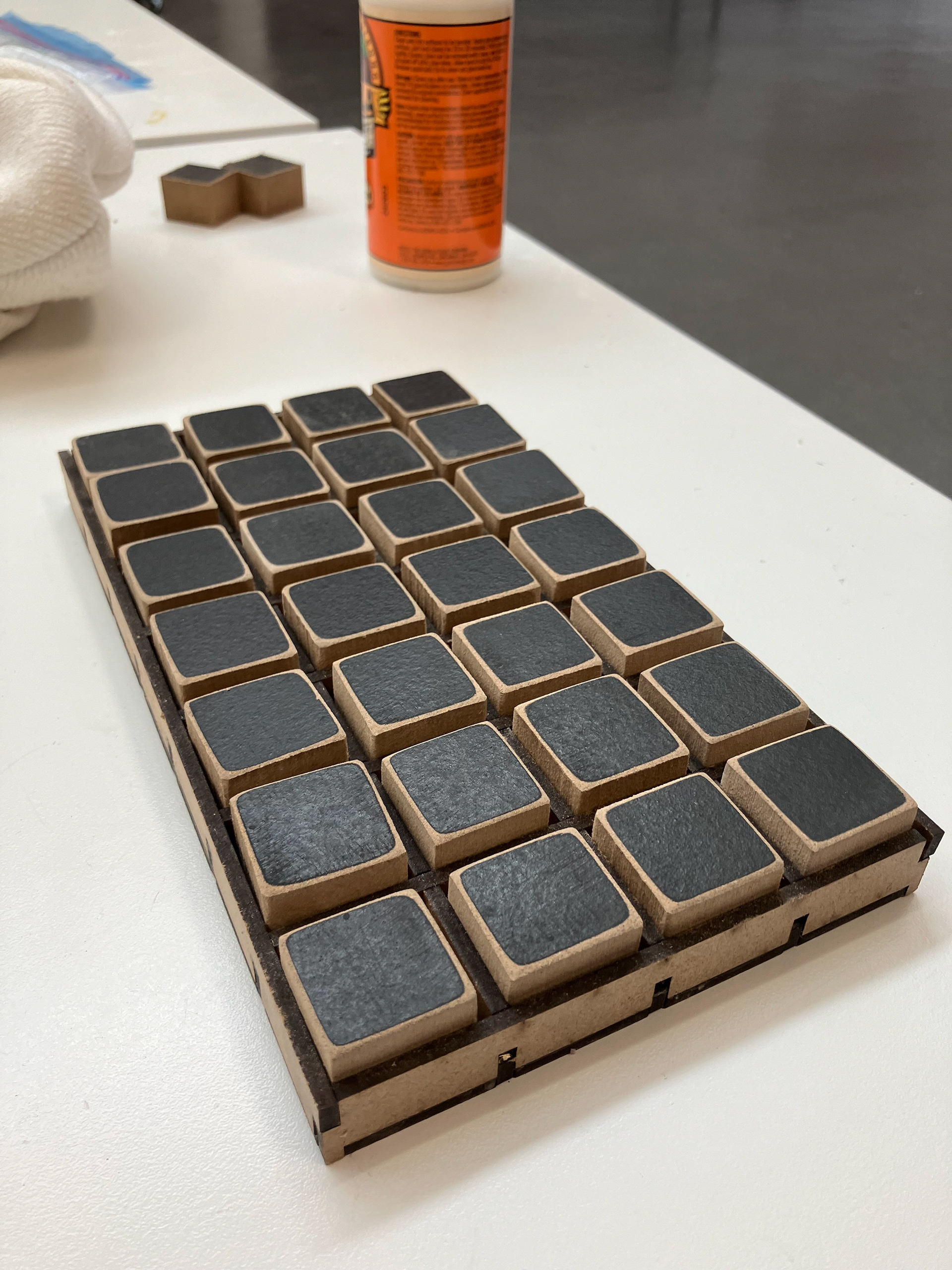
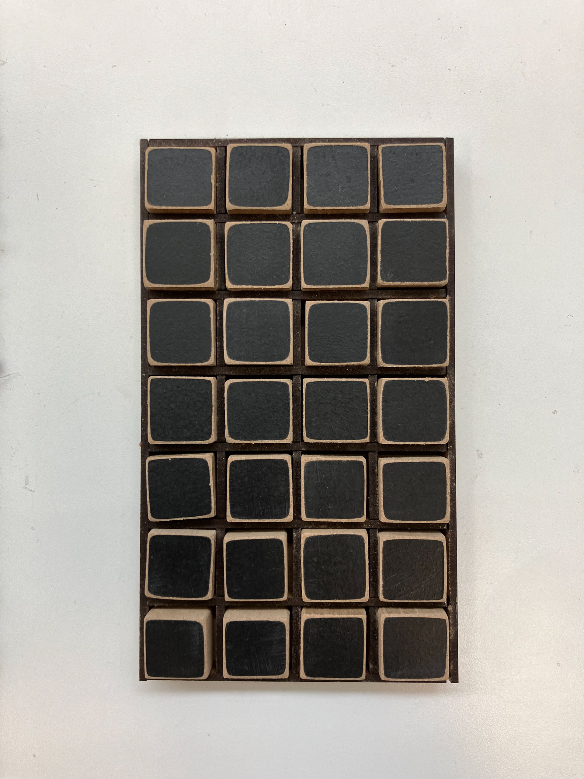
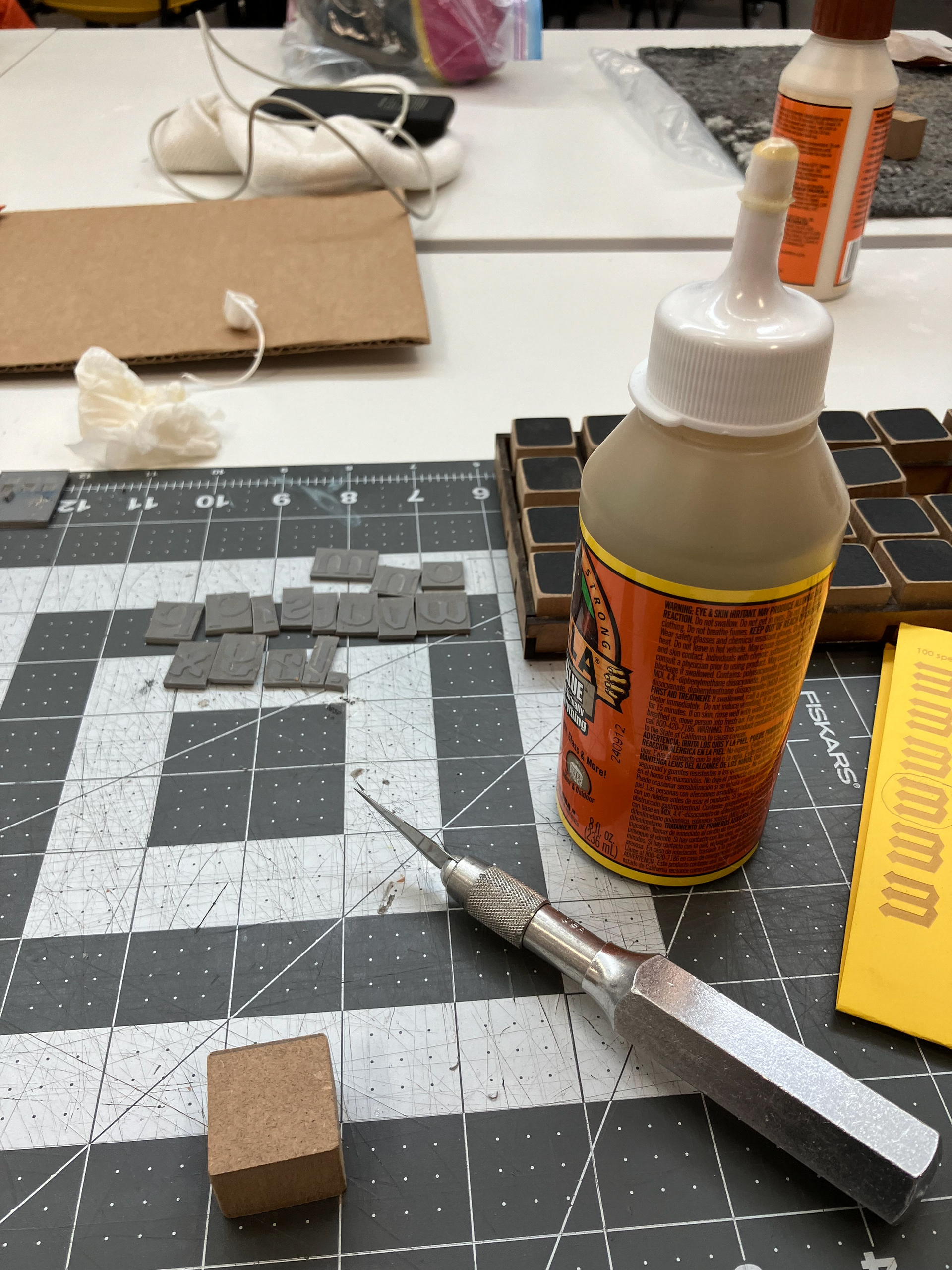
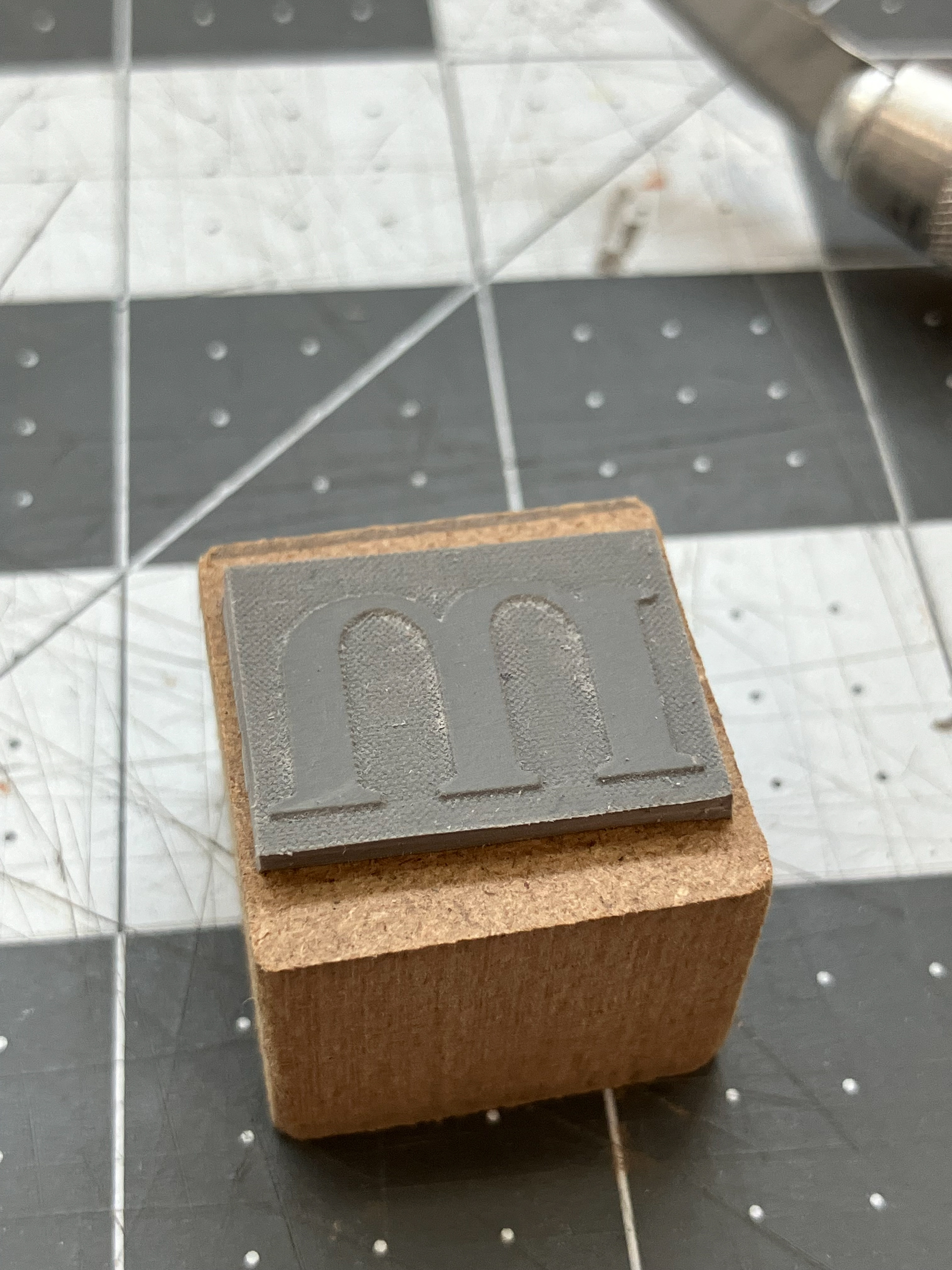
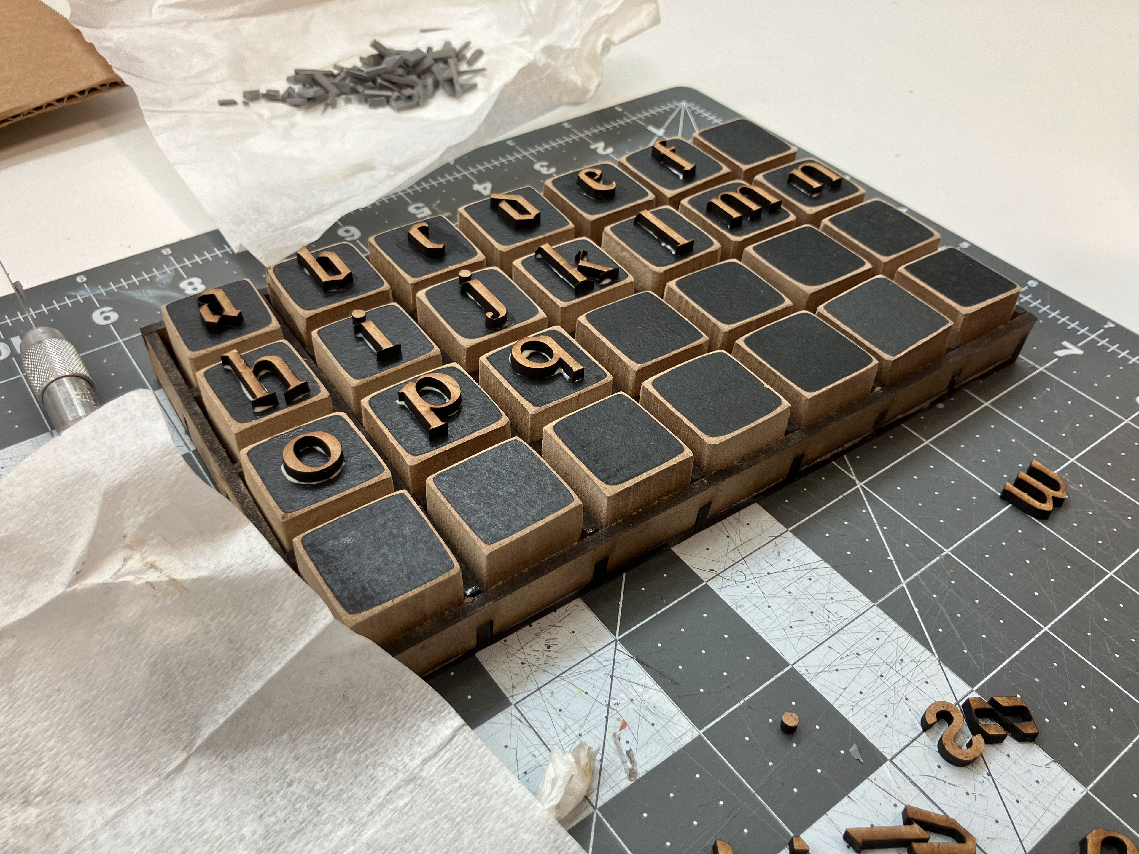
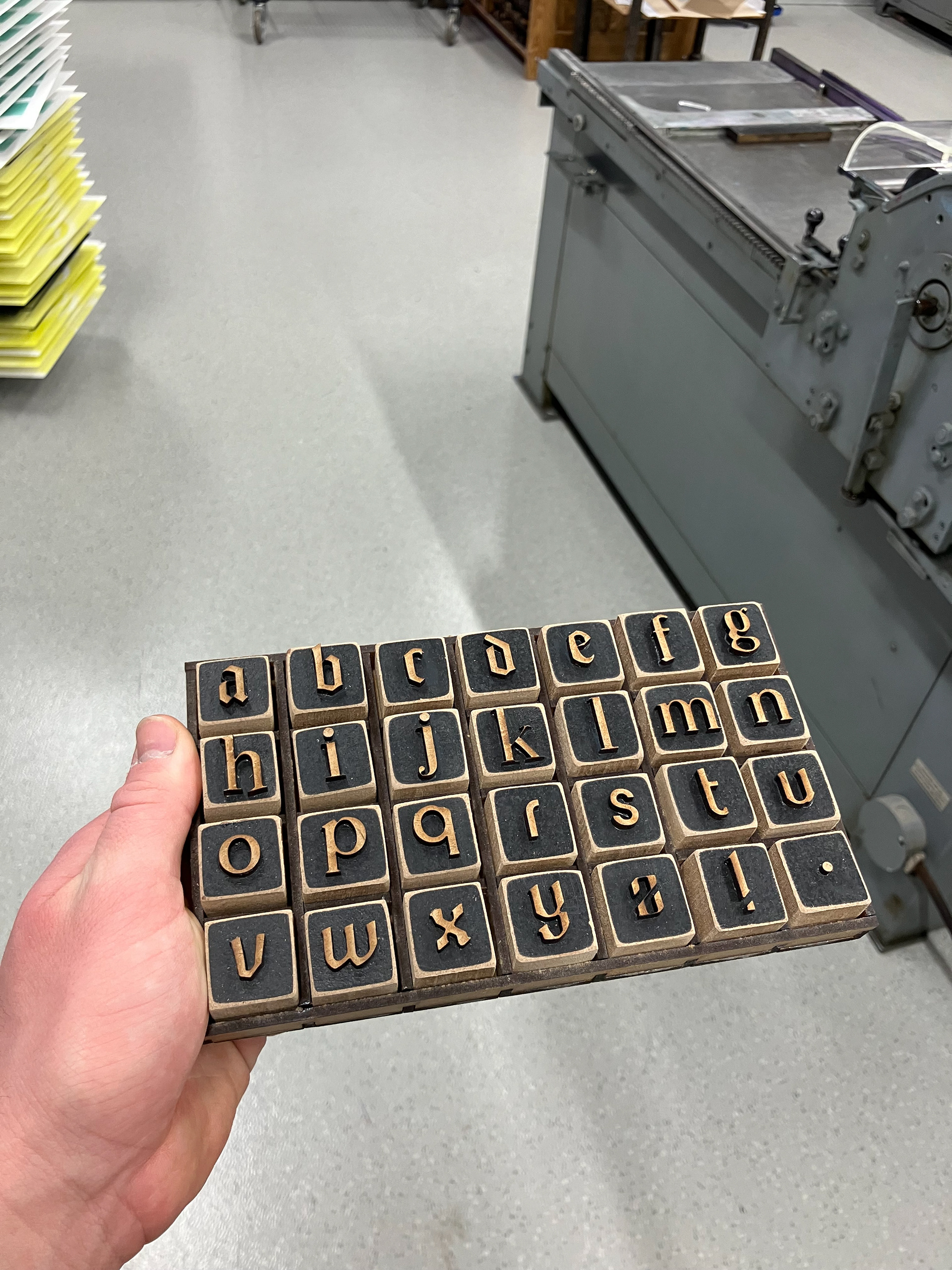
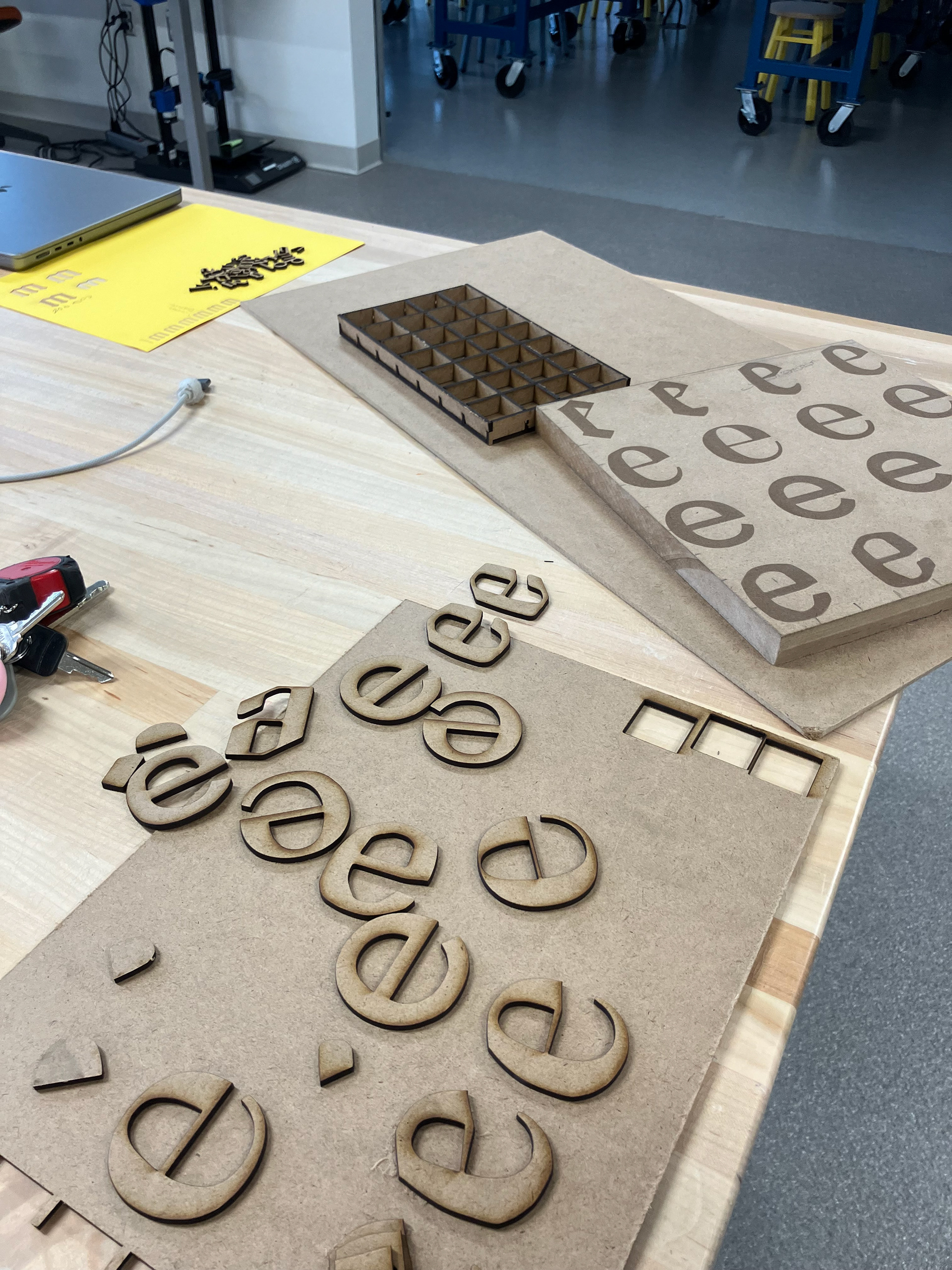
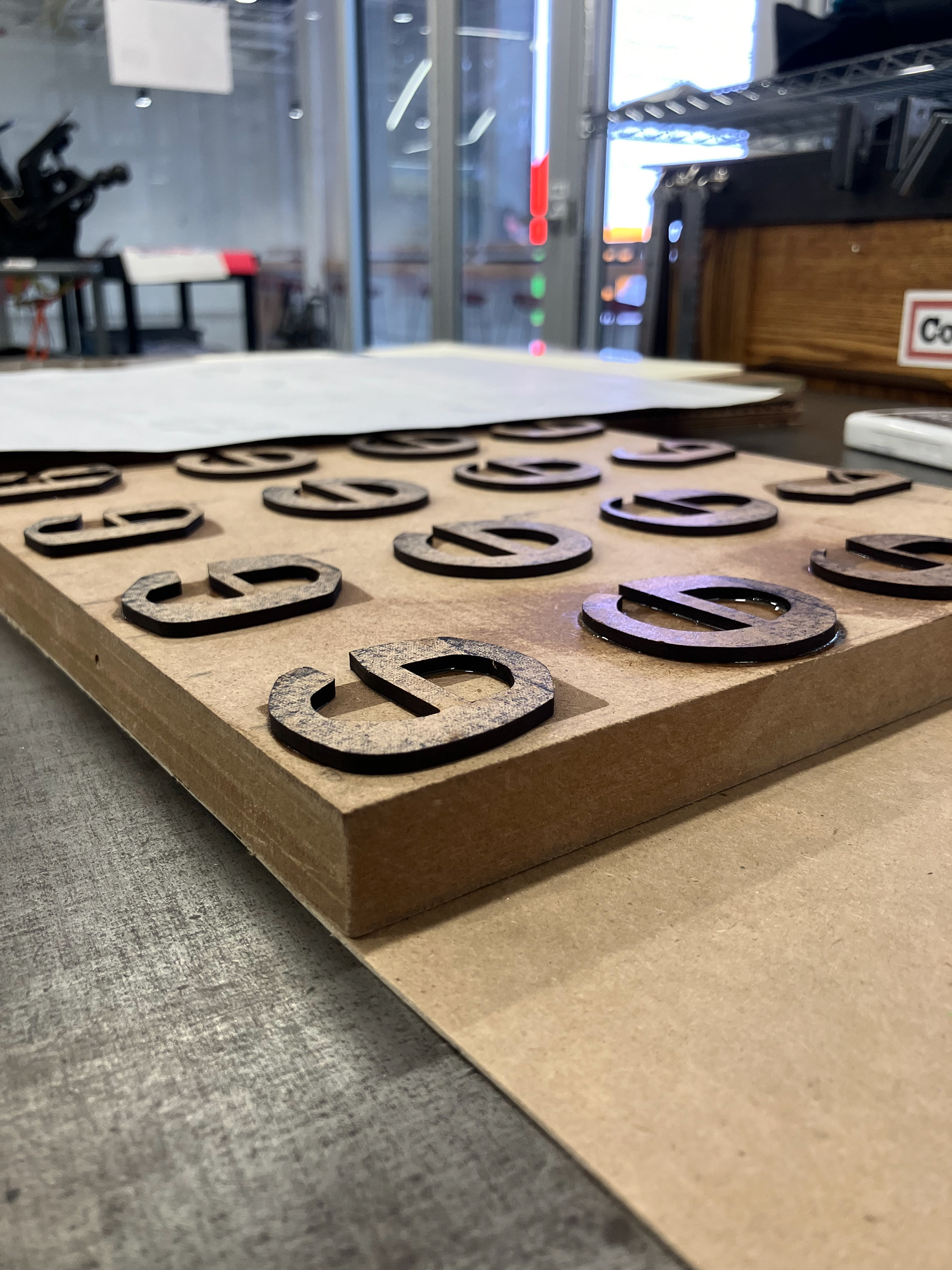
RUBBER STAMP SET PROCESS
Laser cut MDF, rubber, Gorilla glue.
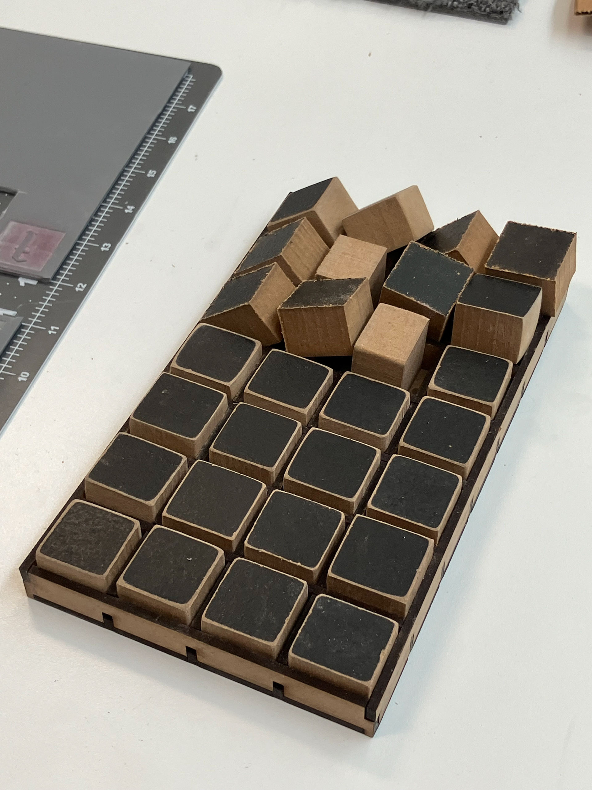
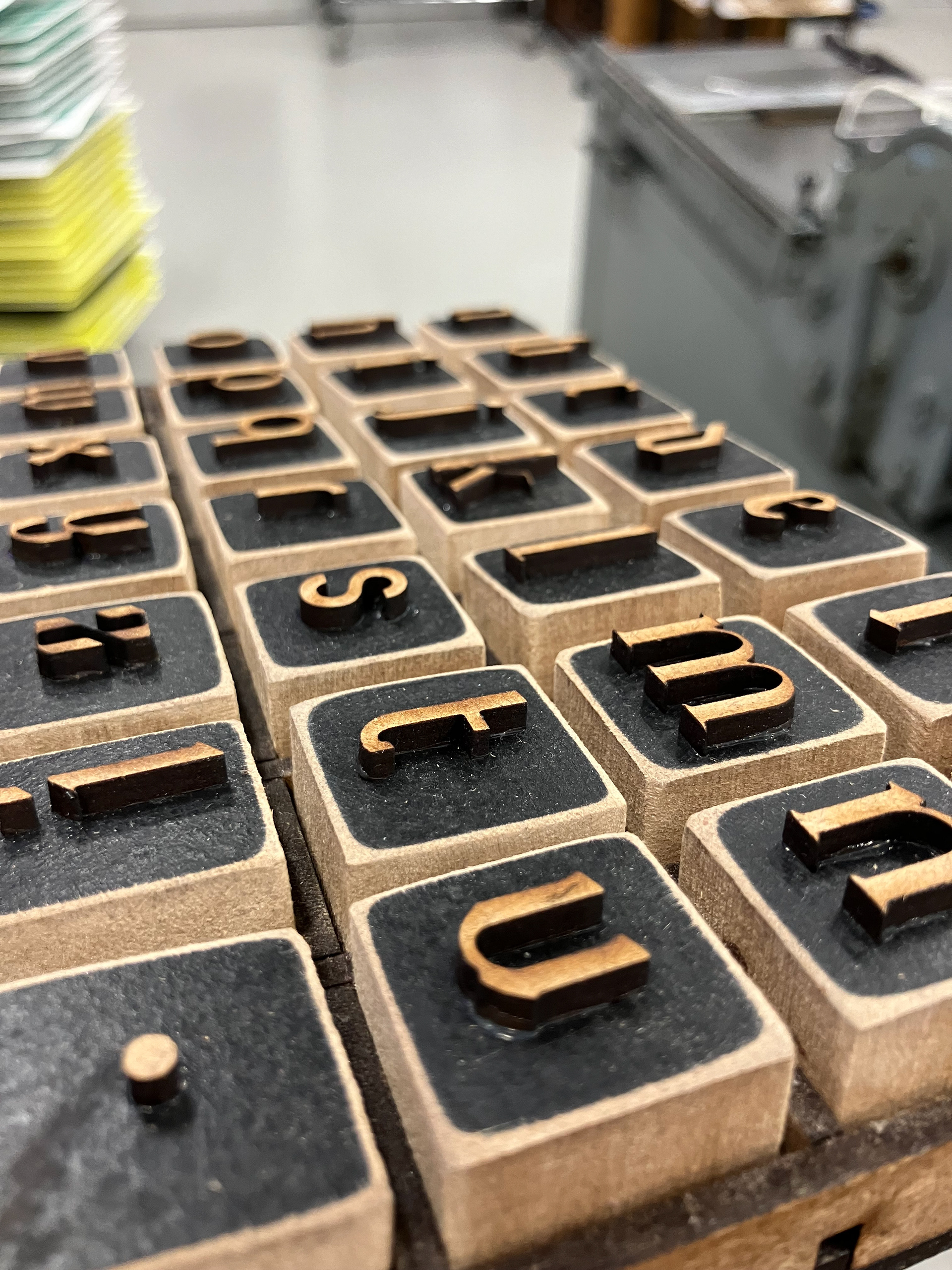
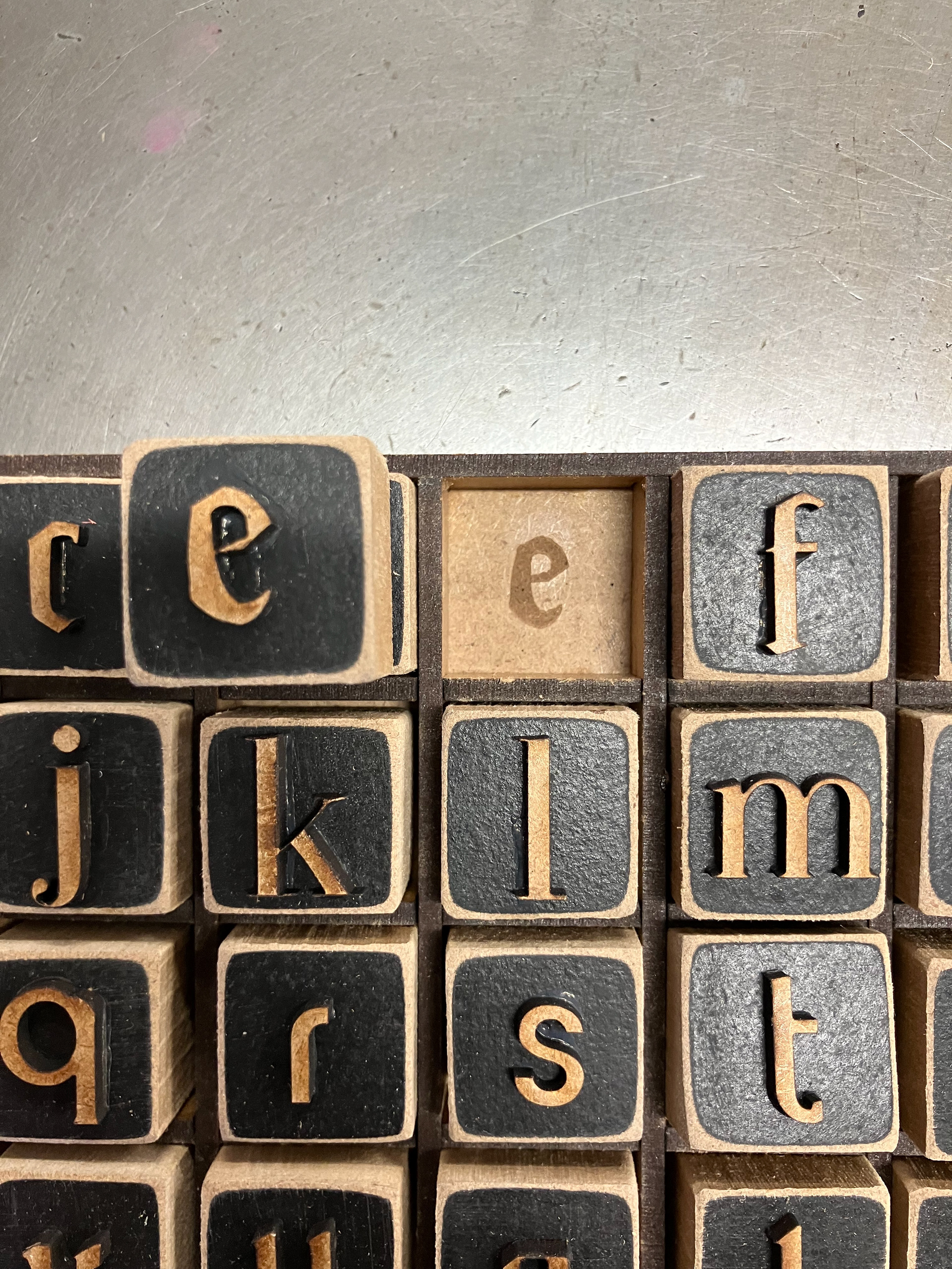
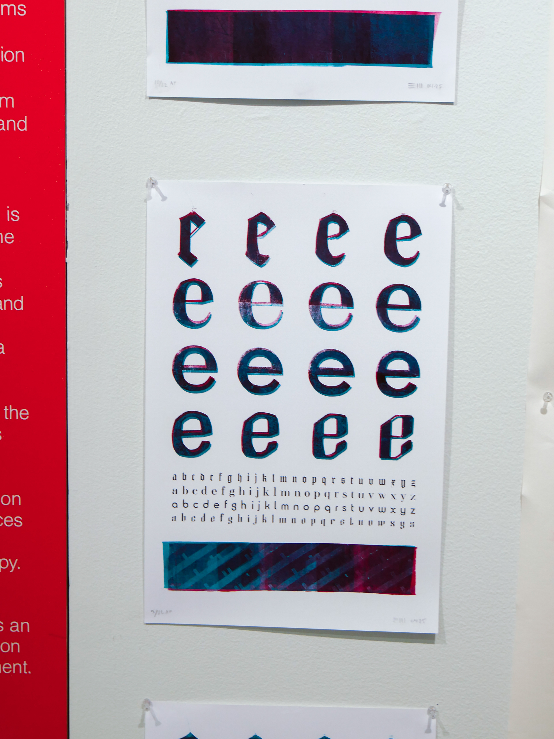
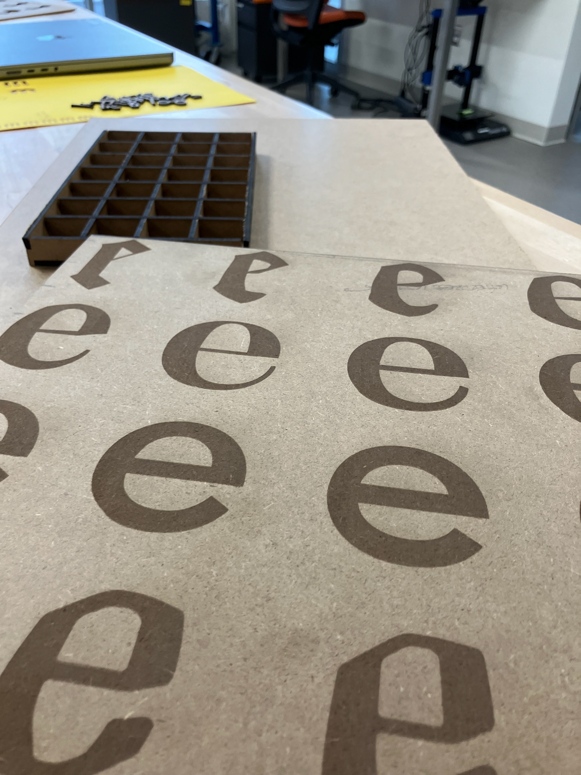
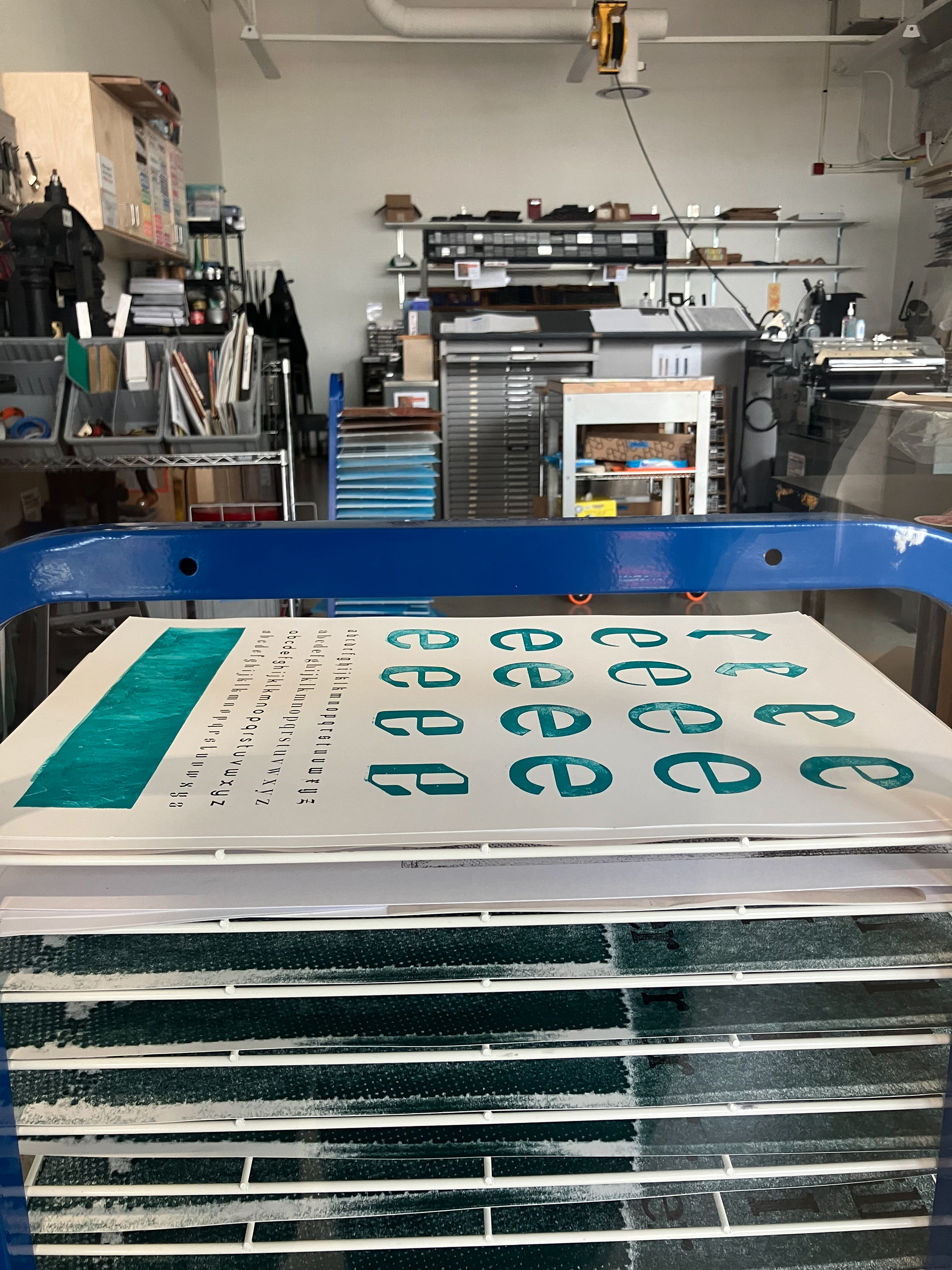
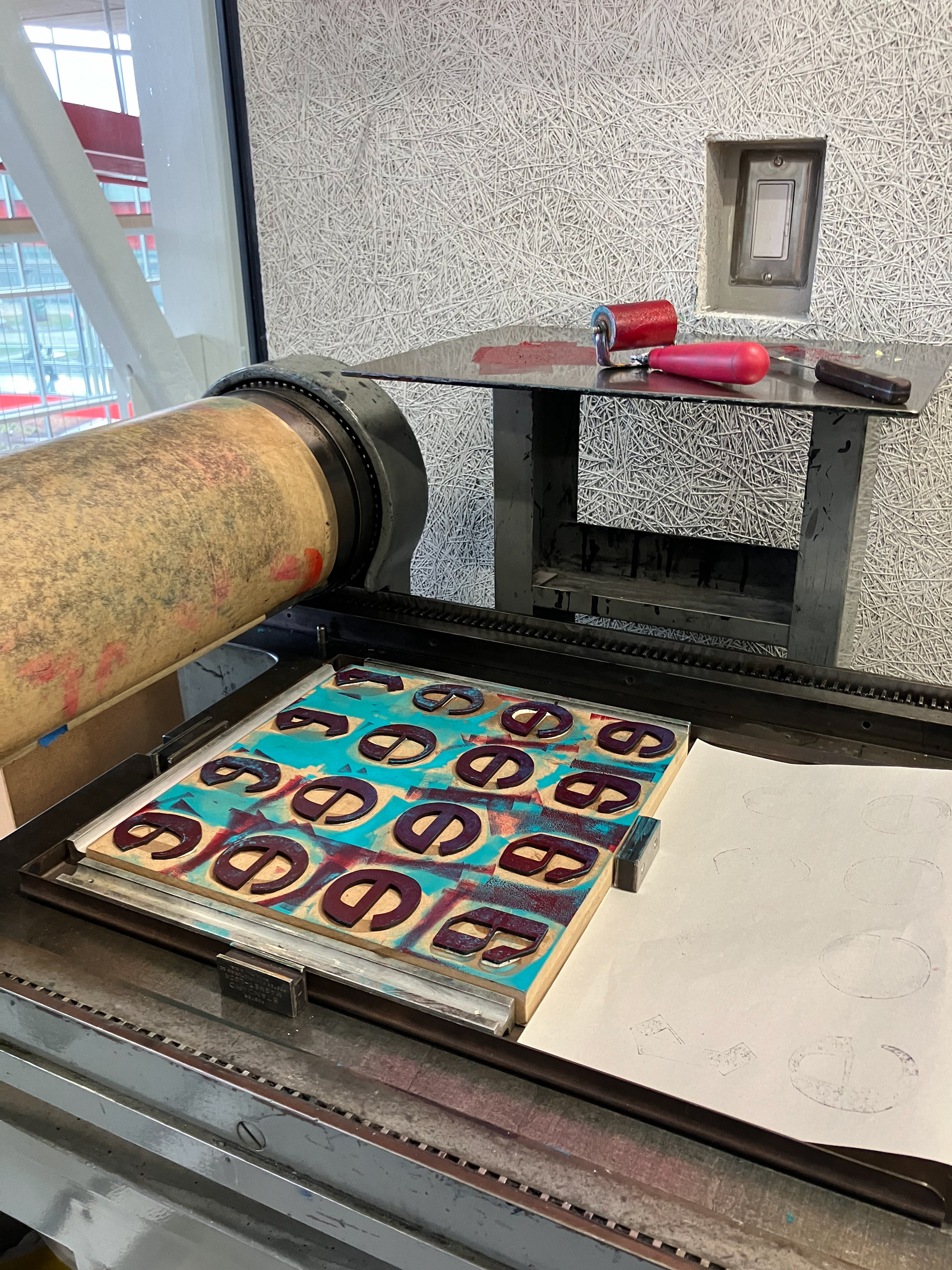
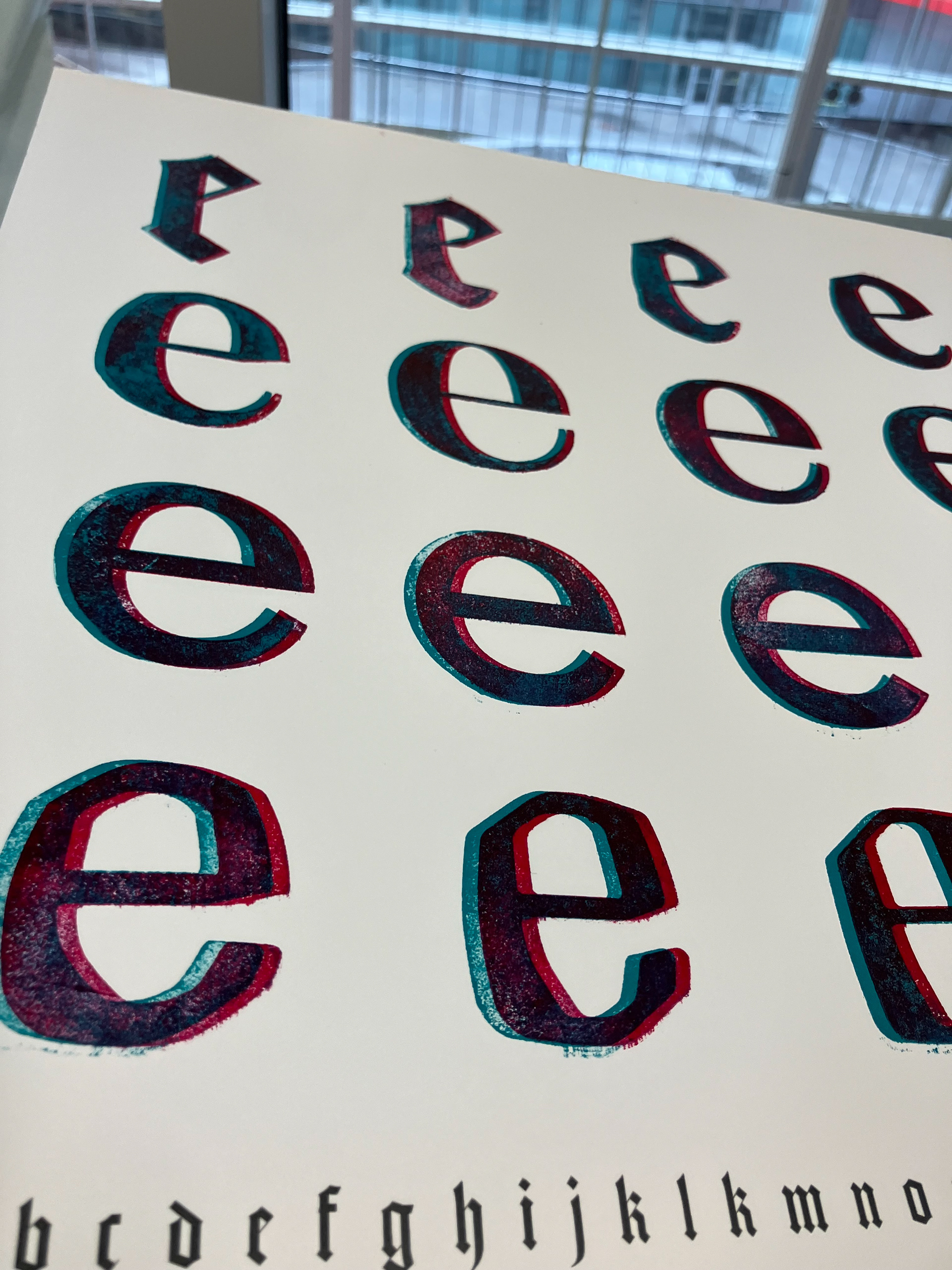
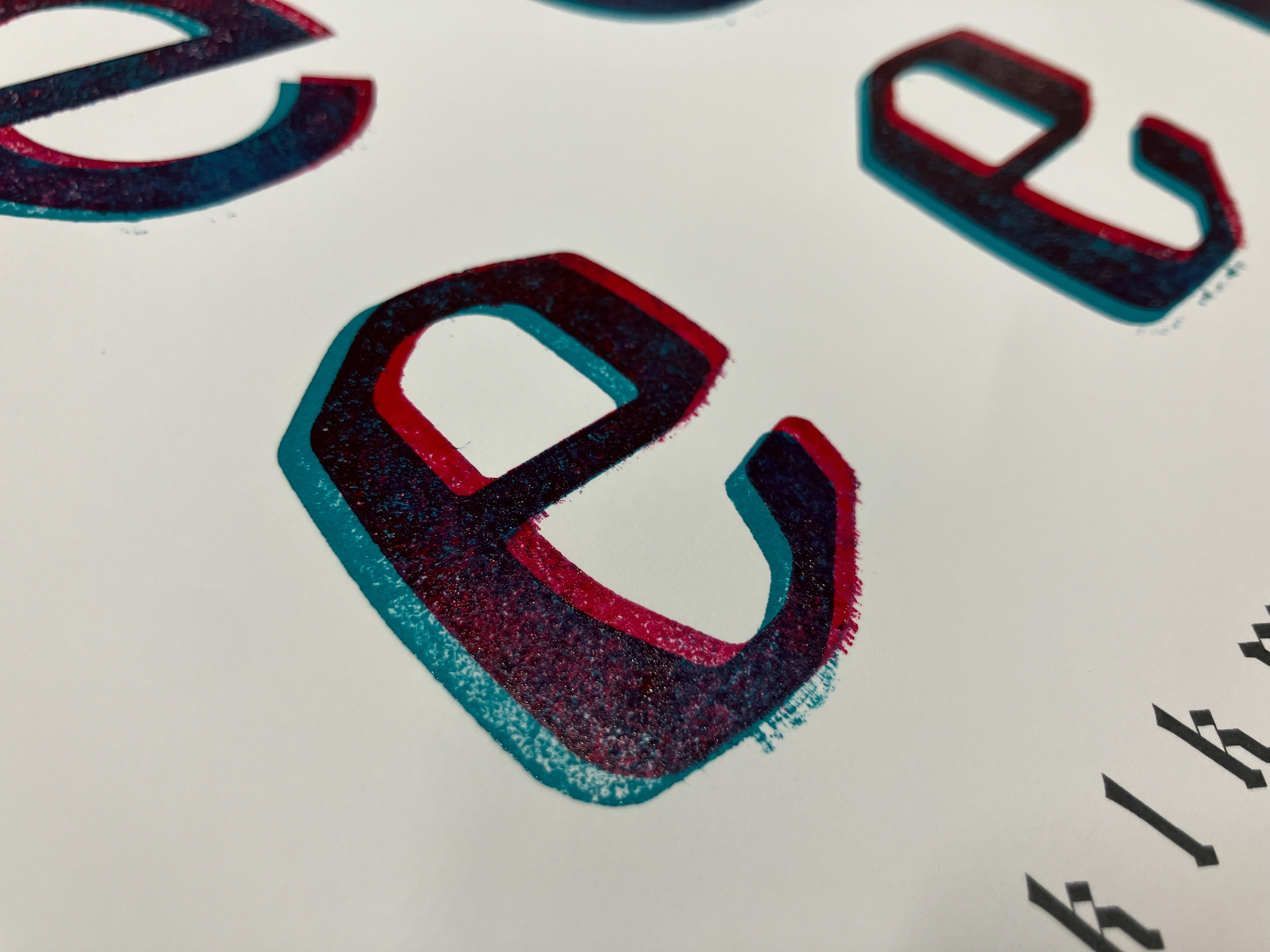
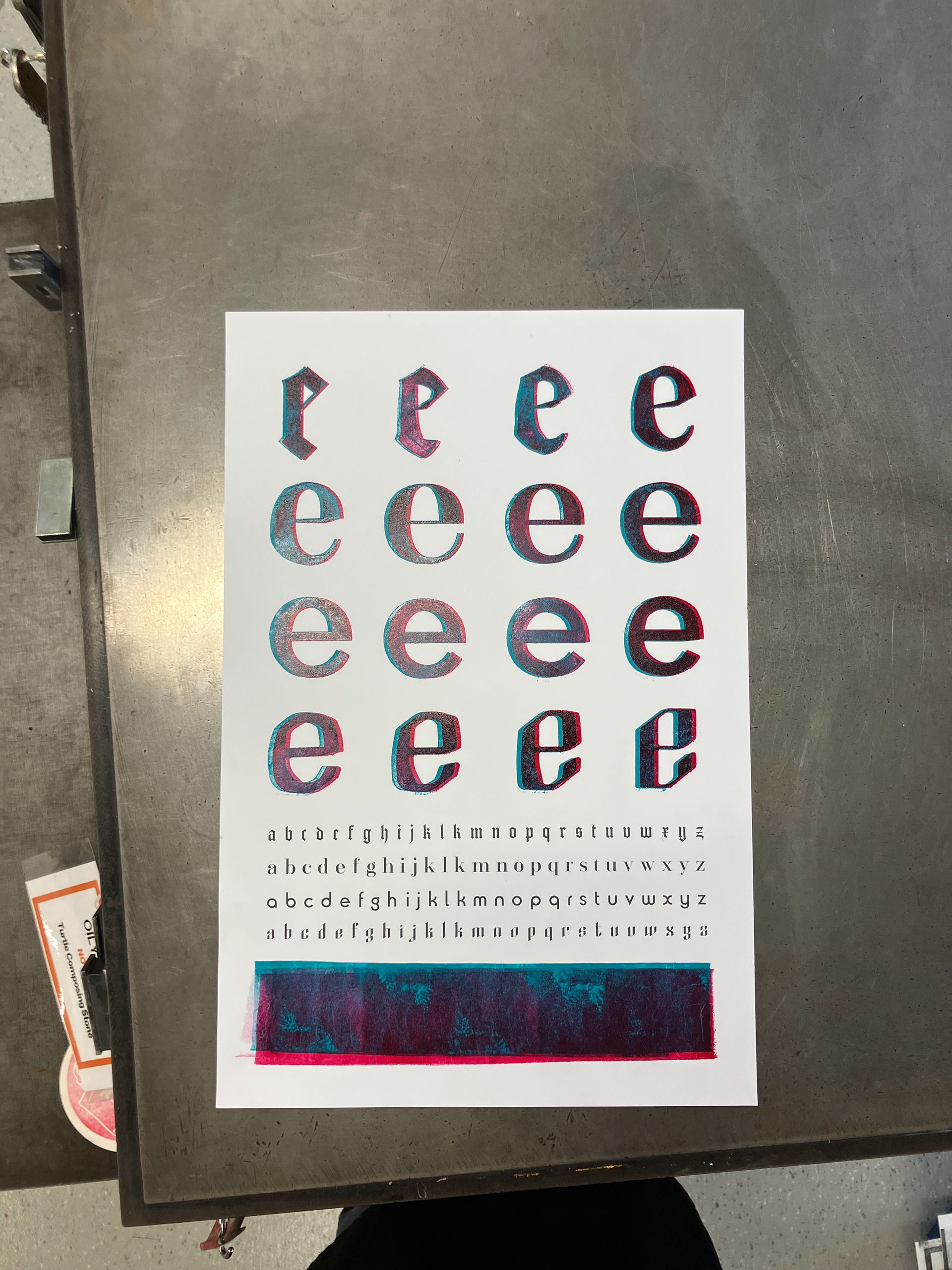
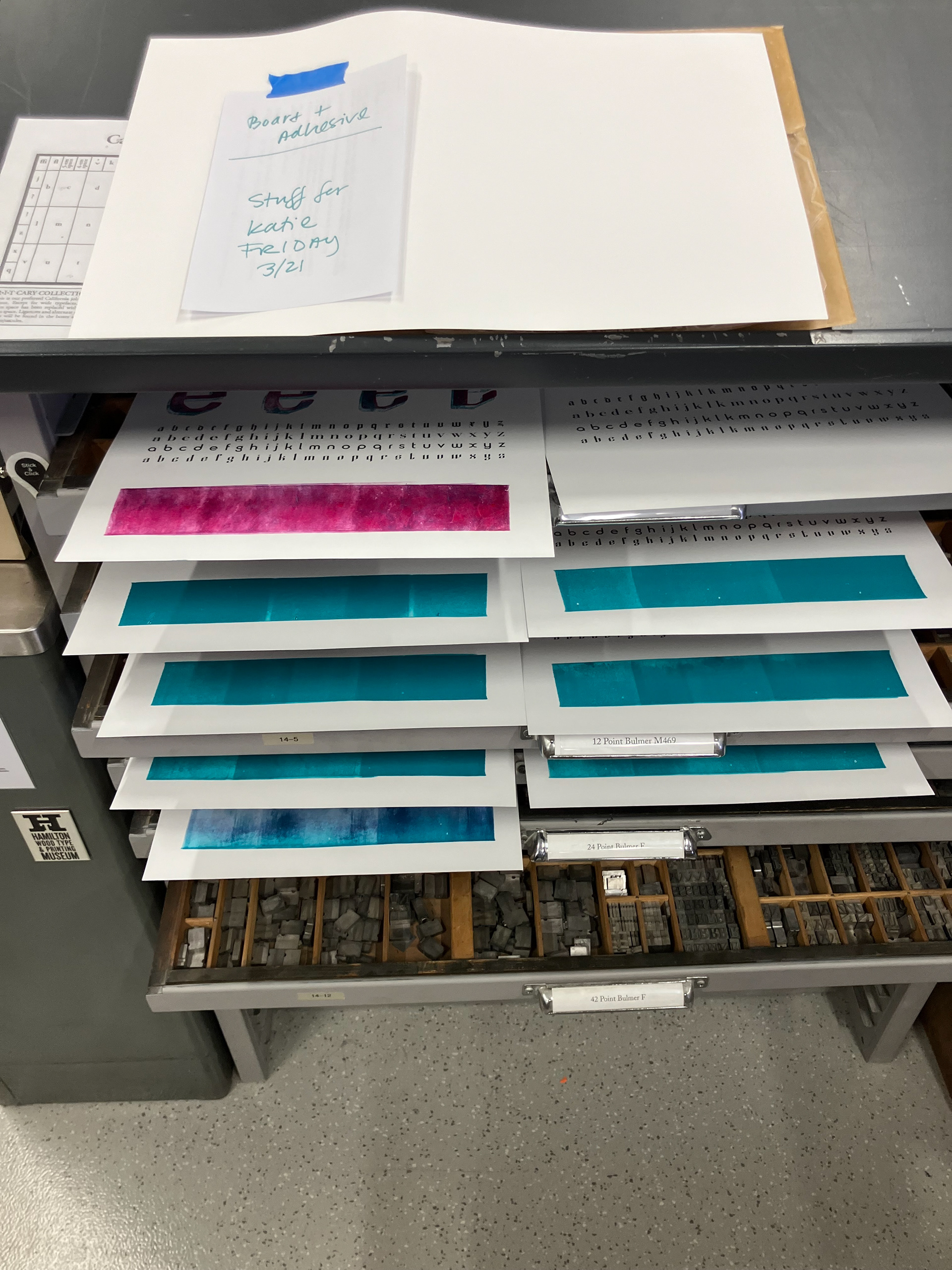
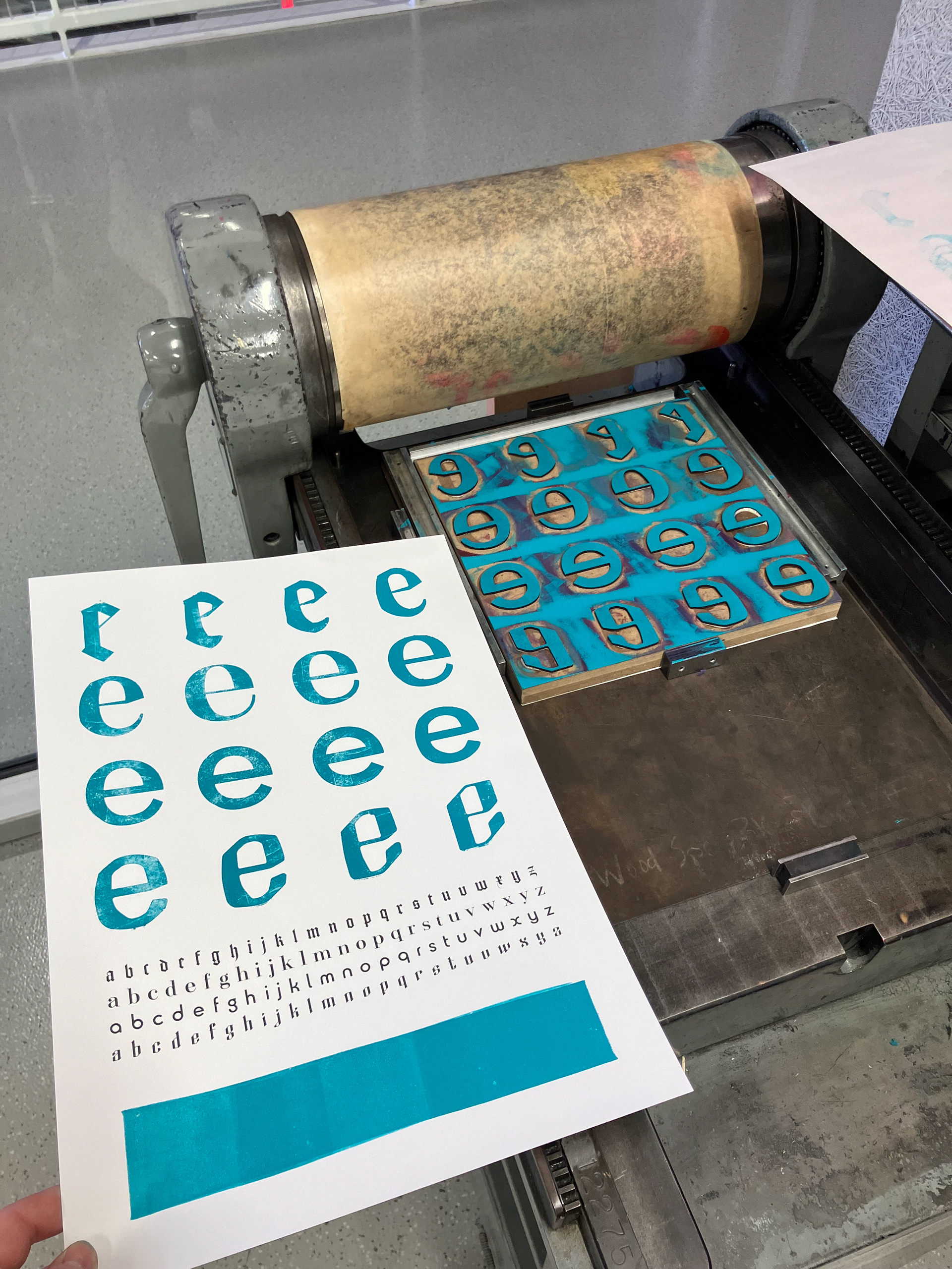
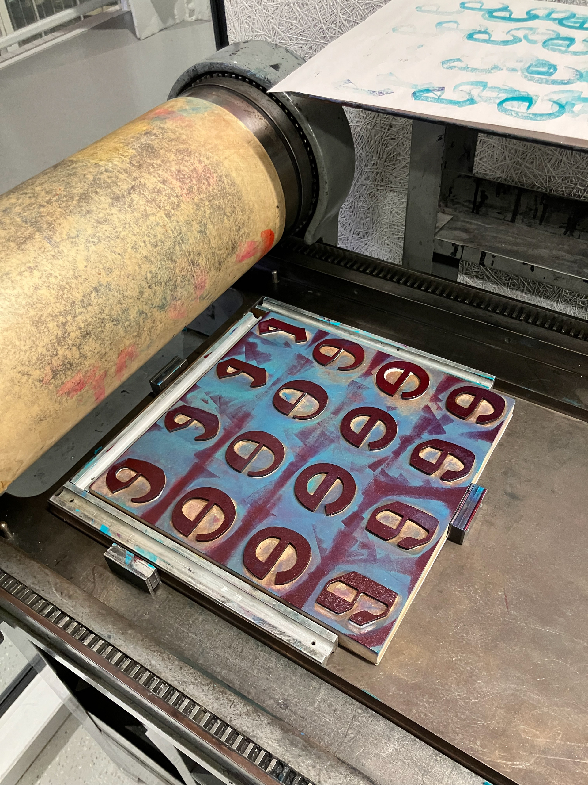
WOOD BLOCK PRINTS
Laser cut MDF raised to type high, printed on cover stock with a Vandercook proof press of some sort.


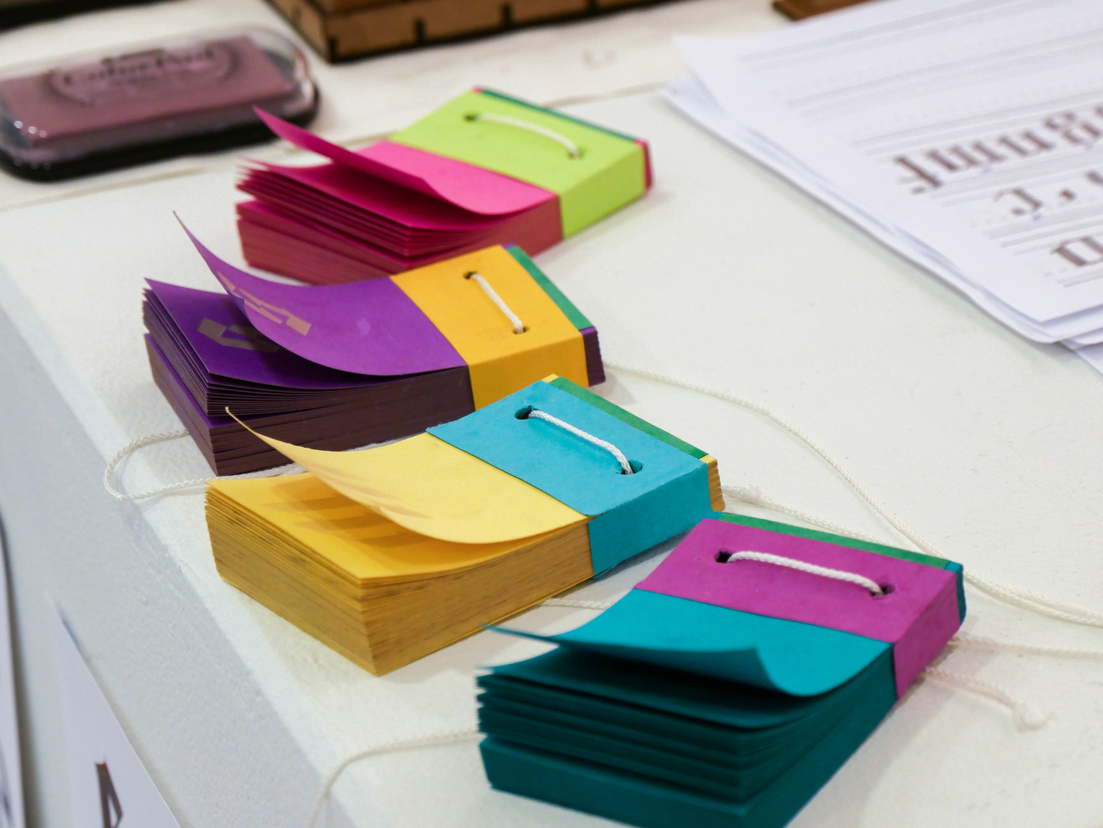
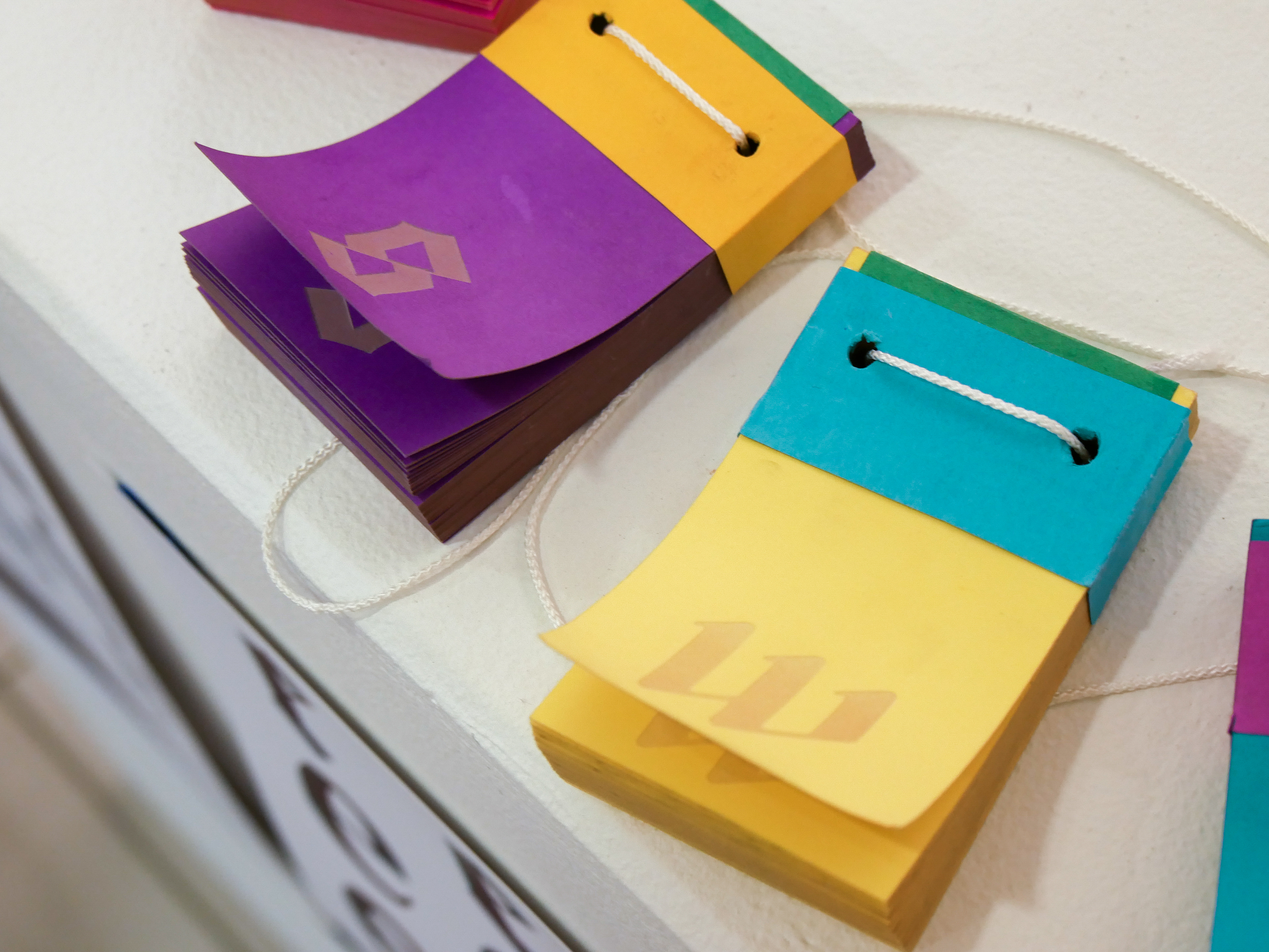
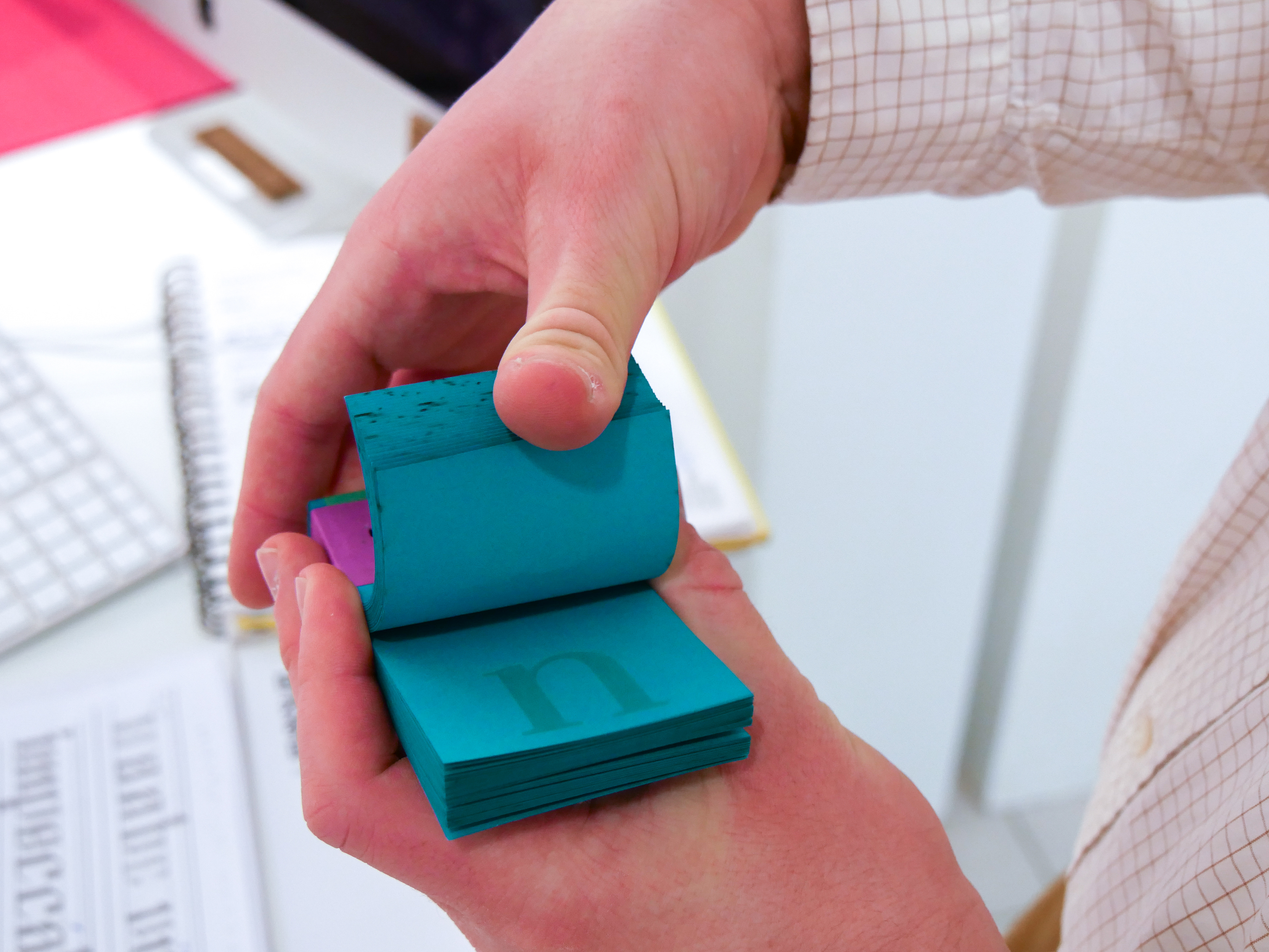
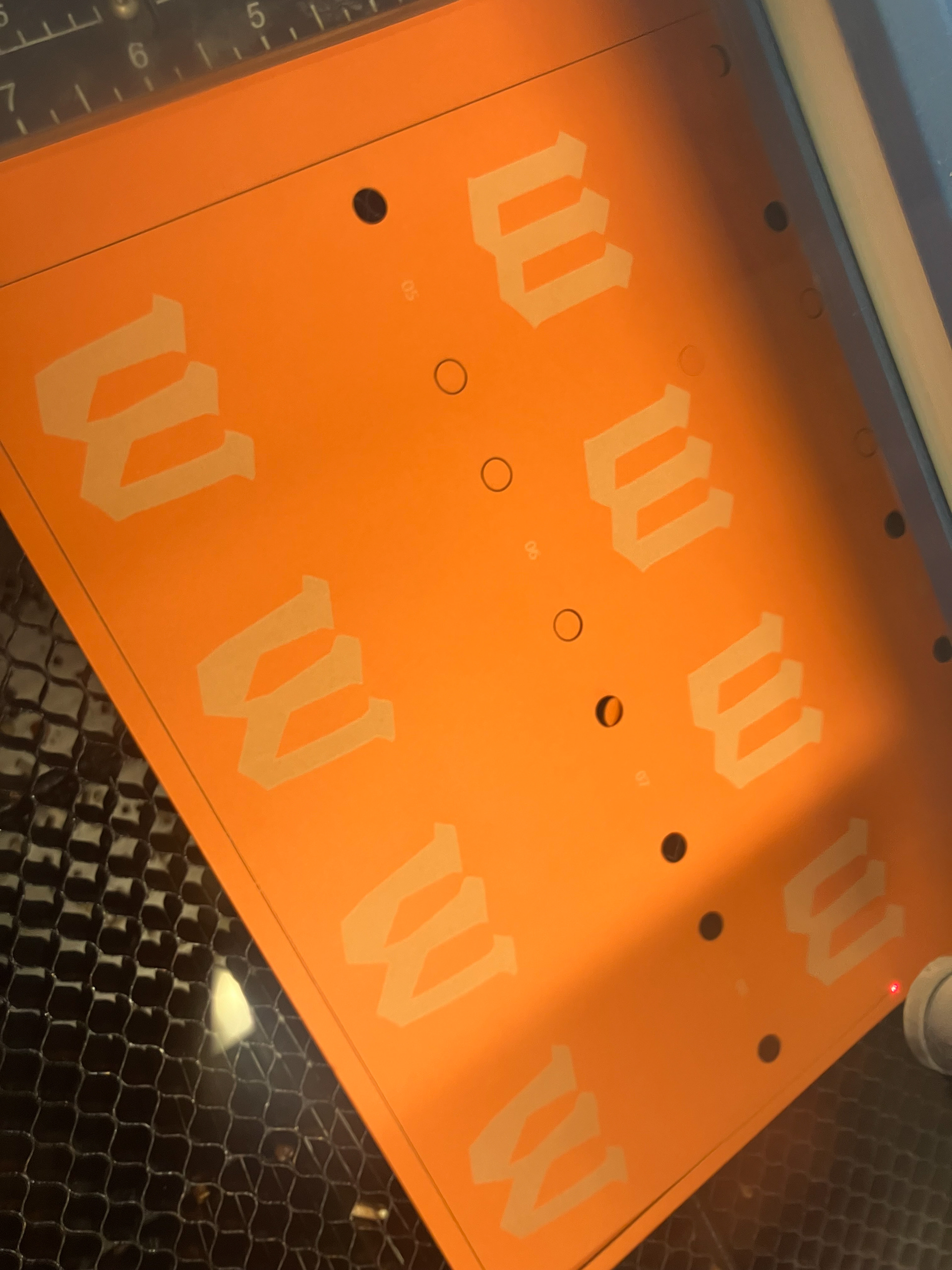
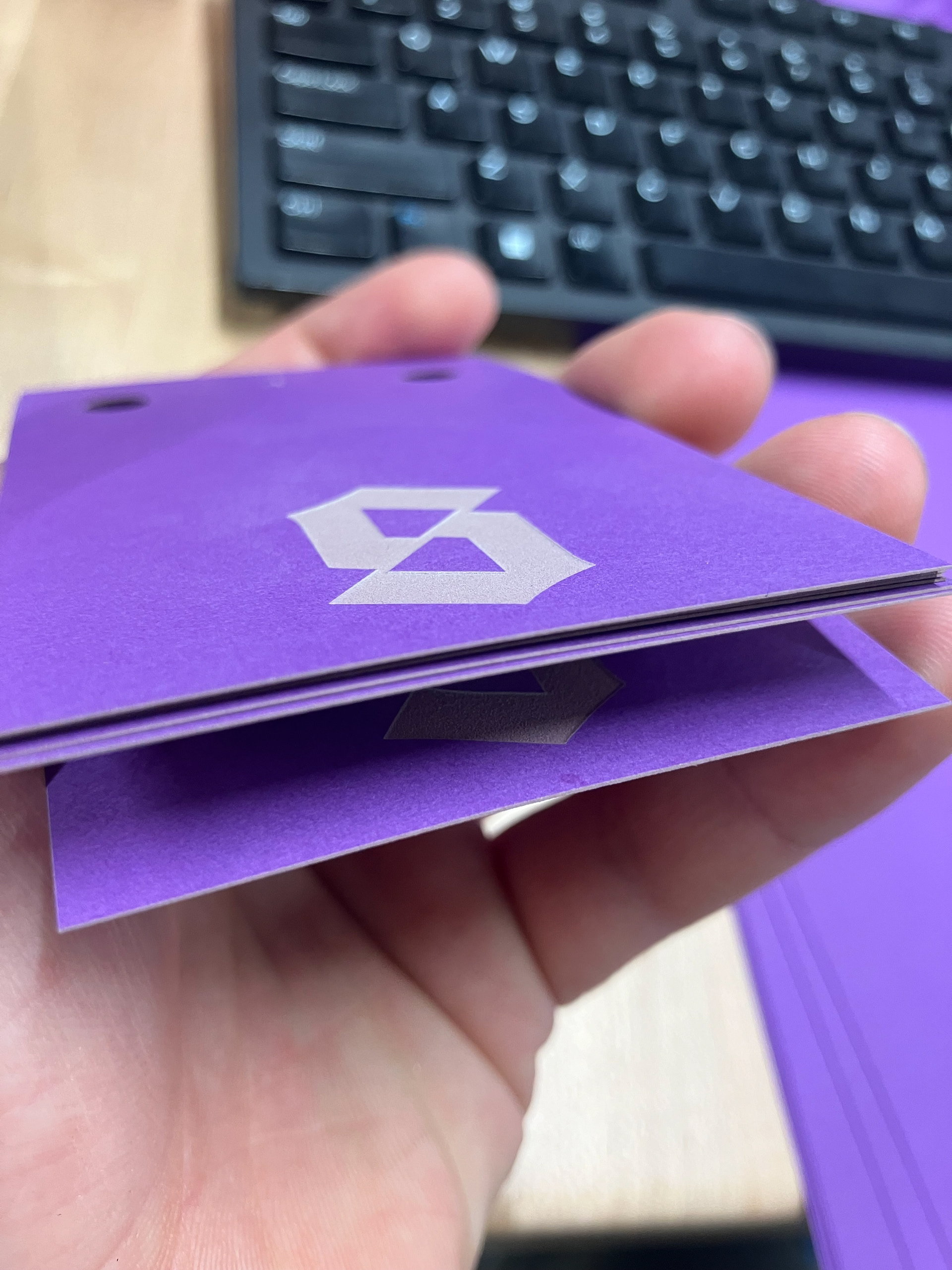
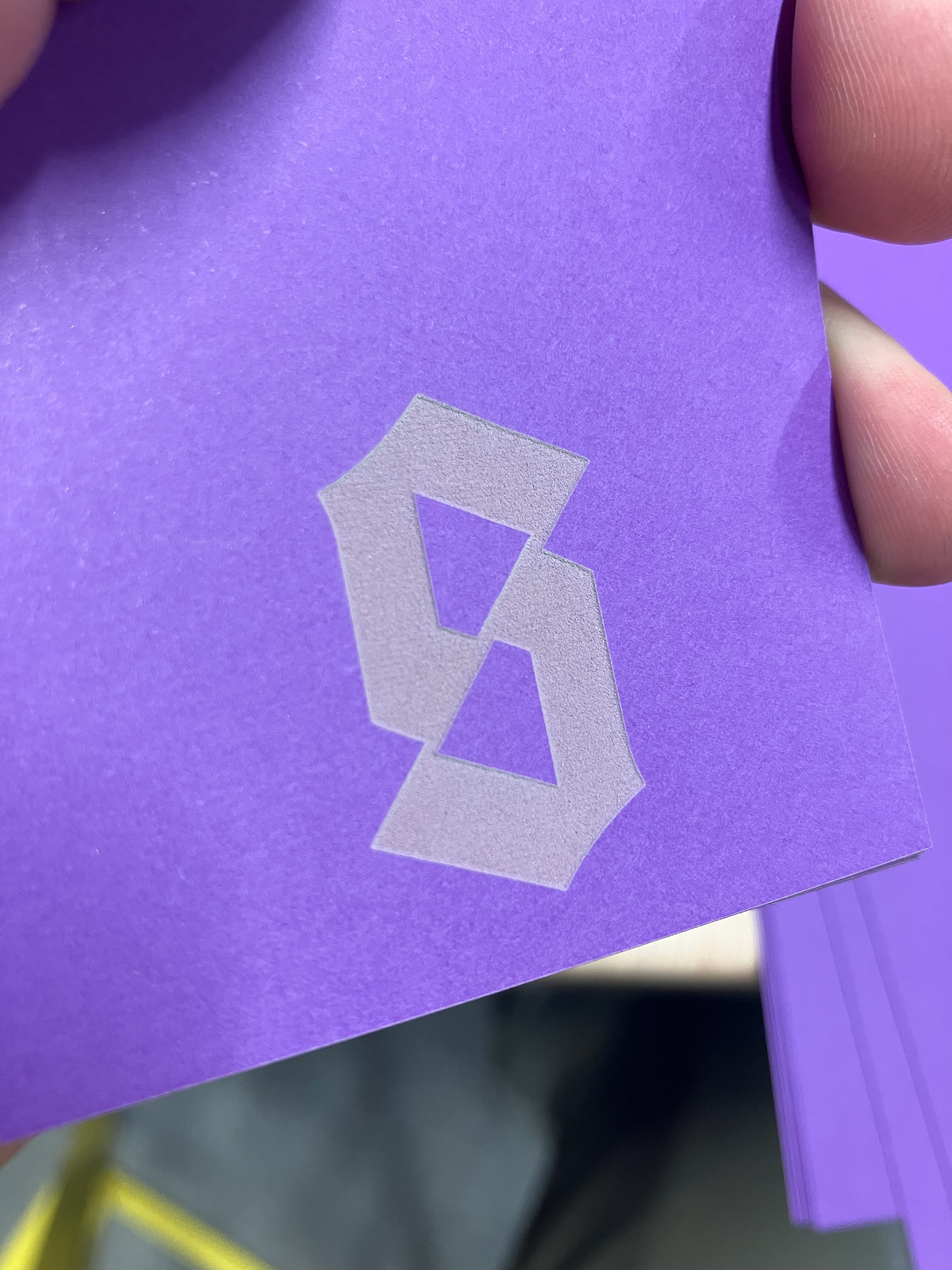
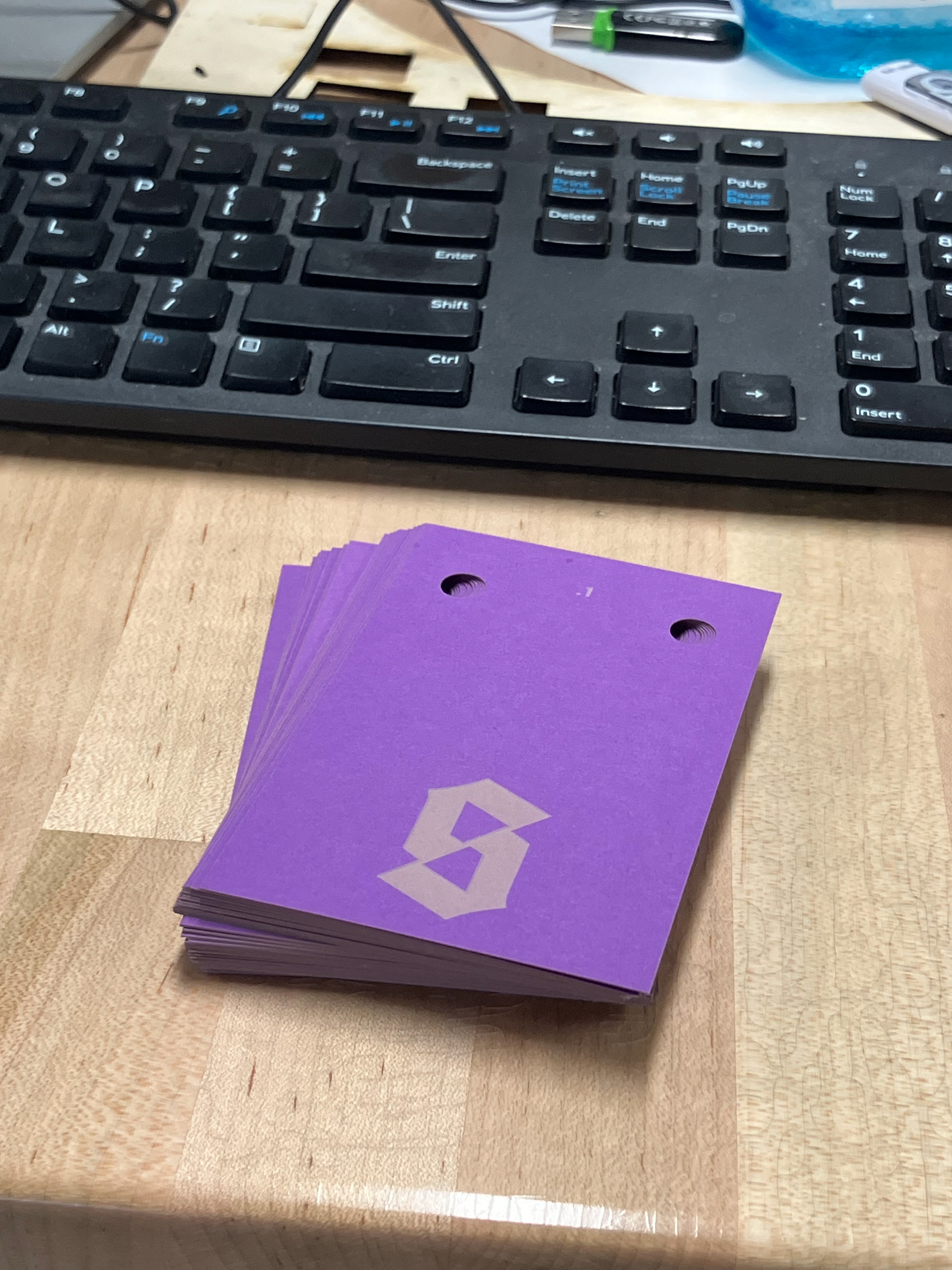
FLIP BOOKS
Using the laser cutter for these flip books gave them ultimate precision and a lovely tactile textural indent. Not pictured are the attempts with an X-acto knife and printer.
WELLINGTON VARIABLE GITHUB REPOSITORY